
Happy Tuesday! I’ve gotten a few requests lately on how I choose color when I’m designing, so this week, I thought I’d share my process which consists of 3 easy, but important steps. You can see how I apply each step using a brand I made up for this tutorial, Fearless Hair, in the video below, but if you’re unable to watch, I’ll break down each step right below the vid 🙂
Step 1: Define
When considering color, the first step is defining what your design is for and/or related to. In the example I use, Fearless Hair, the brand is for an upscale women’s hair salon. The demographic is young and established professional women, ages 30 to 50. These women want to be taken seriously and are looking for a salon that fits their stressful, but successful lifestyles.
Knowing this about my brand gives me a few valuable points when I’m choosing color:
– for females only
– hair salon
– professional women
– upscale, pricier services
Step 2: Discover
This is considered the research step – finding colors that are relevant to the industry, demographic and price point of the brand. Once I find colors that fit those categories, I can begin developing (step 3) my color scheme, but not until then. There are some great color resource tools + sites to make this step move pretty quickly. My personal favorite is color.adobe.com but it’s great to have some variety, so here are a few of my other favorites:
– Colourlovers
– Colrd
– The Ola Brothers
Also feel free to pull relevant images (table full of hair salon ‘tools’, salon exterior + interior, trendy female professional, etc.) and eye drop colors from them! There are many ways to find color, not just predetermined, popular schemes on color sites 😉 Once you pull some colors you like, it’s time to move to the final step!
Step 3: Develop + Apply
If you’ve already found ‘the one’ in terms of color schemes, you can head right into applying those colors to the elements within the brand. If you have a bunch of colors you like, but haven’t necessarily developed a scheme of 3-5 that are grouped together, you can begin that process! If you’re familiar with the color wheel – defining colors that are complementary, compounds, triads, etc. now’s a great time to put those into practice because we already know those colors go well together. Once established, apply in different combinations – there’s always a little experimentation here – until you’re happy with the overall look 🙂
So that’s it! Define, Discover, Develop + Apply and you’ll always have relevant (and defendable!), smart color schemes for any project!
Receive special offers on courses + products, a new design file every month plus instant access to the Resource Library!

Pick up over 50 design + lettering files as our gift to you when you join the Tuesday Tribe for free!
error
Congrats!
Please check your email to confirm.
You May Also Enjoy
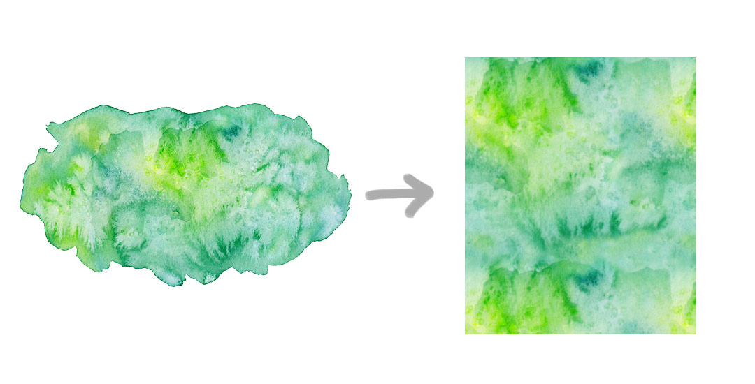 Create Seamless Watercolor Patterns in Photoshop Posted in Tutorials, Color, Patterns, Textures
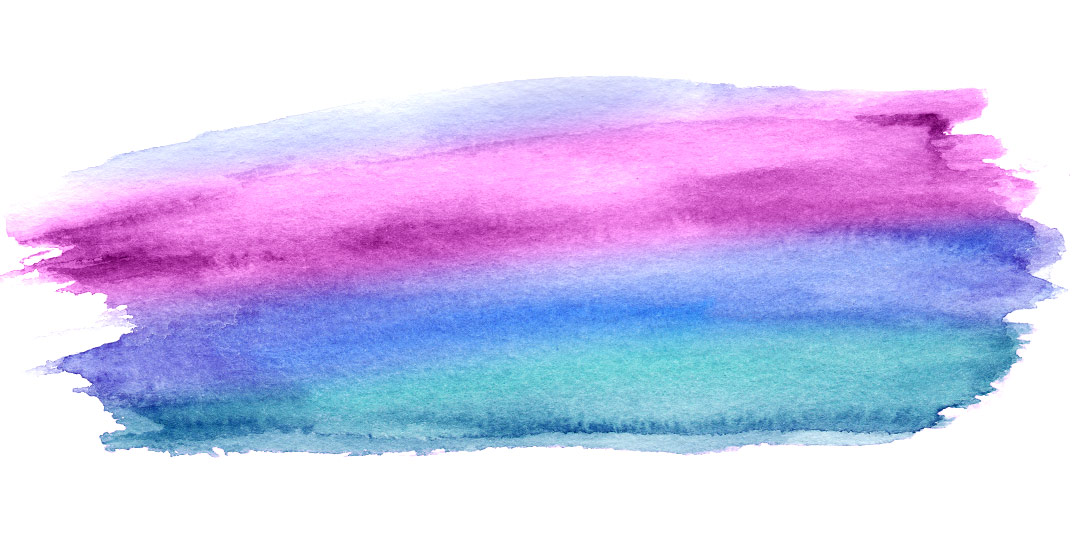 Change any Watercolor Texture to a Specific Color Posted in Tutorials, Photoshop, Color, Branding, Textures
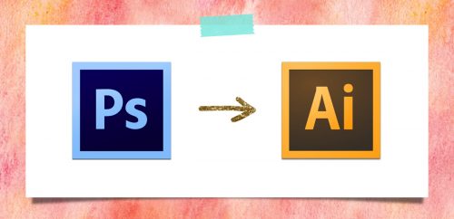 How to Convert a Photoshop Pattern into an Illustrator Pattern Posted in Tutorials, Photoshop, Illustrator, Patterns, Textures
 Create a Hipster Logo in Adobe Illustrator Posted in Tutorials, Typography, Illustrator, Branding
JM | January 14, 2015
|
This is one of my favorites of your tips. While confirming how I find colors is in the right ballpark, of more interest was hearing your comments with adjectives defining what your color sets meant to you. E.g, expensive looking, confident, bold. I can look at color combinations and think like or don’t like. It is hard to look at them and come up with “confident.”
TeelaC | Author | January 14, 2015
|
Thanks so much for watching! I spent more time on this tut than I think any of my others, so it means a lot to get this feedback! 🙂
Tanja | January 20, 2015
|
Hi Teela! I just came across your tutorial and your blog today. Even though I am familiar with some of the pages for color pallets inspiration, I really found your video helpful and it was nice to get an insight in your workflow. I discovered that I am using similar techniques, but I didn’t have a structure for it, so at some points it became rather confusing. Looking forward to some future posts! 🙂
TeelaC | Author | January 21, 2015
|
Thanks so much for the feedback and for watching! It feels great to hear the tut was helpful 🙂 I’m glad you found me!
Naomi | January 27, 2015
|
Hi Teela,
I’m very new to all this and your tutorials have been superb! I’ve been wanting to start making stationary designs for some time and your videos have given me the push I need.
By the way, what font is used for Fearless hair?
TeelaC | Author | January 27, 2015
|
That makes my day to hear! Thanks so much for watching and checking everything out, I’m so glad I was able to help with your goal! I actually hand drew Fearless Hair using the same method in this tutorial http://138.68.151.169/how-to-vectorize-hand-lettering/ 🙂 But maybe I should make it a font!
Cayetano | February 25, 2015
|
This is my new favorite. great info and really easy going yet knowledgeable narration. Just came across your site and have already found some really great content.
TeelaC | Author | February 25, 2015
|
Thank you so much for this and for checking everything out! So happy to hear 🙂