HomePosts Tagged "colorful"

colorful Tag

This week, we’re creating a colorful butterfly in Procreate! In support of racial equality + the need for change happening globally and especially today, I bring you a symbol of beautiful transformation 🦋 This is very beginner friendly, uses only one (free) brush and the color palette is free, as always (both are also available in the Resource Library

When I received these Karin markers a few weeks ago, I obsessively played with them for days on end. Unlike other watercolor markers I’ve tried, these ones were packed with pigment, so easy to use and blended like a dream with water. The more I experimented, the more I was drawn to all the incredible textures you can achieve with them! In this week’s tutorial, I’m sharing 3 winter watercolor texture tricks you can use for cards + holiday artwork! Read on for the full tutorial + supply list!

You may have seen this style of lettering floating around instagram and created in Procreate on an iPad. In this week’s tutorial, I share how to create the same effect, but in Illustrator. By using Illustrator, everything can be infinitely rescaleable since it’s vector-based. We’ll utilize some features you may not be aware of that you can use for future work, too. This is a slightly advanced tutorial, so the pace is a bit quicker. If you’re new to Illustrator, allow some extra time (or check out some beginner tutorials first). Read on to create colorful gradient lettering in Adobe Illustrator!

This week, we’re returning to one of my favorite topics: watercolor textures! Ever since I received these brush pens in the mail, I have been swooning over all of the cool textures I’m able to create – and quickly, too! These are the most vibrant watercolor-simulated outcomes I’ve been able to achieve with brush pens, which makes the creation process that much more fun. Use these as backgrounds for your lettering, or even scan them in and make a digital texture or repeat pattern out of them! Read on to see 3 different watercolor texture tricks using brush pens below.

When I first started using Procreate, I just selected the colors I needed at the time and went on my merry way. Once I became more comfortable with the program, accessing quick, harmonious color palettes dramatically changed (and improved) the feel of all of my artwork moving forward. Spending the time to experiment with and decide on the right color combos became increasingly more time consuming, though. Thinking about how I choose color palettes for my graphic design artwork, I realized I could utilize the same tools, but in a different way using Procreate. In this video, I’ll share how I now put together quick color palettes in Procreate in a matter of minutes. Once you see how easy it is, I promise, you’ll never look back!

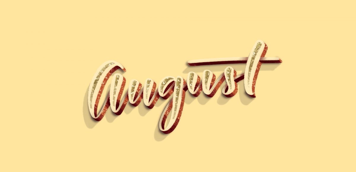
It’s the last Thursday in July, which means it’s time for your free August 2017 desktop wallpapers! It had been a little while since I created a desktop wallpaper using Procreate, so that was the plan for August. If you saw this post, then you know that I’ve been obsessing over 3D hand lettered signage lately. I wanted to experiment with bringing this same look onto the iPad, and after a few hours of playing around, I had exactly what I was going for. On a whim, I decided to integrate textures from my metallic procreate kit. The final design was exported into Photoshop where the dates were added using my font, Miss Magnolia. The addition of the glitter, especially, made this come to life and I already love having it on my desktop, even if it’s a little early 🙂

The download includes the wallpapers in two common resolutions: 1280x1024px and 1920x1080px, with and without dates. I’ve left the year off of the ‘no-dates’ versions, so you can use it for any August in the future, too!

It’s the last Thursday in June, which means it’s time for your free July 2017 desktop wallpapers! This month, I wanted to experiment with a new technique for creating watercolor textures. I picked up these small spray bottles, filled one with regular water and used it, along with this no.4 round brush to create the texture. Each new layer, I let *almost* dry before adding a little extra color to create more depth/vibrancy. It was created using this pan set – I was on the fence when I originally bought it since it’s a little pricey, but it has hands down become my favorite watercolor set (even beating out liquid concentrated!). I scanned the final texture in, made a few minor color enhancements in Photoshop, added July which I hand lettered, and typeset the dates using Miss Magnolia.

The download includes the wallpapers in two common resolutions: 1280x1024px and 1920x1080px, with and without dates. I’ve left the year off of the ‘no-dates’ versions, so you can use it for any July in the future, too!

It’s the last Thursday in May, which means it’s time for your free June 2017 desktop wallpapers! I’ve been wanting to play with acrylics a bit more lately, so this month’s wallpaper was an experiment of color mixing and texture. I went with a blue/green/teal palette for Father’s Day this month, keeping a balanced mix of all (without getting too muddy) throughout. Let me know if you’d like a tutorial on how I made the paint texture and I’ll put one together 😉 Once created (and dry), I scanned the artwork into the computer, color adjusted in Photoshop, then added the dates using my font, Miss Magnolia.

The download includes the wallpapers in two common resolutions: 1280x1024px and 1920x1080px, with and without dates. I’ve left the year off of the ‘no-dates’ versions, so you can use it for any June in the future, too!

It’s time for your free May 2017 desktop wallpapers! This month’s (May flowers) wallpaper was created using this Winsor & Newton watercolor pan set with a no. 1, no.4 + no.8 round brush on this Canson watercolor paper. I then scanned the individual flower + leaf elements, enhanced them and cut them out in Photoshop using the methods from this course (vid no.7 covers cutting them out). I hand lettered ‘May’ and applied it to the center within Photoshop, then added the dates using my font, Miss Magnolia.

The download includes the wallpapers in two common resolutions: 1280x1024px and 1920x1080px, with and without dates. I’ve left the year off of the ‘no-dates’ versions, so you can use it for any May in the future, too!

It’s time for your free April 2017 desktop wallpapers! This month’s (April showers) wallpaper was created using this Winsor & Newton watercolor pan set to carefully drip different colors on this Canson watercolor paper. I then scanned it and enhanced the colors using photoshop, then typeset April + the dates using my font, Miss Magnolia.

The download includes the wallpapers in two common resolutions: 1280x1024px and 1920x1080px, with and without dates. I’ve left the year off of the ‘no-dates’ versions, so you can use it for any April in the future, too!

I am knee deep in preparing the launch of the new font making course (be sure to check back here next week!), so this week’s tutorial is a quick, but super handy tip for choosing color. There are many times I find myself needing quick color palettes in Adobe Illustrator, where I just need something beautiful that fits the mood. Adobe Color’s website has always been the perfect help for me whenever I’ve been in a color pinch. If you’re a Creative Cloud subscriber, it couldn’t be easier to grab a color palette, tweak it and start using it directly in Illustrator. Here’s how!

GDPR Icon

Your Privacy Matters

We use cookies to customize and create content that’s most important to you. We’ll never share the info we collect.

View Privacy Policy