HomePosts Tagged "depth"

depth Tag

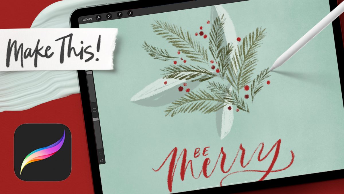
We’re kicking off my annual holiday tutorial series this week with tutorial number 1 of 6! I’ve got a bunch of fun projects for you this year that you’ll be able to repurpose however you’d like for both digital and stationery needs! Today, we’re starting with some easy evergreen doodles using chalk brushes for that nice hard + soft feel, then finishing it up with hand lettering and a textured, two toned border.

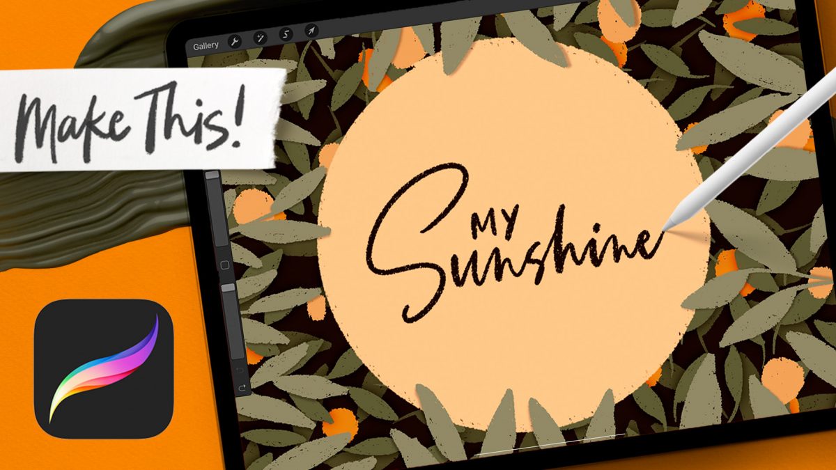
I just loooove a layered illusion, especially when it’s made of simple elements where your eyes don’t have to focus on a zillion things. What’s better is being able to replicate that same process with any element! Today I’m sharing a really easy method for an impactful depth illusion and we’re doing it all with *one* brush. Use this on stationery, social media posts, quote graphics…you name it!

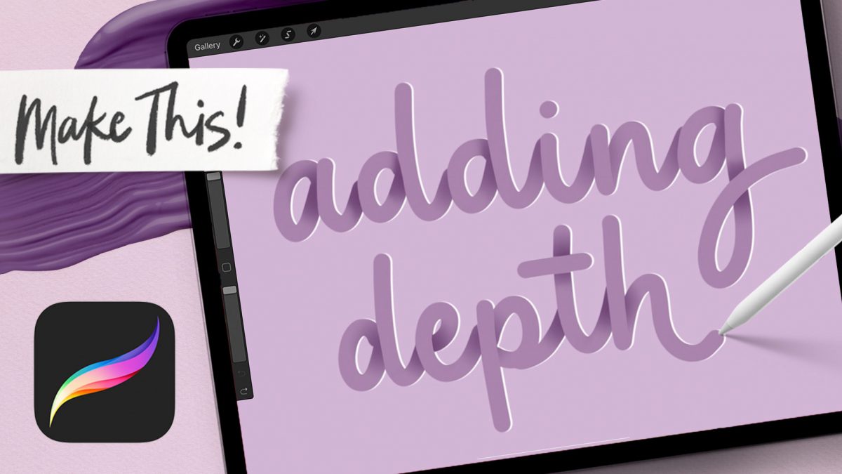
I’ve had a few requests for advanced tutorials, so if you’re up for a challenge, this week’s tutorial is for you! This is one of my favorite depth effects when it comes to lettering; I love how it starts out completely flat and things pop forward more and more as you go – soooo satisfying! You can use this same effect on overlapping shapes or even your favorite font if you don’t want to use lettering – win, win!

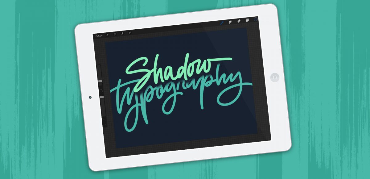
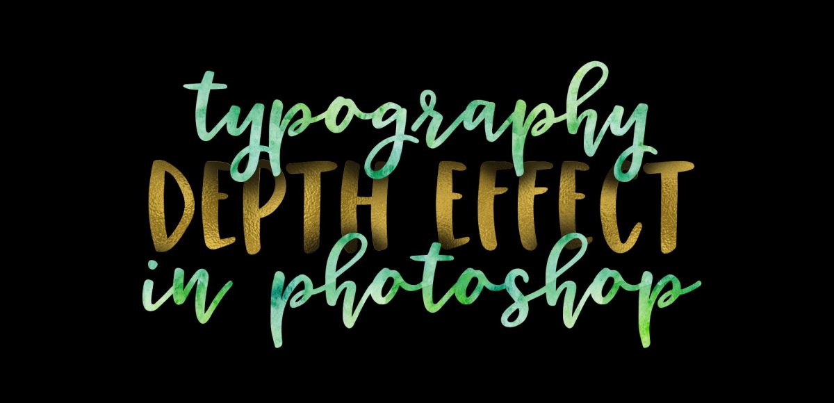
A few months ago, I shared how to create a similar effect as this in Photoshop, and I was asked how to also do it in Procreate, so here we are! This week, I’m sharing how to create shadow depth typography using Procreate on an iPad. At first glance, you may think this is just a simple drop shadow, but this drop shadow is much larger and darker than what you can get by implementing it traditionally. It also fully connects to the word it’s attached to, while also extending further than you can get by just sliding a copy of your lettering and blurring it. I also share how to group layers, so you can move more than one item at a time, but still edit layers independently of one another. I promise it’s worth the 5 minutes this week! Read on to see it all 😉

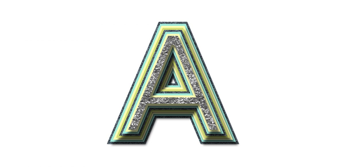
While browsing pinterest last week, I came across this ‘A’ and I knew I had to recreate it digitally. I loved the way the shadows ‘stair stepped’ the different sides, and how those shadows made the letter feel raised. I also liked the fact that I could integrate a bunch of colors without it seeming too busy, and that I could put my own spin on it with some glitter textures. In this week’s tutorial, I’m sharing my process for creating this layered letter effect, using both Illustrator and Photoshop. You can stay in Illustrator the entire way if you’d like, but I discuss my reasons for hopping into Photoshop to finish things off. Read on to see it all!

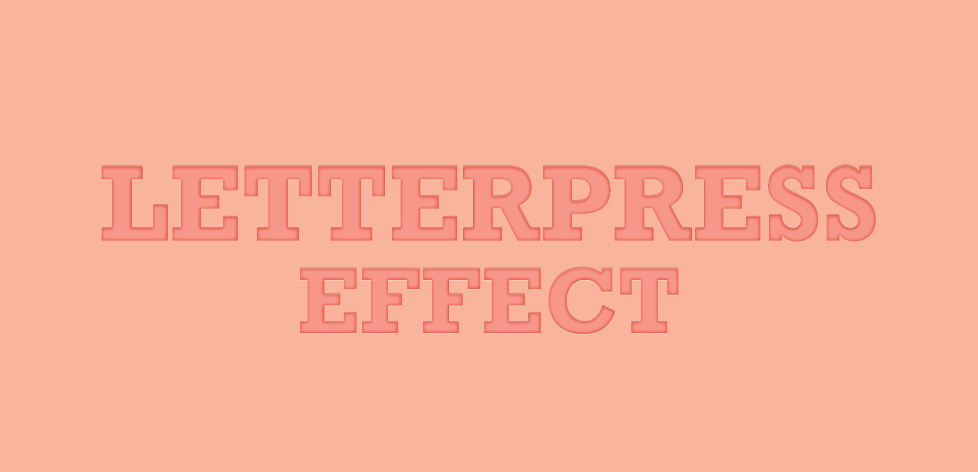
Last week, we created a realistic foil stamp effect using only illustrator and a seamless foil texture. This week, we’re borrowing some of the same tips, but simplifying. If you don’t have a texture on hand, but still want to add an element of cool, a letterpress effect is a great option. The letterpress effect simulates the impression a polymer plate makes on paper when it’s pressed into it. Letterpress has become increasingly popular over the last 5 years, but fun fact: letterpressing was never meant to be a final print effect. Letterpressing first began as a ‘test’ print before metal plates were developed which create stronger, deeper (and more expensive) impressions. In this week’s tutorial, adjust the settings for however strong of an impression you’d like as we create a letterpress effect entirely in Illustrator.

Hope your weeks are going well and if they aren’t, tomorrow’s Friday! I have a little survey favor to ask if you can spare (literally) 10 seconds today (please don’t cringe!). Every week, I try to think of things I wish I would have known when I was first getting started or while I was fully established in my career. I want to make this site as helpful as possible for anyone feeling unsure, intimidated or just wanting to learn a little more about being in the field or designing new work. I’m playing around with the idea of creating a full course on a design topic so things can go a little deeper than a 15 minute vid. Obviously this would be a big time commitment, so I’d like to make sure I spend that time on a topic that will be the most useful to readers of this blog. So! My little survey is only one question (hence your 10 seconds) which you can answer by clicking the box of your choice below. Thanks so much in advance! Have a great rest of your week with the extra karma I’m sending your way 😉

GDPR Icon

Your Privacy Matters

We use cookies to customize and create content that’s most important to you. We’ll never share the info we collect.

View Privacy Policy