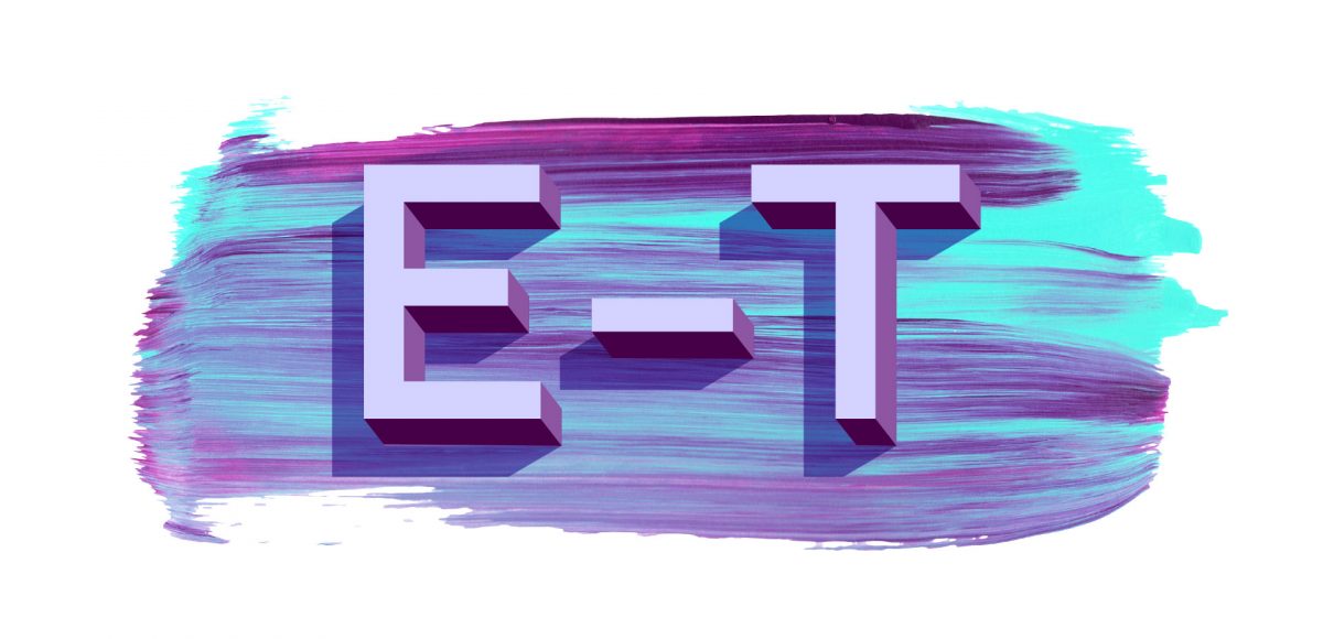
HomePosts Tagged "letter"

letter Tag

It’s Tuesday! Time for another tutorial 😉

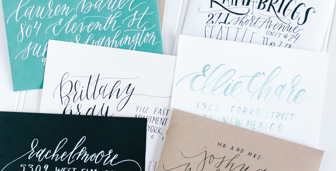
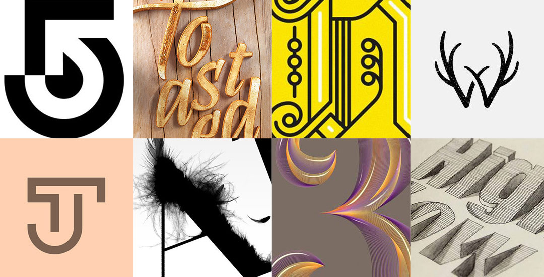
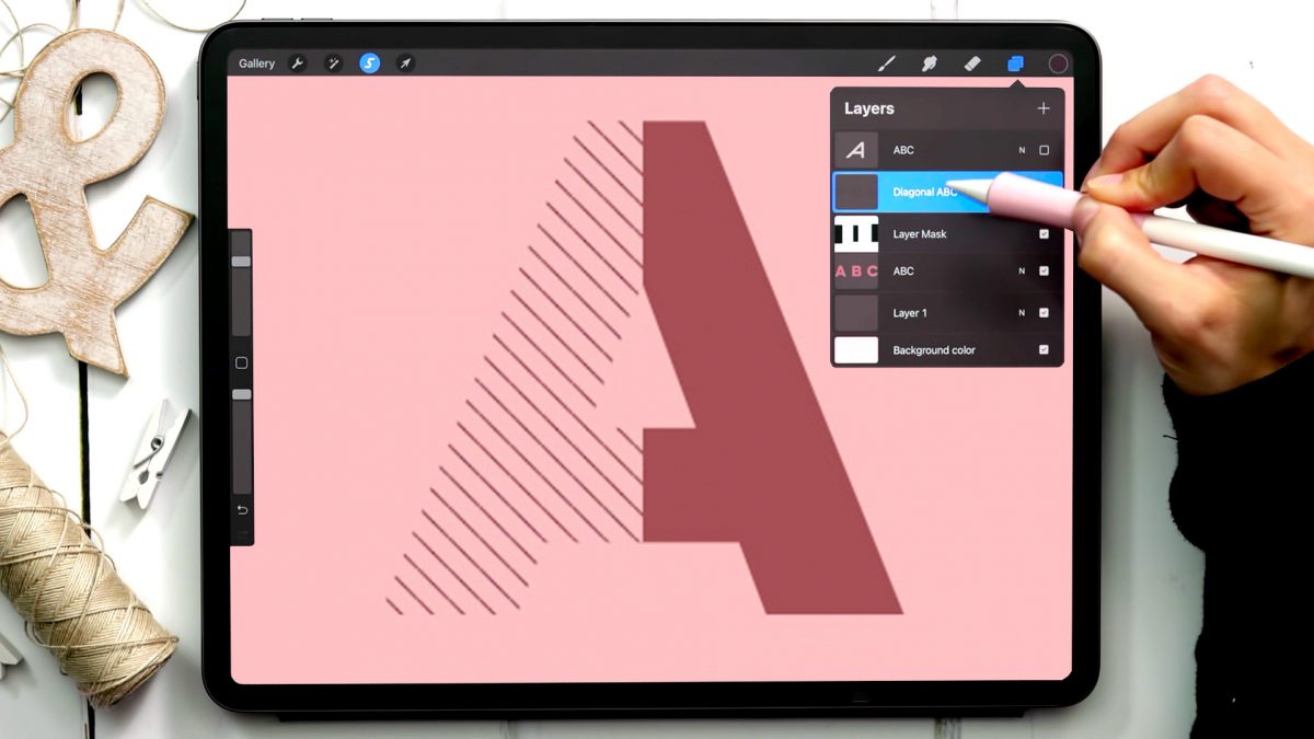
A few years ago, I shared how to create a pattern letter effect using Adobe Illustrator and I randomly came across that tutorial and wanted to give it a try in Procreate, too. With a few masking tricks and a custom diagonal line pattern brush, pattern letters in Procreate were born! This tutorial is one of my most advanced ones to date, so if you haven’t taken my free Procreate 5X for Beginners course yet, you’ll want to watch the masking module in that first. Once you understand the steps, though, this is a super fun effect you can apply to your typography or even abstract shapes for some really unique outcomes!

One of my favorite typography books is Shadow Type by Steven Heller + Louise Fili. I’ve broken the hardcover spine with all of the times I’ve paged through, sticky noted the tops of others and left it flat open, absorbing as much as possible. What’s most impressive is the consistency and creativity with all of that 3D type, perfectly executed by hand. I’m constantly reminded of how lucky we are to have a program like Adobe Illustrator, making things in seconds that once took hours. One shadow type project I’ve been working to perfect is dimensional signage typography. I love how the typography looks 3D and oftentimes has a long shadow, extending in the opposite direction. In this week’s tutorial, I’m sharing my method of creating that signage typography look using Illustrator!

While browsing pinterest last week, I came across this ‘A’ and I knew I had to recreate it digitally. I loved the way the shadows ‘stair stepped’ the different sides, and how those shadows made the letter feel raised. I also liked the fact that I could integrate a bunch of colors without it seeming too busy, and that I could put my own spin on it with some glitter textures. In this week’s tutorial, I’m sharing my process for creating this layered letter effect, using both Illustrator and Photoshop. You can stay in Illustrator the entire way if you’d like, but I discuss my reasons for hopping into Photoshop to finish things off. Read on to see it all!

Jamie got in touch with me a few weeks ago, asking how to recreate the letters in this image. I loved that idea, though I had a bit of trouble tracking down the original source. I also wasn’t totally sure what to call this look, so we’re going with ‘pattern letters’ 😉

Essentially, we have letters with a multiply blend mode (so you end up with three colors including the overlap), plus a pattern element integrated into one of the strokes of the letter. This creates a semi-dimensional look, plus a beautifully colored one – perfect for modern headlines (or even logos!). Read on to create your own!

I’ve had a few requests on how to replicate the look of the incredible artwork by Eiko Ojala and I’m so excited to share my interpretation of it this week. This week’s tutorial is a little more advanced, but I have tutorials for every part I speed through and I’ve linked to all of them under the video if you’d like a more thorough explanation. This technique can be used for so many cool applications – logos, greeting cards, branding, web graphics, etc. We’ll start out in Illustrator creating our organic shapes and finish everything up in Photoshop, adding in shadows and textures to complete the layered letter look. See how it all comes together below!

With the release of my new class, Bounce Letters: Adding Character to your Hand Lettering this week, I thought it was only right to share a little bit of bounce lettering inspiration! I love how the bounce effect can really be used with any kind of lettering style. From quotes, to pantry labels, to plain old phrases, the addition of a bounce can give something plain or simple a pretty big personality. So grab a pen, paintbrush, marker, or crayon and put your new skills to work because you’re about to get hit with inspiration 😉 Click on any image below to be brought to its source!

My brand new Skillshare class, Bounce Letters: Adding Character to your Hand Lettering, is officially live! To celebrate its launch, today I wanted to share the trailer for the class, as well as a sneak peek of one of the class videos which you’d only see if you were enrolled. Below the video, I’ve also included links to everything you saw mentioned in the sneak peek if your current lettering supplies could use a few more friends 😉

If you’ve taken Waterbrush Lettering Essentials, this is the perfect follow up class to take your own personal lettering style that much further. In the class, we talk about how bounce is influenced on letter direction, how much exaggeration is *just* enough, the best places to add bounce and not add bounce, as well as some practice words to get you started. Have a peek below for everything covered in the class!

If you’ve been an Every-Tuesday visitor, you know there are a lot of typography loving posts here, like Typins (typography pins) and Text Drive (a purchased version and a free version of a similar font style), but I’ve had yet to create a post series about current fonts that I’m crushing on or putting on my ‘gotta buy it!’ list.

Checking out new and old fonts and lettering styles is something I spend time every week doing, so starting today, Font Crush is going to be a new post series where I share some of my favorites I’ve recently come across. If you’re a self professed letter lover like me, I hope you’ll be just as inspired with this new series. So! Without further ado, here’s Font Crush #1!

With holiday “thank you” card writing winding down and Valentine’s Day right around the corner, I’ve been making a ton of trips to the stationery aisle at Target, bouncing back and forth between Valentine’s card ideas for my friends. Last year, it was a batch of homemade cards with funny pick-up lines handwritten on them; the year before that, individually selected cards from Paper Source; and the year before that, I actually gave out Valentine’s (yes, like the ones you’d find in a 3rd grade classroom). This year, with so many of my friends living out of town now (and, therefore, cards needing to be mailed), I thought 2016 would be the perfect opportunity to try my hand at envelope calligraphy!

Welcome to Part 2 of how to create 3D typography from scratch! In this final video, we take everything we created in Part 1 using Illustrator and bring it into Photoshop. Using Photoshop, we’ll add custom shadows and texturize those shadows to add extra visual interest and dimension. At the end of this video, you’ll have your own custom, print ready 3D typography you can use for social media profiles, posters, prints and monogrammed stationery. Let’s get started!

Happy Tuesday! First of all, I have to tell you that I’ve been completely overwhelmed by all of the kind comments from last Friday’s post. My heart is bursting with gratitude. Thank you so very much for making this past weekend one I’ll never forget!

My co-workers gifted Spencer and I this amazing typography book as a going away gift last week and I have a serious problem with putting it down! There’s something that completely pulls you in when you lay eyes on the shadow type in the book – each layer so carefully planned, highlights and shadows in perfect contrast with one another along each angle and curve. Handmade type back in the day was so killer. I’m jealous of those craftsmen and craftswomen type masterminds. Of course, I couldn’t help myself with creating my own, digital form, inspired by pages from the book. In this week’s tutorial, we’ll create our own multi-layered 3D typography from scratch in Illustrator. In part 2 next week, we’ll bring that typography into Photoshop to add texture and enhance highlights + shadows to complete our type. Let’s gets started!

Welcome to Typins #4! This post is where I share my recent favorite typography pins from pinterest. I’m obsessed with (and if you’re here, I’m sure you are too!) and have boards for general typography (phrases, quotes, full words) written beautifully, just letters and just numbers. I pull from those boards for these posts, so there’s even more over there if you’re craving a bigger type fix 🙂  Here are 8 of my current favorite pins to get your type on!

GDPR Icon

Your Privacy Matters

We use cookies to customize and create content that’s most important to you. We’ll never share the info we collect.

View Privacy Policy