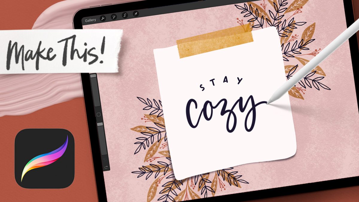
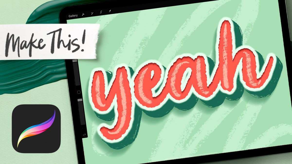
HomePosts Tagged "shadow"

shadow Tag

3D lettering is definitely up there with my favorite things to make in Procreate. I tried out a new dry media brush set this week from Envato Elements, and once I tried some 3D lettering experiments with the brushes, I was hooked. The texture is so beautifully varied that the ideas just started to flow once I started to play. For this week’s tutorial, I’m sharing one of my favorite results! 

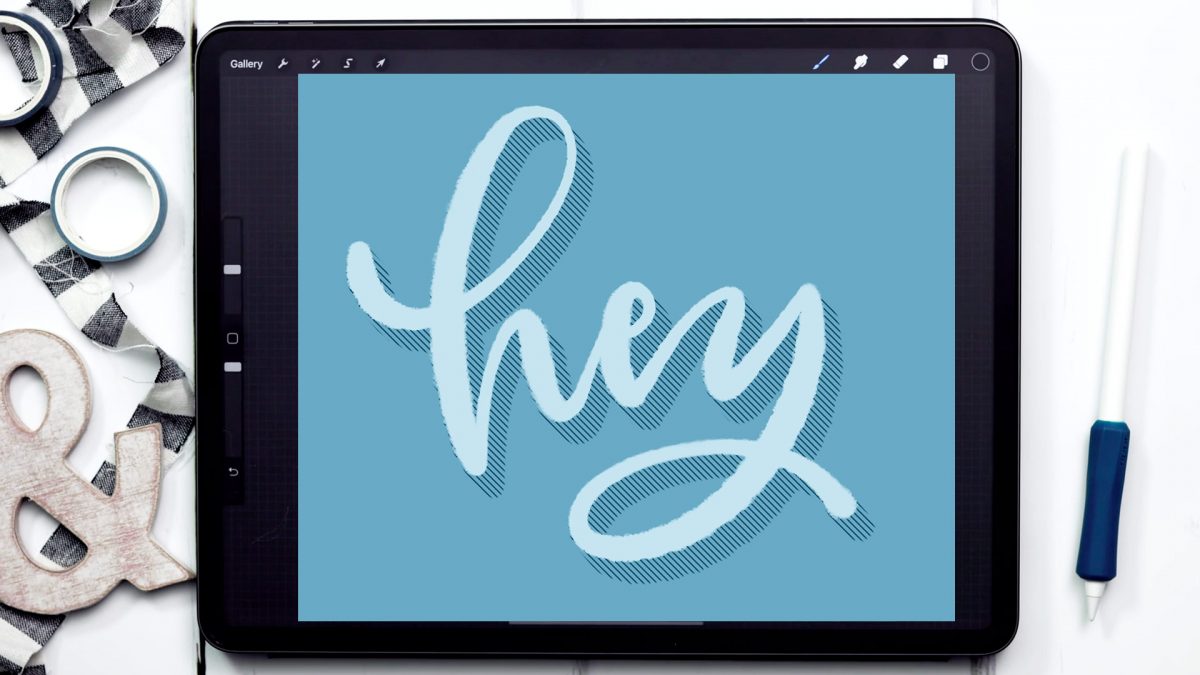
We’ll be adding more complex details to the lettering like an outer stroke, inner shadow, and cast shadow, so if you need to slow me down at all, hit the gear icon in the bottom right of YouTube’s player + adjust the playback speed 😉

I think it’s pretty clear that I love cute polaroids + post-its and how easy it is to to make them lift from the screen 🤩After making my free washi tape stamps, I couldn’t stop myself from drawing more! This week, I’m bringing you a fall themed post-it that uses all free brushes – two of my own and one in Procreate’s default library. It’s the perfect element to display all of your sweet fall messages whether you use hand lettering or typeable text.

While I love creating and sharing project tutorials each week, I also want to start adding in some quick tip tutorials, too. These will be fun little tool tips or extras you can easily add into your own work. This week is one of those extras – a 3D hatched shadow effect! You can add this to lettering, typeable text or even shapes and it takes less than 5 minutes to do.

A while back, I created this tutorial where I shared 10 lettering enhancements anyone can do. The responses to the video have been amazing, so this week I wanted to take things a step further with a lettering shadows version! Adding shadows to lettering can really takes things to the next pop-off-the-page level. The best part is they are super simple to implement! Today I’m sharing 10 lettering shadows anyone can do – I even included a free download with them all listed out below 😉 Read on to see the full video!

Last year, I bought myself a big pack of Coliro Colors FineTec metallic watercolors for my birthday. I had experimented with their gold collection earlier and couldn’t wait to have more colors to play with. The rest of the year, I obsessed with using them on new lettering pieces, custom greeting cards for friends and family – anything I could think of. The way they glimmer in the sunlight is so beautiful, I was constantly looking for ways to create other shiny outcomes 🙂 I broke them out again the other day and realized I never shared my blending methods in a tutorial, so it was time for that to change! These watercolors get thick + dry pretty fast, so blending can be a little more complicated than traditional watercolors. In this week’s tutorial, I walk you through 3 blending effects using metallic watercolors with all of my favorite, long-tested tricks 😉 Read below for them all!

A few months ago, I shared how to create a similar effect as this in Photoshop, and I was asked how to also do it in Procreate, so here we are! This week, I’m sharing how to create shadow depth typography using Procreate on an iPad. At first glance, you may think this is just a simple drop shadow, but this drop shadow is much larger and darker than what you can get by implementing it traditionally. It also fully connects to the word it’s attached to, while also extending further than you can get by just sliding a copy of your lettering and blurring it. I also share how to group layers, so you can move more than one item at a time, but still edit layers independently of one another. I promise it’s worth the 5 minutes this week! Read on to see it all 😉

One of my favorite typography books is Shadow Type by Steven Heller + Louise Fili. I’ve broken the hardcover spine with all of the times I’ve paged through, sticky noted the tops of others and left it flat open, absorbing as much as possible. What’s most impressive is the consistency and creativity with all of that 3D type, perfectly executed by hand. I’m constantly reminded of how lucky we are to have a program like Adobe Illustrator, making things in seconds that once took hours. One shadow type project I’ve been working to perfect is dimensional signage typography. I love how the typography looks 3D and oftentimes has a long shadow, extending in the opposite direction. In this week’s tutorial, I’m sharing my method of creating that signage typography look using Illustrator!

A few weeks ago, I shared how to create this effect using an iPad with Procreate. This week, I wanted to share how easy it is to create typographic floating shadows in Adobe Illustrator, too! The method I use utilizes the blend tool and pathfinder palette and a few simple steps. This effect is perfect for headlines, special art projects or even signage. Read on to see it in action!

Happy Tuesday! It’s been a little while since we made some iPad lettering, so this week we’re creating floating shadows in Procreate. I’ve seen this effect referred to as ‘off shade’ before, but I’ve always thought of them as floating shadows. Essentially, it’s a drop shadow that’s disconnected, or there’s a space between your lettering and the shadow itself. I love how simple this effect is, but also how it adds that cool factor/semi 3D look right away. See how to apply this exact effect to your lettering below!

I’ve only recently started incorporating Illustrator texture brushes into my work, and I regret not doing it sooner! Illustrator texture brushes offer so much hand made feel with such little effort, you almost feel like a magician 😉 To get started, all you need is any kind of vector texture like this set of inky brush strokes or these mini grit textures (both free!). From there, we convert them into Illustrator art brushes with specific settings and we’re done! This will be such a great addition to your regular workflow if you love including extra texture into your work. For the tutorial, we’ll create some inky and gritty typographic drop shadows in just a few quick minutes. Read on to see it all!

Happy Tuesday! This week’s tutorial comes courtesy of Brittany, who shared this photo with me, which I agreed would make a great quick tip tutorial! As a bonus, I’m sharing how to create multi-colored long shadow typography, in case you’d like to use more than one color for your shadows 🙂 We’ll create every version quickly in Illustrator using one simple tool and a couple of extra time saving options. This is perfect for gig posters, MTV-esque retro designs, greeting cards, or paired with simple icons. Read on to see it all!

GDPR Icon

Your Privacy Matters

We use cookies to customize and create content that’s most important to you. We’ll never share the info we collect.

View Privacy Policy