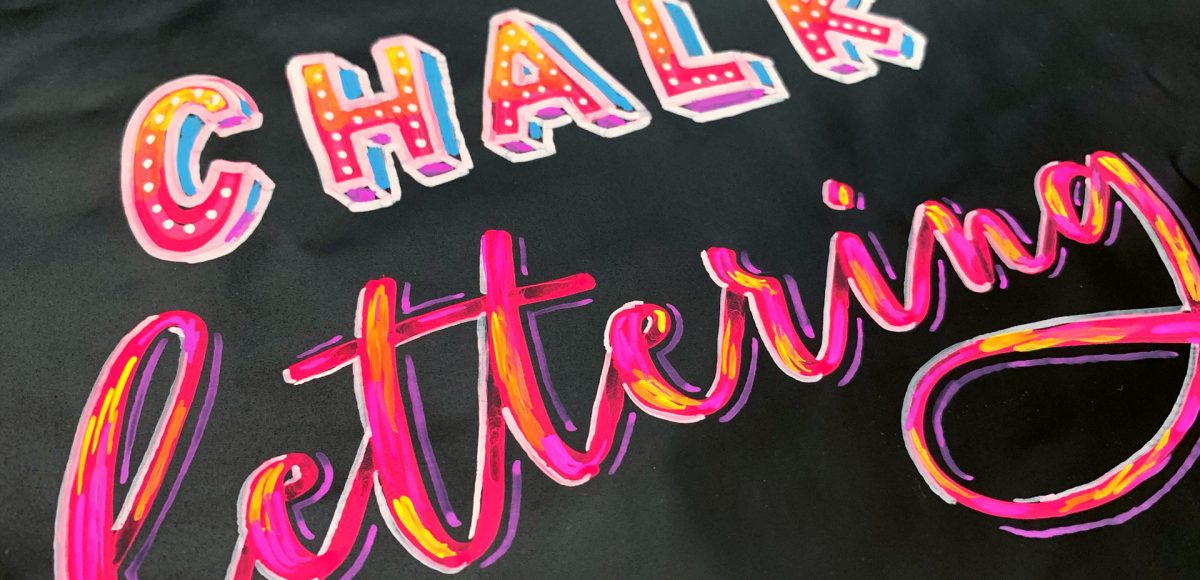
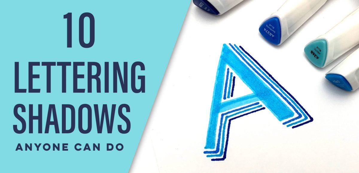
HomePosts Tagged "tips"

tips Tag

A while back, I created this tutorial where I shared 10 lettering enhancements anyone can do. The responses to the video have been amazing, so this week I wanted to take things a step further with a lettering shadows version! Adding shadows to lettering can really takes things to the next pop-off-the-page level. The best part is they are super simple to implement! Today I’m sharing 10 lettering shadows anyone can do – I even included a free download with them all listed out below šŸ˜‰ Read on to see the full video!

Chalk marker and traditional chalk lettering have been popular for a while now and they don’t seem to be letting up any time soon! While I love both, there’s soooo much less mess with chalk markers, so it makes them a little quicker and easier to experiment with. I had a thought the other week about using a wet paintbrush with my chalk markers to simulate depth. That idea ran into creating a paint streak effect, which led me to experimenting with fine line highlights and shadows. As I came out of that rabbit hole, I was so excited all of my experiments actually came out the way I had hoped, or better! This week, I’m sharing exactly what I did (including other effects), so read on for 10 chalk marker effects anyone can do!

Many of you likely know I teach a comprehensive course on creating and selling hand lettered fonts (check it out here!). The course reopens next week for the last time this year, so if you plan to get started, I thought some lettering supply recommendations were in order!

There are 2 ways you can create your initial lettering for converting into a font: digitally or analog. If you choose the digital route, I recommend using Procreate on an iPad with pressure sensitivity since there are amazing brush options for different looks. This post is all about the analog, though – as much as I love the iPad, there’s still something about lettering supplies on paper (not to mention the much lower price point!). Read on for my favorite lettering supplies for font making, analog-style šŸ˜‰

This week, we’re returning to one of my favorite topics: watercolor textures! Ever since I received these brush pens in the mail, I have been swooning over all of the cool textures I’m able to create – and quickly, too! These are the most vibrant watercolor-simulated outcomes I’ve been able to achieve with brush pens, which makes the creation process that much more fun. Use these as backgrounds for your lettering, or even scan them in and make a digital texture or repeat pattern out of them! Read on to see 3 different watercolor texture tricks using brush pens below.

A couple weeks ago, I shared 3 tricks for creating unique grit textures. This week, I’m sharing how to create a gritty photoshop texture brush using a texture we created! This texture brush can be used for borders, backgrounds, illustrations and more (tutorial on those coming soon!). In the video, I share my scan settings and how I edit the texture before ever creating a brush with it. Once the texture is optimized, I share some of my favorite Photoshop texture brush settings. These are settings that you can easily implement into future texture brushes, too. This tutorial is perfect for beginners, so if you’re just getting started with Photoshop, be sure to read on to see it all!

Grit textures are one of the quickest ways to add a handmade feel to digital art. By adding a little texture to edges, borders, blocks of color or even shadows, simulated depth and an organic feel are created. What’s even better is that it only takes a little effort to create and apply them. In this week’s tutorial, I’m sharing 3 of my favorite simple tricks for creating unique grit textures. In the coming weeks, I’ll also be sharing how to digitize and apply them to artwork. Let’s kick this off by breaking out some ink and experimenting!

Last fall, I shared a video on 3 simple tricks for unique watercolor textures. To my surprise, it quickly became my most viewed video of all time (almost 1 million views as I type this!). Since integrating textures into my work is one of my favorite parts of design, I wanted to share another quick tip texture video. This week, we’ll be going over 3 simple tricks for unique acrylic textures. I first started creating acrylic textures when I made this paint streak typography tutorialĀ (over 2 years ago!). After that, I posted this video on Instagram of another method, and most recently this one. Ā I love that I can keep things traditional if I’d like, but also that I can create digital work from these textures that still feels authentic, hand made and special šŸ™‚ So, let’s get these going!

We have ALL been there. Days, weeks, or projects where there’s just nothing to grip onto upstairs. You scour the internet for inspiration, create mind maps and doodle out ideas, but find them all predictable; maybe even a little clichĆ©. You start to question if creativity will ever locate youĀ again, or worse – whether you ever had it to begin with. Oh, and this helplessĀ feeling of creative blockĀ always happens at *the* worst possible time. Because itĀ just wouldn’t make sense otherwise. Obviously.

So what can you do? Read on for 5 tips Spence and I have relied on throughout our creative careers to lift ourselvesĀ out of that inevitable rut.

Happy Tuesday! I know we’ve been a little Illustrator crazy over here, but it’s hard not to love a program that has so many rescalable benefits! However! I definitely have not forgotten about Photoshop, so today I’ve got a video that I think will really help with yourĀ black and white photo enhancements. I’ve got two options for you this week: enhancing existing black and white photos, and best practices for converting a color photo into a black and white one. There are a few *really* simple steps you can take to bring them more to life, and this tutorial is perfect for beginners! Read on to get started with your own!

2016 was a really intense work year for both Spence and I. I sat in front of my computer more than I didn’t, but it led to a lot of self growth which I’m immensely thankful for. While I hope (and plan!) toĀ pull myself away from my desk more this year, I wanted to share the ways I hit my design + lettering goals in 2016 and steps I’ll take in 2017. I hope this can be a motivator if you’re just digging into lettering or graphic design, but you aren’t quite sure where to begin.

Happy December! Now that the holiday season is in full swing, I wanted to offer up a fun hand lettering technique for your (any timeĀ of the year) stationery, too! This ombre embossing effect is SO eye catching *and* I have a technique that avoids mixing your embossing powders together. Using this technique, you’re able to maximize the life of your powder purchases and create beautiful outcomes, too. Plus, look at the colors on black! I love the vibrancy and contrast embossing straight onto black produces. Swoon. Read on to see it all!

GDPR Icon

Your Privacy Matters

We use cookies to customize and create content thatā€™s most important to you. Weā€™ll never share the info we collect.

View Privacy Policy