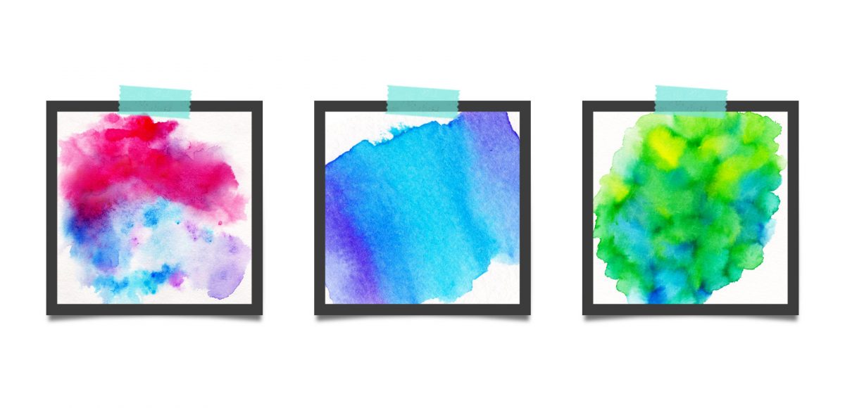
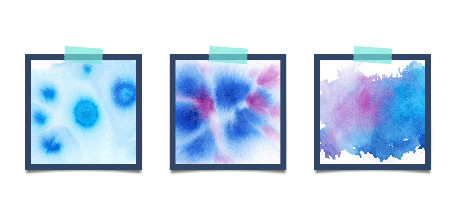
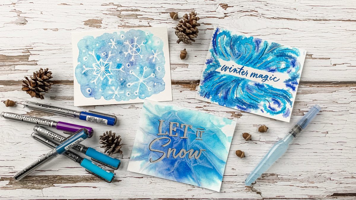
HomePosts Tagged "tricks"

tricks Tag

When I received these Karin markers a few weeks ago, I obsessively played with them for days on end. Unlike other watercolor markers I’ve tried, these ones were packed with pigment, so easy to use and blended like a dream with water. The more I experimented, the more I was drawn to all the incredible textures you can achieve with them! In this week’s tutorial, I’m sharing 3 winter watercolor texture tricks you can use for cards + holiday artwork! Read on for the full tutorial + supply list!

This week, we’re returning to one of my favorite topics: watercolor textures! Ever since I received these brush pens in the mail, I have been swooning over all of the cool textures I’m able to create – and quickly, too! These are the most vibrant watercolor-simulated outcomes I’ve been able to achieve with brush pens, which makes the creation process that much more fun. Use these as backgrounds for your lettering, or even scan them in and make a digital texture or repeat pattern out of them! Read on to see 3 different watercolor texture tricks using brush pens below.

A couple weeks ago, I shared 3 tricks for creating unique grit textures. This week, I’m sharing how to create a gritty photoshop texture brush using a texture we created! This texture brush can be used for borders, backgrounds, illustrations and more (tutorial on those coming soon!). In the video, I share my scan settings and how I edit the texture before ever creating a brush with it. Once the texture is optimized, I share some of my favorite Photoshop texture brush settings. These are settings that you can easily implement into future texture brushes, too. This tutorial is perfect for beginners, so if you’re just getting started with Photoshop, be sure to read on to see it all!

Grit textures are one of the quickest ways to add a handmade feel to digital art. By adding a little texture to edges, borders, blocks of color or even shadows, simulated depth and an organic feel are created. What’s even better is that it only takes a little effort to create and apply them. In this week’s tutorial, I’m sharing 3 of my favorite simple tricks for creating unique grit textures. In the coming weeks, I’ll also be sharing how to digitize and apply them to artwork. Let’s kick this off by breaking out some ink and experimenting!

Last fall, I shared a video on 3 simple tricks for unique watercolor textures. To my surprise, it quickly became my most viewed video of all time (almost 1 million views as I type this!). Since integrating textures into my work is one of my favorite parts of design, I wanted to share another quick tip texture video. This week, we’ll be going over 3 simple tricks for unique acrylic textures. I first started creating acrylic textures when I made this paint streak typography tutorial (over 2 years ago!). After that, I posted this video on Instagram of another method, and most recently this one.  I love that I can keep things traditional if I’d like, but also that I can create digital work from these textures that still feels authentic, hand made and special 🙂 So, let’s get these going!

I created something similar to this watercolor fireworks trick last year and I couldn’t stop thinking about it this year. It’s soooo easy, quick and really fun to create. In celebration of Independence Day here in the US (and the fact it lands on a Tuesday this year), today we’re going to create watercolor fireworks together 🙂 Grab your favorite watercolors, a waterbrush, a straw and let’s go!

If you’ve been here for any length of time, then you know I  have a slight obsession with watercolor. Part of it is mixing beautiful color combinations together, and another is creating abstract and unique textures. Creating unique textures allows you to then use them in designs, producing an outcome no other person is capable of replicating – ever. And that makes everything even more special. As you might imagine, I’ve spent many hours experimenting with watercolors and this week I want to let you in on 3 simple tricks to create unique watercolor textures of your own. It doesn’t matter which kind of watercolors you have on hand, either – these tricks will work with em all 😉

Happy Tuesday! I’m so excited I get to bring my newest online class to you this week, Mastering Mockups! In the class, we take original artwork, apply a little photoshop trickery, and put that artwork on products which look convincingly real. This is the perfect sales tool if you’re a seller on Etsy and need better product photography, if you’re a freelancer who wants to impress and convince your client to approve the artwork you created for them, or if you’d like to level up your design portfolio making fictitious projects come to life. You can also use the class’s techniques to create social media posts, blog images, digital product sales pages and more. Your enrollment in the class gets you all 4 base photos used in the class for free. With those photos, you’ll be able to follow along, completing every step as we go 😉

Keeping with tradition, I’m sharing the class trailer today, along with a bonus lesson from the class. In this lesson, we’ll create a single use, social media mockup. Are you ready to mock?! Everything below!

One of my favorite time saving tools when using Photoshop is Photoshop actions. I have used these for batch photo and file delivery to clients in a professional setting, and batch editing when putting together photos for family. Whenever you need to apply (the same) multiple settings to many files or photos at once, you create an action, then just run it for all of the others and you’re done in no time 🙂 It’s basically the closest thing to magic I’ve seen Photoshop do. In this week’s tutorial, we take 3 photos (this one, this one, and this one) and create a unique action for them that sets all of their widths to 1000px and also applies a sepia tone effect to the photos. We apply everything we need to one photo, then hit a single button to apply the same exact multiple steps to the others. It’s cool. You should definitely check out the video below to see!

Welcome to Photoshop month! Because Photoshop plays such a large role in taking my designs further, this month I’m sharing some of the tools and tricks I use all the time in Photoshop. This month is specifically in celebration of my new Intro to Photoshop class with Brit + Co which launches tomorrow (today’s the last day to sign up and get 15% off using this link!). In the class, we create this outcome, which uses watercolor textures and lettering, so today I wanted to share some quick tips on adjusting watercolor textures for your specific needs.

I’ve been asked quite a bit lately how to change any watercolor texture to a specific color, so I think this tutorial was meant to be! Say you want to incorporate a custom watercolor texture into your branding – you love the texture, but it’s not the right color for your brand. Or, you just want it to be something else. In this week’s video, I walk you through three methods using Photoshop: changing all of the colors within the watercolor to something different, changing the entire watercolor into one specific color (which is great for branding), and changing just a portion of the watercolor to a different, specific color. All the tips in the video below!

This week’s tutorial comes courtesy of Kori, who requested an overview of the Illustrator Pathfinder Palette and I thought it was a great idea! The pathfinder palette is a ridiculous time saver when it comes to creating custom lettering, flourish designs, and vector-based Illustrations just to name a few. In this week’s video, we go over my favorite and most used pathfinder options. We’ll also go through a brief overview of the other options for you to get started. As a bonus, I’ve created a couple of Illustrator pathfinder palette cheat sheets (pdfs), so you have them handy whenever you may need them in the future. Download link to the cheat sheets and full overview video all below!

A couple of weeks ago, I shared some tips for using a waterbrush to create watercolor lettering. It was so well received, I wanted to do a follow up using that same waterbrush, but with ink this time. Yep, I filled that blue waterchamber with super black speedball ink instead of water, squeezed + lettered to my heart’s content 🙂 Before filling the waterbrush with ink, I had been using a Tombow for my brush script lettering, but after burning through a few pretty quickly, I was in search for an alternative to save a little dough. That led me to the waterbrush and I haven’t looked back! In this week’s video, I share some basic tips for getting started with your own brush script lettering. Lettering in black vs. watercolor will quickly allow you to scan your artwork in, vectorize it and use it in a bunch of applications quickly, like masking or font making (more on that next month!). Let’s get started!

GDPR Icon

Your Privacy Matters

We use cookies to customize and create content that’s most important to you. We’ll never share the info we collect.

View Privacy Policy