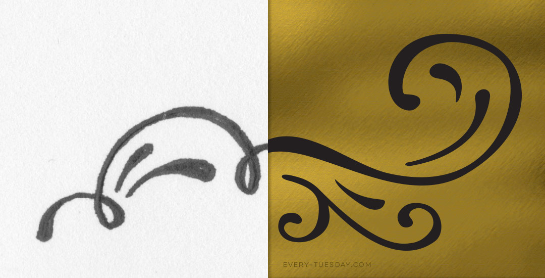
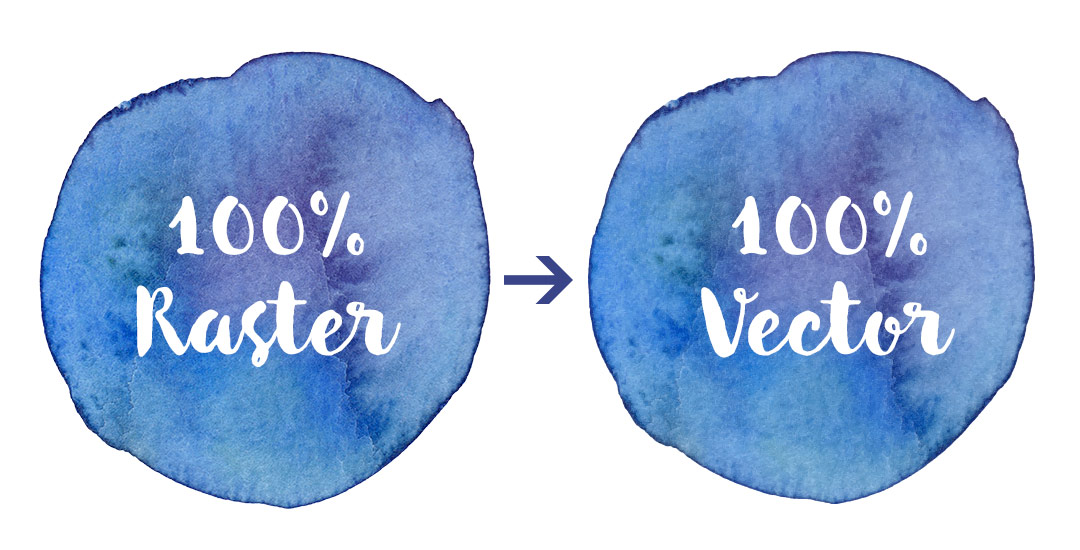
HomePosts Tagged "tut"

tut Tag

There’s something that feels soooo good about crossing off items on a to do list. Having a written list keeps me on track every day of the week. Most times, I grab a scrap sheet of paper and bullet my to-do’s out, but it’s never quite as satisfying as when they’re written on a custom design. In this week’s video tutorial, we’ll create our own designed to do list from scratch, perfectly prepared for printing in a few quick and easy steps, so you can start crossing items off to your heart’s desire 😉 All of the steps below!

Happy Tuesday! This week’s tutorial is brought to you by Whitney + Monica who both emailed asking how to vectorize hand drawn doodles so they would have reuseable, and infinitely rescalable vectors. You’ve probably seen vector artwork around a lot lately – I just released a pack of vectors a few weeks ago and gave 5 of them away for free. In this tutorial, using that vector pack as an example, I share how I took those hand drawn elements from a doodle on a sheet of copy paper to a crisp vector that can be used over and over again on any application. Do you remember the how to vectorize hand lettering tutorial? If you’ve practiced that at all, you’ll be in great shape with converting doodles 🙂 In this video, we’ll go over 3 different methods of cleaning up your doodles, so whether you’re a beginner or advanced Illustrator user, there’s an option that will work for you. Let’s get started!

If you took my Watercolor Branding Skillshare class, you learned how to digitize watercolor textures – from scanning them in, to color adjustments, to removing the background correctly so they could be placed on anything. When a watercolor texture is scanned in, you’re limited by the greatest size and resolution your scanner is able to scan at. For large applications (think billboards, signage, posters), if a professional scanner wasn’t used, resolution is likely too small for the texture to reproduce as crisply as you might wish. Enter vectorized textures. Since vectors (which are point based instead of pixel based) can be rescaled infinitely without losing quality, they make a great alternative to finding a high res scanner and going through the process of color editing + removing the background again. Watercolor textures are super detailed, so finding a happy medium with file size and a similar outcome to the raster (pixel) based image is key when vectorizing. In this tutorial, I share my exact method on how to vectorize watercolor textures using two different textures. We’ll go over what to look for when you vectorize your own.

A few weeks ago, Kori emailed me asking how to create an editable pdf file. If you’ve ever browsed the template files on Etsy, chances are you’ve come across files for sale that come as editable pdfs. This is cool because you can offer a design file to someone who doesn’t have the programs and they can still work with and edit them to some degree. This is also useful to know if you ever need to send a client any kind of form you’d like them to fill out and send back – same rules apply – which eliminates unnecessary printing steps for the client. In this tutorial, I’ll share how easy it really is to create your own editable pdf. We’ll take a design created in Illustrator and transform it into that editable pdf using Adobe Acrobat. If you don’t have Acrobat (it’s the professional version of Adobe Reader) you can try it out for free for 30 days here. Let’s get started!

Happy Tuesday! This week’s tutorial comes courtesy of Kamron’s request on how to replicate a line gradient typography effect, like this one. While you could create this effect in a similar way as this retro type effect tutorial in Photoshop, the blend tool in Illustrator performs the effect quicker (in my opinion), AND you end up with vectors that can scale infinitely without losing resolution. Win, win 🙂 This is one of the quicker type effects we’ve created, making it the perfect solution when you need a nice type effect in a pinch!

I came across Pawel Norbert‘s paint streak typography a while back and completely fell in love with it. There’s so much color, so much energy, so much personality displayed in just a single letter. With the addition of the Mega Paint Streak asset pack I created a few weeks back, Pawel’s work came rushing back to mind, as it paired similar textures with my most favorite element of design: typography. In this week’s tutorial, I share how I would create a similar type of paint streak typography using Photoshop. Once created, we’ll add shadows + highlights to finish it off with some extra dimension. You’ll be able to use the artwork you create to either gift, sell as a customized art print, wallpaper your desktop, or keep it for yourself + display it on your own wall! Not too shabby for ~15 minutes! Let’s get started!

It’s that time of the year when there are a bunch of events to celebrate: graduations, weddings and anniversaries from weddings before. Confetti is obviously a must have, real and digital. 🙂 That’s why we’re creating our own digital custom confetti brush in Photoshop in this week’s video tutorial! We’ll create the shape of our confetti, adjust color at the slide of a knob, and even control how much it scatters in a few quick and easy steps. Prepare to start confetti-tizing all of your digital celebration themed work from here on out 🙂 Let’s get started!

Welcome to the third and last video in the video series, ‘How to Create a WordPress Website from Start to Finish‘! In this week’s final video, we’ll start by briefly walking through WordPress’s interface to get familiar with where everything is for editing purposes. Next, with the help of our friends at seoai.co.uk, we’ll find, install and activate plugins to improve our theme’s SEO, limit spam, offer downloadable content, and provide related posts at the end of every post to keep your readers engaged within your site. We’ll also walk through where to find your theme’s documentation to customize your specific theme even further. By the end of the tutorial, you’ll be up and running and feel confident knowing the little details in the background will be working for you with each new post you create. Let’s get started!

The other week on every-tuesday’s facebook page, Valarie asked how to replicate the texture seen on this ice cream cone. This week, I’m here to deliver the answer! In this tutorial, we’ll create our own halftone texture, then apply it to a similar ice cream cone to replicate the same effect. As a bonus, I’m including the ice cream cone used in the tutorial as a psd file for free so you can follow along exactly if you’d like. Click read more for the download and to see how it’s all done!

GDPR Icon

Your Privacy Matters

We use cookies to customize and create content that’s most important to you. We’ll never share the info we collect.

View Privacy Policy