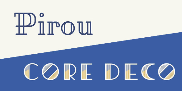
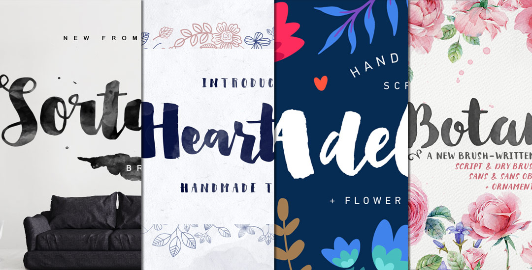
HomePosts Tagged "typeface"

typeface Tag

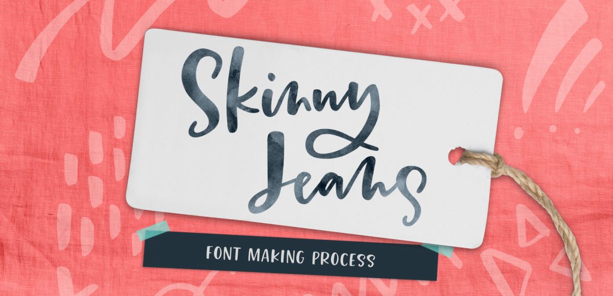
In my course, Learn Font Making, I take you through all the steps to prepare your lettering for font making, convert it into a working, professional font and I share my best tips for selling your font, too. I’m often asked by students is if I think the market is too saturated for new font makers. Although converting your lettering into a sellable font *is* a process, the fact the font making market is booming right now should not hold you back from starting; it should actually do the opposite. In this week’s video, I share my perspective about the saturation of the font market. I also share tips to stand apart from the crowd to get your fonts noticed by those buyers. Read on for it all!

My newest font, Skinny Jeans, just went live this week! I’ve been making a point to share process info for the fonts I make (here’s Espresso Roast), so that’s what this week is all about 🙂 Skinny Jeans is a font trio that includes the main script style, a caps style that pairs perfectly and a symbols font to add extra personality to layouts. The hand drawn + illustrated symbols also come as a vector file to make things quicker for those who work in Illustrator. This font is by far the most in depth of all I’ve created; it contains 30+ ligatures, alternates and extra features. In the video below, you’ll see what raw materials I used to initially hand letter the font, then the steps I took to make it a fully functioning font. Read on to see everything!

In my online course, Lettering Layouts, we talk about how to pair different styles of lettering and creates beautiful, impactful messages with them. Sometimes it can be tough just coming up with some different lettering ideas, though! To make things a little easier, this week I’m sharing 10 super easy hand lettering enhancements anyone can do. We’ll slowly increase in complexity as we go along, but you’ll see quickly how easy they are to apply. I’ve also included a free pdf of everything we covered below 😉 All you need is a pen and/or pencil and some paper, so let’s get lettering!

Ever dreamed of creating your own hand lettered font? Actually typing with *your* letterforms? I promise there are fewer better feelings when it comes to loving lettering than that 😉 But where do you even begin? How do you create those initial letters so you can convert them into a font? While the topic of how to prepare your lettering for font making is covered extensively in my course, Learn Font Making, I wanted to share a bit of my process in this week’s tutorial. In this video, we’ll talk about how to prepare lettering traditionally (writing utensil + paper) so you get all the characters you need for your font. If you’d prefer to prepare lettering on an iPad instead, that’s covered specifically inside the course. For now, read on for the traditional method!

Whether you’re creating font or lettering styles that go together as a family or creating beautiful layouts with clear hierarchy, pairing type is important. When two styles are too similar to each other, it can cause visual confusion at first glance: what part do you read first? What styles feel most harmonious with each other? What will make my layout look great and communicate well? With a few tips in mind, those decisions can be much easier to make. Read on for my 3 simple tips for pairing type!

Happy Thursday, friends! Earlier this week (on Tuesday, as fate would have it), my youtube channel hit 100,000 subscribers, so I wanted to make it extra special by celebrating with a free font!

I’ve been posting a new tutorial/video every single Tuesday for nearly three years now. Your support over that time – whether you are a new follower or have been along for the full ride, has meant more to me than I can possibly express. Each tutorial takes a minimum of 4-6 hours to complete. From concept, to figuring out the best possible process for it (*making it before teaching it* time), recording, editing, tagging, uploading, writing the accompanying blog post, creating images and announcing it on various social channels. It’s a labor of love I’m happy to continue each week because of all of you.

To celebrate properly, today I’m giving away my new font, Corner Bakery, which is all yours to pick up below 🙂

If you’ve been an Every-Tuesday visitor, you know there are a lot of typography loving posts here, like Typins (typography pins) and Text Drive (a purchased version and a free version of a similar font style), but I’ve had yet to create a post series about current fonts that I’m crushing on or putting on my ‘gotta buy it!’ list.

Checking out new and old fonts and lettering styles is something I spend time every week doing, so starting today, Font Crush is going to be a new post series where I share some of my favorites I’ve recently come across. If you’re a self professed letter lover like me, I hope you’ll be just as inspired with this new series. So! Without further ado, here’s Font Crush #1!

Oh my gosh, you guys. It’s finalllllly done! Today I’m happy to announce the debut of my first ever brush script font, Tuesday Script! I started this font in early December, following the same processes as the font project, but this time in script form, so there were a few adjustments to make sure all the letters flowed and connected properly together. Plus – this font comes with international supported characters so how those were made in the program was another learning experience 🙂 I took the leap and purchased the pro version of Glyphs (which is not so cheap, but I was able to get a discount by providing them with my itunes receipt from my Glyphs Mini purchase). I’m no expert yet, and when I figure some of the fancier features out, I may create a full class (is that something you’d want?), but for now, I’m celebrating the win of having the font complete and ready for you!

Spencer coded up another text editor, so you can try the full font out below. I’d love to hear what you think!

It’s time for another Text Drive post! (I can’t believe the last one was in June!) I mentioned a couple weeks ago about being gifted this amazing book on shadow typography and thought that would be a great topic for a text drive post. Shadow type is best used as a headline with simpler, supporting fonts for your main body copy. Because it has so much character, long sentences can become difficult to read, while short headlines make perfect use of each detail and call attention immediately to what’s being discussed. As with all text drive posts, below you’ll find two fonts in a similar genre (shadow type) – one for free (Nexa Rust) and one for a fee (Eveleth) – read on to see what I love about each one and which fonts I’d pair them with!

It’s time for another Text Drive post! To be honest, there’s nothing I love typing with more than a beautiful script. There’s something about the way all the letters connect so seamlessly, so beautifully, all at the same time. While brush scripts are definitely in the spotlight these days, there’s something to be said for more subtle, personality driven, simple scripts… Scripts that have *just* enough decoration where you scale them up or zoom out a bit and take them in. Bonus points when you’ve got a great quote to typeset 🙂 As with all text drive posts, here are two similar fonts, one for free (Daydreamer) and one for a fee (Mulberry Script) as well as a little summary of what I love about each and what fonts I’d pair them with!

I’ve started using Pirou lately as a headline on some Canva layouts I’ve created, and I’m really liking it! I typically pair it with a regular to medium weight sans serif to create some contrast since Pirou has so much character. Because Pirou is free, I was wondering what kind of buyable fonts were similar that might offer some nice extensions of this look. I discovered Core Deco the other day and I’m getting very tempted – especially because it’s 80% off right now, which means each variation is only $4. Though I wouldn’t completely consider Pirou deco, I really like the different vibes Core Deco gives off + it’s fun to play around with phrases in the type editor on myfonts. Here are a couple of previews with links if you’d like to check them both out a little more 🙂

Brush script style fonts have been gaining in popularity – from hand drawn versions to vector point-perfect variations. Brush script styles lend themselves to applications with character and personality, an artsy organic feel, or just an extra human touch. This versatility gives brush scripts a well deserved spot in any font library. Here are a few for free and for a fee to round out your brush script font collection.

GDPR Icon

Your Privacy Matters

We use cookies to customize and create content that’s most important to you. We’ll never share the info we collect.

View Privacy Policy