With the launch week of Brush Lettering with Watercolor coming to a close, I thought it would be fun to tie colorful letters into a quick tip design tutorial. And what better way to talk about type anatomy than getting colorful with it? 🙂 This is actually kind of perfect for hand letterers and graphic designers alike. For hand letterers, an intimate understanding of letterforms is essential, keeping qualities consistent for balanced, harmonious styles. For graphic designers, understanding style pairings and their character traits creates more strategic, thoughtful designs.
Over my (almost) 10 year career as a graphic designer, there’s definitely a short list of type characteristics that serve as an excellent base if you’re just starting. In this week’s video, I walk you through those base type anatomy qualities, with full descriptions throughout the video. Download the free cheat sheet below to reference later!
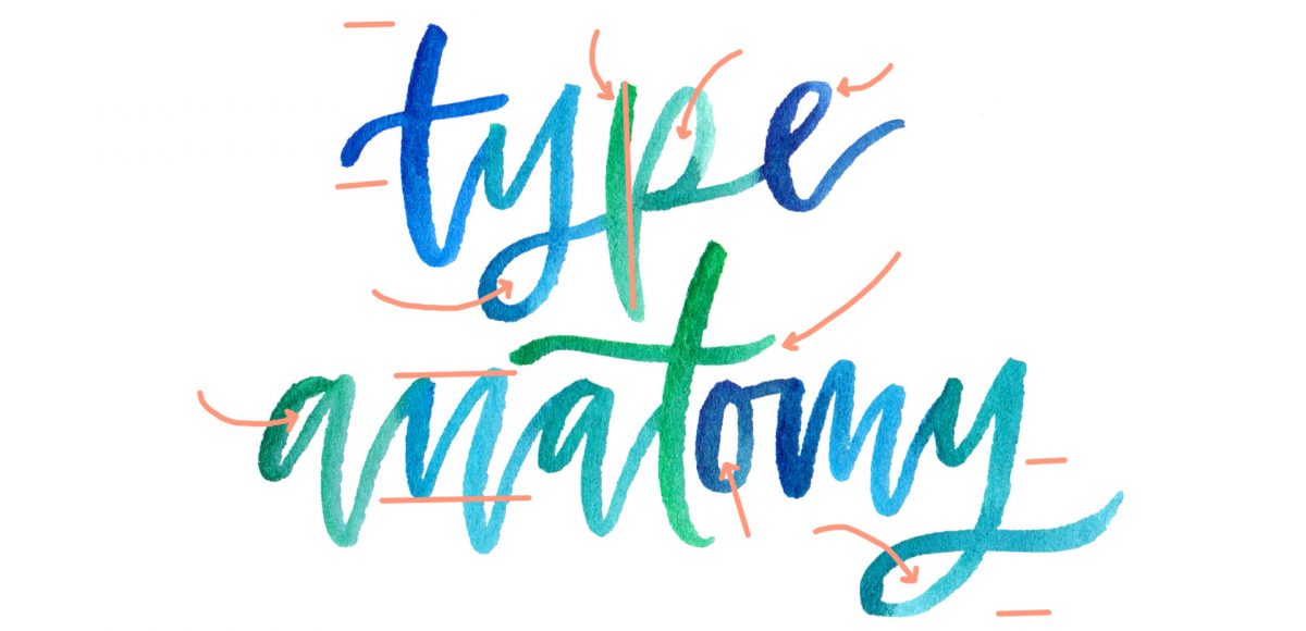
A Colorful Crash Course in Type Anatomy

Here are a few visuals with their descriptions below in case you’d like to reference this post later on 😉
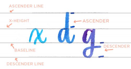
Baseline: the invisible line where all characters sit
x-height: the height of a lowercase x
Ascender Line: the invisible line marking the height of ascenders. Ascenders rise above the x-height, like a lowercase b, d, or h.
Descender Line: the invisible line marking the lowest point of descenders. Descenders fall below the baseline, like a lowercase g, y, or j.
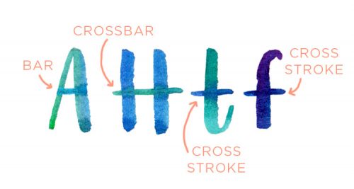
Bars vs. Crossbars vs. Cross Strokes
Bars: The horizontal stroke in characters when it meets, but doesn’t intersect/cross through other strokes.
Crossbars: The horizontal stroke in characters when it intersects/crosses through other strokes.
Cross Strokes: The horizontal stroke in lowercase characters when it intersects/crosses through other strokes. Examples: t, f.
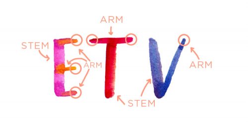
Arms: Horizontal or upward strokes that do not connect to the stem at one or both ends.
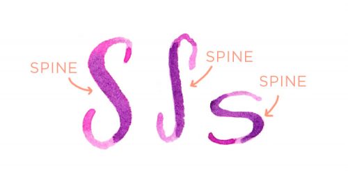
Spine: The main curved stroke of a capital or lowercase ‘S’.
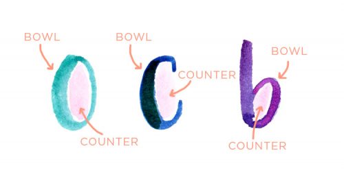
Bowls vs. Counters/Apertures
Bowls: The curved part of the character which encloses the circular or closed (negative space) parts.
Counters/Apertures: The negative space in a fully or partially closed area of a character.
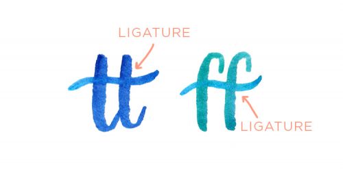
Ligature: Two or more characters that are joined together to form one character.
Receive special offers on courses + products, a new design file every month plus instant access to the Resource Library!

Pick up over 50 design + lettering files as our gift to you when you join the Tuesday Tribe for free!
error
Congrats!
Please check your email to confirm.
You May Also Enjoy
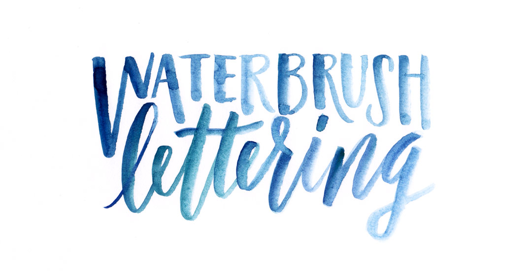 Tips for Lettering Using a Waterbrush Posted in Tutorials, Typography, Hand Lettering, Color, Hand Drawn, Illustration
 How to Add Watercolor Textures to Typography Posted in Freebies, Tutorials, Typography, Photoshop, Color, Hand Drawn
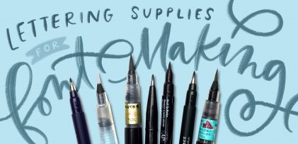 My Favorite Lettering Supplies for Font Making Posted in Tutorials, Roundups, Typography, Hand Lettering, Beginner
 Create Colorful Rainbow Brush Lettering Posted in Tutorials, Hand Lettering, Color
Kate | October 18, 2016
|
Excellent! Thank you!
cat norris | October 19, 2016
|
Love! Thank you!!
Steve | November 6, 2016
|
Super useful! Thank you!!
Sarah | November 12, 2016
|
Your colorful example is so helpful! Thanks 🙂
Ambur | January 11, 2017
|
Excellent Video – thank you so much for making that so easy to understand!
Mandolin | February 20, 2017
|
Your stuff is so neat. I love it all.