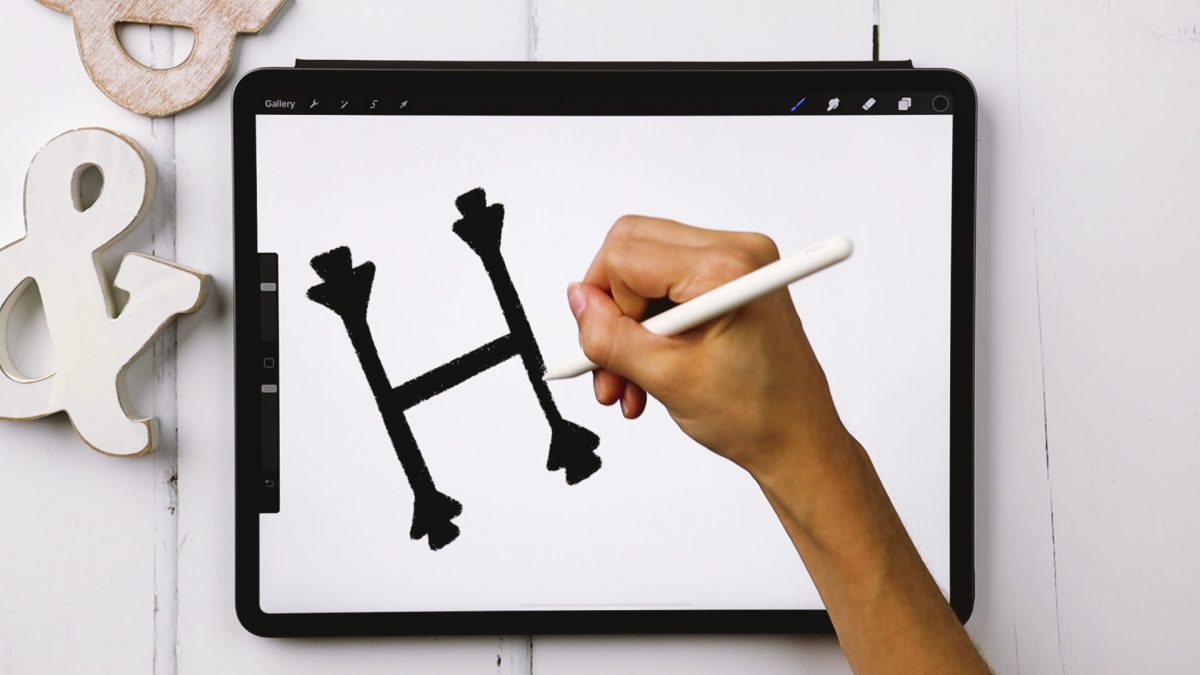
Serif + Sans Serif Lettering the RIGHT Way
Welcome to Episode 3 of Style Studies! This month, we’re finishing the foundations portion of this series so you’ll be prepared for all of the more decorative + modern styles coming next year! Getting a solid understanding of basic serif and sans serif styles will be something you can always rely on in design layouts in the future. I can’t emphasize enough how much I’ve used what I’m sharing in this episode throughout my career. They may not be the sexiest styles, but they’re the most reliable ones you’ll ever use. As with every episode, printable and Procreate practice sheets are included for free, below. So let’s jump in to how to create serif + sans serif lettering the right way!


