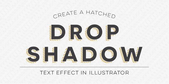
Hatched drop shadow text effects are becoming more common in typefaces these days – Trend was one of the first to offer a layered font with a faux hatched drop shadow which motivated others to offer them. But what if you want a hatched drop shadow on the font you’re using, not trend? What if it’s for a one-off headline where lots of text doesn’t need it, it just needs to look beautiful in one powerful instance? That’s when we start making art instead of adjusting type, which is why this week’s tutorial isn’t on a text layer style; we’ll be customizing our hatched drop shadow to fit an artistic style.
The font used in this tutorial is the free font, Novecento Sans Wide Demi Bold, which you can pick up here with a free myfonts.com account. Let’s get started!
Receive special offers on courses + products, a new design file every month plus instant access to the Resource Library!

Pick up over 50 design + lettering files as our gift to you when you join the Tuesday Tribe for free!
error
Congrats!
Please check your email to confirm.


Madhvi | February 16, 2015
|
Great tutorial! Really appreciate it. I was wondering if I can make text in illustrator in a curve (or a line) that is thinner in the beginning and becomes larger at the end. For e.g: Life is beautiful. So “L” will be smallest in size in life and “L” will be the biggest in Beautiful towards the end. And the letters were a part of a swoosh or something.
TeelaC | Author | February 16, 2015
|
Hey there,
Thanks for asking! Try this: With your text typed out and selected, go to Effect > Warp > Arc. This will bring up a small dialog box. You should see a ‘preview’ checkbox in the lower left corner, make sure that’s checked. Next, adjust how much of an arc you’d like by adjusting the bend slider, then adjust the horizontal distortion slider to get the smaller at the beginning, larger at the end effect you mentioned 🙂 Hope that helps!
George Fuller | May 7, 2015
|
I really liked your video. It was very clear and I was able to duplicate the shadow without a problem. 2 questions…
1. How do I change the color of the lettering and hatched drop shadow? When I tried it either colored the shadow solid or gave it an outline (switching between stroke & fill).
2. I’d like to take the completed lettering with the hatched drop shadow and make it a cut out. Example: I’d like to use this lettering in white and put it on top of a black circle and “cut out” the lettering using pathfinder to make a .png file. How can this be done?
Again, thank you for the video. Really great job making it easy to duplicate, step by step. Take care.
TeelaC | Author | May 7, 2015
|
Hey George!
Thanks for checking out the tutorial – I’m so glad it was easy to follow! Here are the answers to your questions:
1. To change the color of the hatched drop shadow, with it selected, go to pathfinder and hit the ‘crop’ icon. This will make the mask permanent and you’ll be able to change the color of the hatching.
2. With the black circle and the lettering both selected (you’ll have to make sure the lettering is grouped together and placed on top of the circle – pathfinder needs to recognize the circle is below everything) – go to pathfinder and click the ‘exclude’ icon. This should cut everything out of the black circle so you can make your transparent png.
I hope that helps! Let me know if you have any trouble!
isabel | June 22, 2015
|
Olá, bem, quando eu clico em Mark, fica só uma letra como posso mudar isso?
Megan Rich | February 3, 2016
|
Great video! Thanks so much for sharing this! 🙂
angelacarpenter.com | February 24, 2016
|
Great video!! Thank you for being so kind to share. 🙂
Teela | Author | February 24, 2016
|
thanks for checking it out! 🙂
Jason | April 21, 2016
|
This was seriously such a fantastic tutorial. I have wondered how to do this for probably 5 years. You have the perfect amount of description without being too much or too little. Bravo!
Also learned a little tip watching this – holding shift to apply color to a stroke. Never knew that either.
Thank you for being awesome.
Teela | Author | April 22, 2016
|
Aw, I’m so glad! Thanks so much for checking it out! 🙂
Manni | May 18, 2016
|
This ca me in handy. I followed through another text tutorial which took me all the way to Mars only to drop me back to earth at the speed of light. Thanks for the tut
Megan McDonald | July 23, 2016
|
So great!!!!
Giuliana Zapata | July 26, 2016
|
Muy bueno! gracias! me suscribo!!
Gerald | January 10, 2019
|
Um this is twice you’ve nailed the perfect tutorial that I needed. Currently working on a wordmark for a country artist and this is exactly what I needed. Who would’ve thought that after 20 years of using Ai and I learned something new. I can’t thank you enough.