If you’re a text fiend like me, you know choosing proper fonts for any type of application can make or break it (no pressure). Luckily, there are a lot of super talented typeface makers out there that create solid solutions to pull you out of – what can sometimes feel like – a font options abyss. You just need to know what you’re looking for. This is the first in a new monthly post of my current favorite fonts, free or purchased, that I can’t get enough of or would highly recommend for a specific purpose. Below each font, I’ll list what I like and dislike, which type of application I would use it for, how I’d use it, and what kind of typeface I would pair it with. So, month no.1, here we go!
Some women buy shoes. I buy fonts. Here are a couple fonts I’ve purchased, and a couple that are still on my wish list:
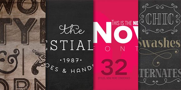
1. Brandon Printed
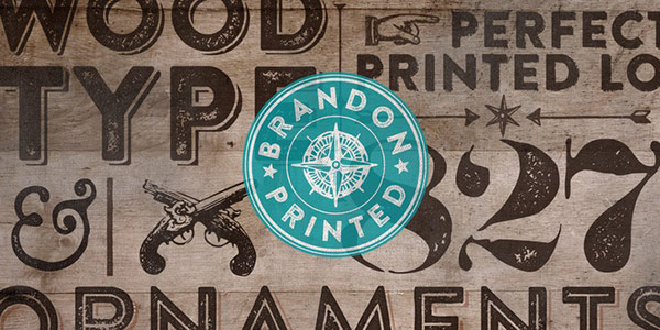 This font had a lot of hype around it when it first rolled out – it was a thicker weight with a shorter x-height than veneer, which was also a nice retro caps-only textured font. I love this font because it’s serious but still has a warm side. It comes in two textured variations, both with a shadow version and an inline. It also has a double version if you want to get super textured (not my favorite). If you’re thinking about picking this up, make sure to check out the extras – it’s pretty sweet that not only does it include roughened, almost hipstery shapes, but different vector texture ‘patches’ too. So if you want to add a little texture to part of your artwork, type out the texture, expand it and place it where you need it. This is the first font I’ve seen this on and I love that it was included. High five.
What I like: Brandon Printed One + One Shadow are my favs, followed by the extras + inline. Super versatile.
What I dislike: Not a huge fan of the ‘double’ version
Where/How I’d use it: I just used this on a site I’m working on + I’m loving it. Definitely a headline only font. Use for web where you want a little human/approachable feel, invites for people who are serious but want to show their fun side, blog post featured images, avoid greeting cards + pairing with other textured/rougher hand drawn fonts.
What I’d pair it with: Definitely a font that has an upper + lowercase, serif or slab serif. I’ve paired it with Aleo, Arvo + Caecilia and have liked all of them. I also paired it with some monoweight hand drawn type I created in Illustrator (with the pen tool) and I really liked the contrast.
2. Showcase
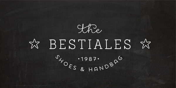 This font is fairly new and caught my attention the minute I saw it. I think the creators were brilliant to make a font that included script and a complementary serif + sans serif. With the popularity of insignias these days, it’s easy to come across mismatched scripts and sans serifs. This font guarantees if you want that kind of pairing, you have nothing to worry about. One thing that’s pretty cool is it’s monoweight across the board, and the sans + slab feel handmade, without being too obvious. While I haven’t used the font a lot, I recently created some certificate options for a client, and the one I presented using this font was chosen. This entire font package includes: ornaments (also monoweight + very cute), sans, sans italic, sans mini (small caps), sans mini italic, script, slab, + slab italic.
What I like: Ornaments are adorable, I’m a fan of the monoweight, and I love all the options included
What I dislike: Typing lowercase script t’s always defaulted with the super decorative crossbar. I like the decorative crossbar, but if you typed ‘matter’ for example, it did matter. To solve this, (in illustrator) go to your open type palette (window > type > open type), and turn off the contextual alternates icon (lowercase script ‘o’ icon).
Where I’d use it: Anything cute or girly, certificates, invites, greeting cards
What I’d pair it with: itself! Or, a slab serif or heavy weight sans serif depending on which option you’re using.
3. Novecento Sans Wide
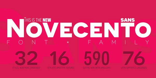 This has been one of my tried and true go-to’s for quite a while. The best part? They offer 6 different weights for free (scroll to the bottom to see)! Novecento recently got an update, supplying a small caps version to their existing all caps font. So, when you type in lowercase, you get small caps now instead of uppercase for everything. I’m a fan of the change, but it caused a couple of headaches for me with templates I created using those fonts. To make the correction, I had to change the name to include ‘sans’ (it was just ‘novecento’ before, and you can’t obtain the previous version anywhere online anymore), then change all type to all caps to give the same look I had before. So, if you’re just getting to meet Novecento for the first time, you’re in good shape. Already know about it? Heads up if you ever give someone a file with the old version. But, I digress. I love this font because, although it’s basically still all caps, it works great for headlines, subheads, big numbers + bullets. It has great angles, weights, and I love the width of all characters throughout. With the exception of Q, all characters are generic enough to stand strong without causing small distractions, but are created so well you take what you’re reading seriously. By the way, the webfont for those 6 free fonts is also free. Score.
What I like: love all the weights you get for free, and how well many different fonts can be paired with it.
What I dislike: They may have updated the font, but they never changed that Q! Seriously, it looks some dude got decapitated. Alas, at least it’s Q.
Where/How I’d use it: It’s hard to think of someplace I wouldn’t use it to be honest. It’s so freaking versatile. Good for headlines, subheads, pull quotes, and super limited body copy.
What I’d pair it with: I would avoid other sans serifs, but anything else is fair game. Especially script or even hand lettering.
4. La Chic
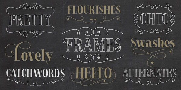 La Chic debuted at the beginning of March, and it’s been tempting me ever since. I love it when type designers dance on the edge of super clean but still offer nods to handmade. This font is a great example of that performance. It’s a clean, beautifully created font with options to enhance the handmade feel (La Chic Outline + La Chic Shaded), or to stay confident with a human edge at the same time (La Chic). And in case you ever needed any kind of perfectly vectored flourish, look no further. La Chic’s flourishes + frames really are gorgeous. If you don’t believe me, just check out these glyphs and these glyphs. To top it all off, when you type in all caps, only the first letter is flourished to preserve the readability, and automatic initial and final lowercase letterforms automatically swap to avoid any letter collisions as you type. It’s the little things, you know?
What I like: the approachable personality of the font, the options provided, and those beautiful flourishes
What I dislike: the fact I have yet to own it
Where/How I’d use it: greeting cards, food signage at whole foods-y stores/farmers markets, anything having to do with food, really, invitations, announcements, certificates, seasonal event web ads/signage/print ads, wedding signage + stationery. I would use this only as a headline font so it can leave the impact and get the attention it deserves.
What I’d pair it with: In limited copy situations, I’d actually pair it with an all caps, medium to heavy weight font. For lengthier copy, I’d pair it with a non-show off sans serif to give sufficient contrast in layout.
Receive special offers on courses + products, a new design file every month plus instant access to the Resource Library!

Pick up over 50 design + lettering files as our gift to you when you join the Tuesday Tribe for free!
error
Congrats!
Please check your email to confirm.
You May Also Enjoy
 Increase Your Text Drive: Nexa Rust + Eveleth Posted in Typography, Fonts, Textures
 Fonts to Increase Your Text Drive: Mulberry Script + Daydreamer Posted in Freebies, Typography, Fonts
 2 Fonts to Increase Your Text Drive: Pirou + Core Deco Posted in Freebies, Typography, Fonts
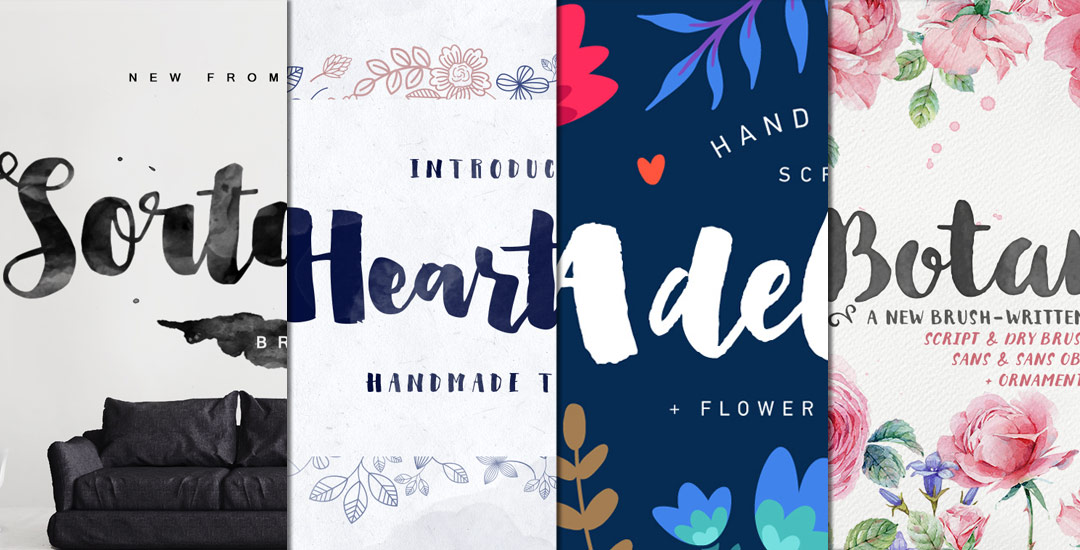 Brush Script Fonts to Increase your Text Drive Posted in Roundups, Typography, Fonts, Resources
Daniel Candelaria | April 17, 2015
|
Really digging this text drive series. It’s helping me better understand how to choose and pair fonts, and is increasing my internal font portfolio. Love it. Thanks.
TeelaC | Author | April 18, 2015
|
Awesome!So happy to hear! 🙂 Will keep them coming!