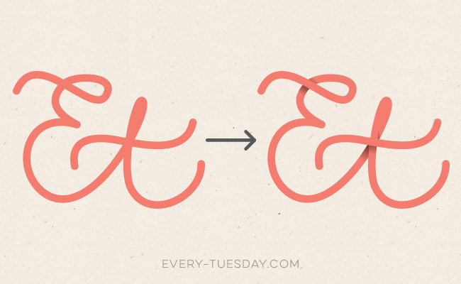
How to Apply Vector Dimension to Typography (Advanced Tutorial)
Happy Tuesday! I thought I’d add a more advanced tutorial to the mix since we’ve really laid all the foundation in earlier tutorials. Plus, this one’s really fun and with just a few quick steps, you end up with a pretty cool outcome. In this week’s video, we’ll add vector dimension to typography by taking some hand lettering created with the Wacom tablet (like in this or this tutorial), and we’ll add vector gradients to simulate shadows to bring in that vector dimension. The end result is a 3d looking piece of your own typography, plus you can use the same technique for any kind of artwork, not just typography – think logos, patterns, icons and illustrations! Let’s get started!


