I am truly so flattered by the response to Lettering Layouts this week (it’s the #1 trending class on Skillshare as I type this!). I have loved, LOVED seeing everyone’s experiments they’ve shared either by tagging me on instagram or posting in the class. So much talent! To say a giant thank you, I wanted to share a little something extra to inspire any new layouts you may have up your sleeves: a hand lettering style inspiration guide!
If you’ve taken the class, you’ve already got your hands on the inspiration elements pdf. On the pdf, there’s one column with a few different lettering styles and weight pairings. I’ve had many times where seeing one cool style sends me down an experimenting rabbit hole that I love. In the hopes this will inspire new layouts or just take other layouts to a brand new place, I have a full inspiration guide to share with you this week.
Below you’ll find everything included in the pdf guide, and there’s a link below for you to download it for any future uses. Here we go!
Hand Lettering Style Inspiration
I go into far more detail in the class on mixing styles and weights, but here are some to get you started. For the purposes of this post, I wanted to share inspiration for primary lettering styles and for supporting styles. We’ll go through the primary first, follow it with supporting and finish off with tips on combining the two.
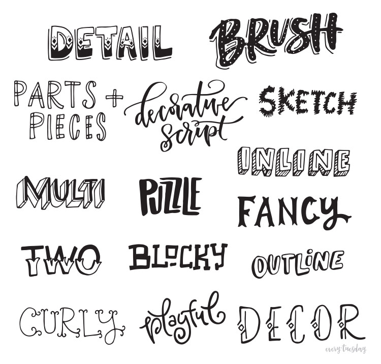
Primary Lettering Style Inspiration
These are the styles that will immediately call attention to any layout. Use them sparingly to keep them special by applying to the most significant word(s) in your layout.
Supporting Lettering Style Inspiration
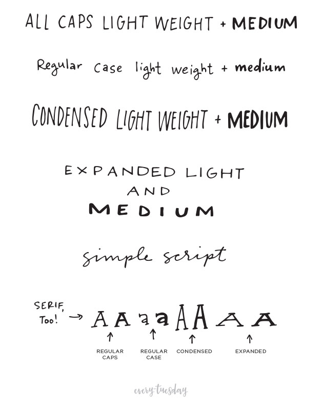
While these styles aren’t as flashy or visually delicious, they’re still very important. Choosing supporting styles that will create the most contrast between them and the primary style(s) you chose will help your layout to be read the way you intend it to be. Note: light and medium weights shown below, but don’t feel limited to only those!
Style Mixing Inspiration
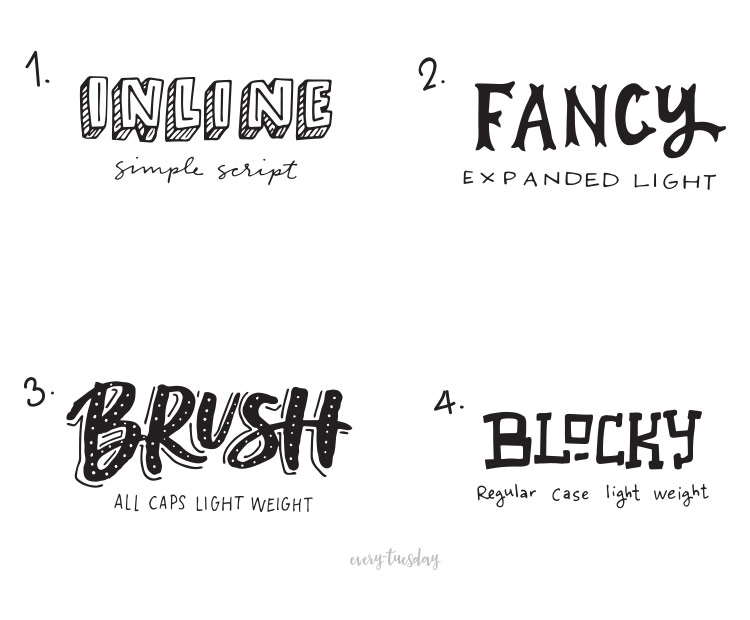
Below, you’ll see a few examples of paired styles that create balance because of the contrast between the two. Choose styles that contrast one another based on:
- weight (thickness of strokes)
- scale (size in relation to other lettering)
- character (style and personality of the letterforms)
Free Hand Lettering Style Inspiration Guide (pdf)
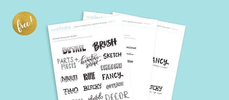
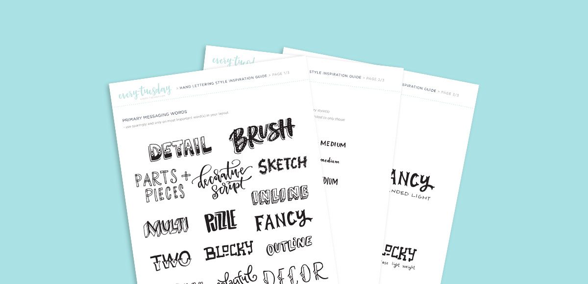
Download this post as a pdf hand lettering style inspiration guide here!
Want to take things further? Be sure to check out Lettering Layouts!
Receive special offers on courses + products, a new design file every month plus instant access to the Resource Library!

Pick up over 50 design + lettering files as our gift to you when you join the Tuesday Tribe for free!
error
Congrats!
Please check your email to confirm.




Kevil Ngoc | August 22, 2016
|
I am finding this style.
downloading… Thanks you.
taby | September 1, 2016
|
you are such a graceful artist
Teela | Author | September 1, 2016
|
Thanks so much, Taby! 🙂
Kori | September 21, 2016
|
Hi Teela,
I can’t hand-letter to save my life!
Are the techniques taught in this class applicable to those of us who have to rely on fonts and Adobe Illustrator?
Teela | Author | September 28, 2016
|
Yes, absolutely! Knowing where to add emphasis with your words – whether it’s scale, contrast, style, etc. plus adding in design elements are all covered. If you’re just using fonts, you’ll definitely get some good hierarchy/arrangement pointers within the class 🙂 Thanks for asking!
Syana | November 3, 2016
|
Hi Teela,
It seems the DOWNLOAD link brought me to a ‘this-site-can’t-be-reached’ page. Thanks for the tutorials you’ve shared. They are very helpful and easy to understand for a newbie like myself.
Teela | Author | November 5, 2016
|
So sorry about that! Should be fixed 🙂