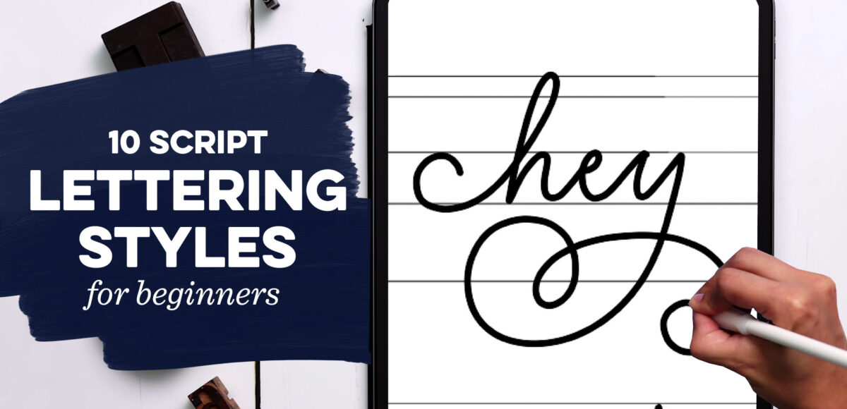
When you’re just getting started with hand lettering, figuring out the lettering styles you’d like to create and keeping them consistent can feel overwhelming. There are so many possibilities!
This week, I’m sharing some simple rules to follow to give you limitless options and we’ll tackle 10 easy script lettering styles you can start using today. Read on for how to make them and pick up a free cheat sheet, so you always have them handy!
Understanding Lettering Anatomy
Before we dive into our styles, we need to understand the general structure of the letters themselves.
Typography and lettering are essentially composed of a cap height, ascender height, x-height, baseline and descender length. The size and proportion of these, along with the angle they’re executed at will always have the most significant affect on the personality, or character of your hand lettering styles. Luckily, you’re likely already familiar with all or most of them:
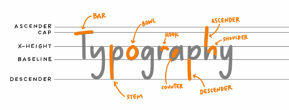
Cap Height and Ascender Height
The cap height relates to the height of all of your capital letters. It is generally a little lower than the ascender height (the height of your ascenders), but is very flexible, meaning they can be the same.
X-height and Baseline
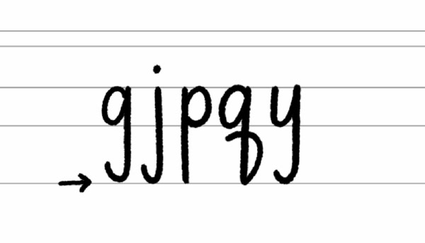
Letters sit or stand on the baseline. Lowercase letters without ascenders reach up to the x-height.
Descenders
Descenders are strokes of lowercase letters that extend below the baseline. Ascenders and descenders don’t have to be the same length; many times, descenders are slightly shorter. Remember! When you’re creating your lettering styles, the lengths and heights are entirely up to you!
Exploring lettering style options
Now that you have a basic understanding of type anatomy and structure, let’s have some fun! In this video, we’ll explore 10 easy script lettering styles for beginners. Feel free to mix and match these, but always keep consistency in mind.
If you have plans to freelance these different styles or convert them into a font later, one of the telltale signs of a professional letterer is their consistency of forms.
Mentioned in this video:
Download your free hand lettering styles cheat sheet here ⬇️

For more free hand lettering style resources and free Procreate brushes, join Tuesday Makers!
10 Easy Lettering Styles for Beginners
Here are the lettering styles and tips outlined in the video, broken down to their basics, with images.
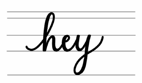
Style #1: Standard Script Style
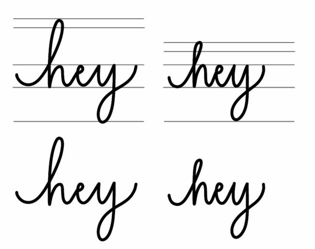
The standard script style refers to lettering guidelines with similar or near-similar height for caps, ascenders, x-height and descenders. I like using this as a base, then altering different components to see how they influence the style and feeling of my hand lettering.
I’ll be using the word ‘hey’ for all lettering style examples, as it contains an ascender, x-height and descender character.
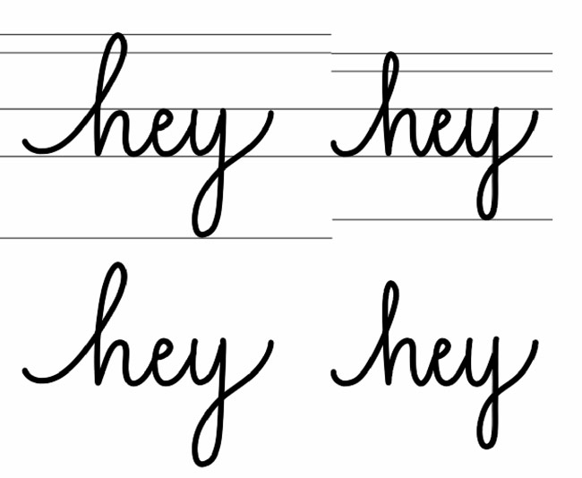
Style #2: Alter the Ascender Height
Using the same lettering guides, let’s change the height of just our ascender line and compare it to our original, standard script in style #1. We’ll make our ascender much taller in one example and much shorter in the other. I’m making these adjustments pretty significant so they’ll be obvious, but even the smallest changes can sometimes have an enormous effect on your lettering’s personality.
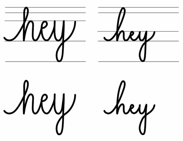
Style #3: Alter the Descender Length
Following the same process as in style #2, let’s now change the descender and see how it changes the feel of our lettering. I’m keeping the same height of the ascender from our standard script in style #1 and only changing the length of the descender. For one example, it’ll be much longer and in the second, much shorter.
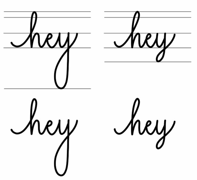
Let’s also look at a standard height for our x-height, but this time, we’ll have both long ascenders + descenders, then short ascenders and descenders:
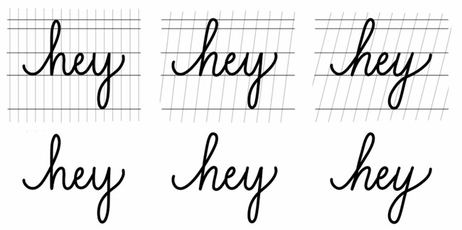
Style #4: Alter the X-Height
Now that you’re a pro at altering guidelines, our last one is the x-height. Let’s look at how the feeling of the lettering changes when the ascender and descender are consistent, but the x-height gets taller and shorter.
Style #5: Alter the Angle
As you went through the first 4 styles, was there one that appealed to you more than the others as a favorite style? Take that style and now let’s change up the angle that it’s written at. We have 3 different angles to try for this one: upright, subtle italics and italics.
I’ll be using style #1 (standard script) for these examples.
Style #6: Add Faux Calligraphy Weight
The calligraphy script style is one where all downstrokes are a heavier weight than the upstrokes. This is an apparent contrast in line weight and can be created in two ways.
The first is generally referred to as ‘faux calligraphy’ where you create your base lettering, then go back in and thicken up the downstrokes manually.
Alternatively, when you create your lettering, if you’re using a pressure sensitive brush in Procreate or a flexible tipped traditional brush or pen, you’d put more weight on your stylus as you write to create those heavier weights. Faux calligraphy is an excellent option for beginners as it takes the pressure off (no pun intended 😉) as you create your individual letterforms.
When adding weight to any custom lettering, consistency is paramount. All of your thick strokes should be the same width and all of your thin strokes should be identical in width.
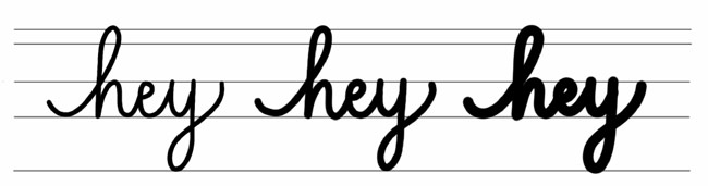
Style #7: Add Universal Weight
Adding weight can influence how lettering styles feel, even if that weight doesn’t have contrast, like in style #6. Let’s look at how universally adding the same weight to all strokes makes the hand drawn lettering feel different. We’ll practice with light, semi bold and bold. This can be accomplished by using a monoweight brush in Procreate or hard tipped traditional pen in different sizes.
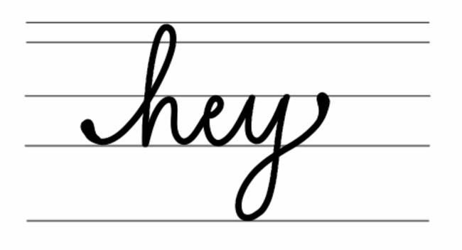
Style #8: Embellish Initial and End Strokes
Your initial stroke begins the first letter of a word and your end stroke is the final stroke of the last letter in a word. Adding consistency to what this stroke looks like, whether it’s a specific curve or embellishment can set your style apart and influence its style. Whatever you choose to do, make sure you’re applying it to both the initial and end stroke.
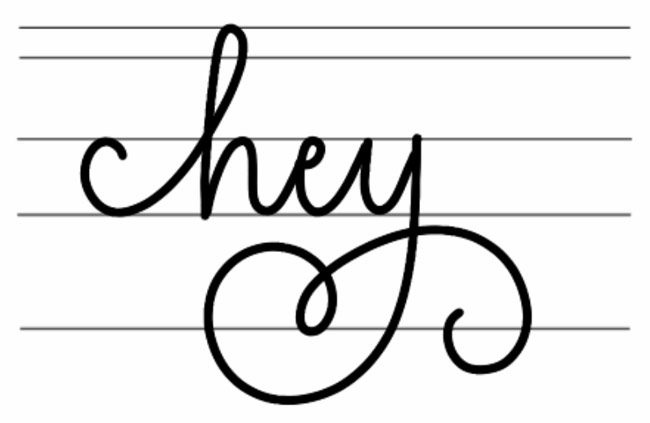
Style #9: Embellish with Consistent Flourishing
Similar to the end strokes, if you introduce any flourishing to your word, you’ll want them to take on similar forms to your initial and end strokes. If you’re using lots of curves, make sure those same curves are mimicked here.
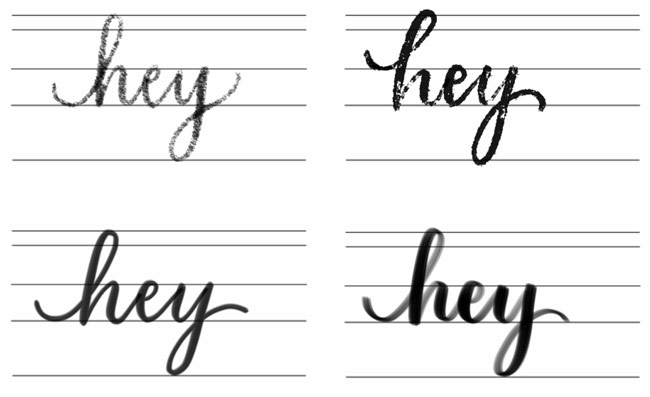
Style #10: Change your Lettering Tool
One of the easiest ways to experiment with different styles and find your own style is by changing your lettering tool! By changing your Procreate brush or traditional lettering utensil, you can instantly create paint streak lettering, brush lettering, distressed lettering and more.
What Should You Consider Before Investing in Lettering Tools?
As lettering skills improve, many artists naturally begin refining the tools they use every day. Moving beyond entry-level setups often means adding resources that support speed, consistency, and higher-quality output — whether that includes premium Procreate brushes, design software, drawing tablets, upgraded displays, or a more complete creative workspace.
While these upgrades can improve both the creative process and the final result, they also introduce expenses that are not always obvious at the beginning. In addition to equipment costs, creators may gradually take on subscriptions, digital assets, training materials, and software renewals that become part of maintaining a professional workflow.
For freelancers and independent creators in particular, upgrading tools often happens in stages rather than all at once. Planning purchases around current priorities and finding practical ways to manage creative expenses can make it easier to continue developing skills, taking on new work, and building a sustainable creative practice over time.
What you can do with different types of lettering
Lettering is such a powerful skill to have because businesses and individuals alike recognize how lettering humanizes brands, products and stationery with personality and character. If you’d like to monetize this in-demand skill, there are several ways to do this passively and actively. Here are a few:
Create and sell hand lettered fonts in other lettering styles (here’s how)
Freelance lettering (think book covers, website headlines, tshirt designs, merch, etc.)
Custom stationery
Your own merch (hand lettered quotes, names, etc.)
Hand lettered logo design
Where to take your styles of lettering next
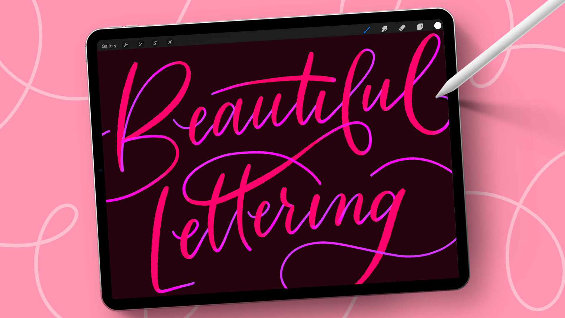
If you’re ready to push your creative lettering style further and develop it into one you can monetize, you’ll learn how to create trendy, sellable styles in my Beautiful Lettering in Procreate course:
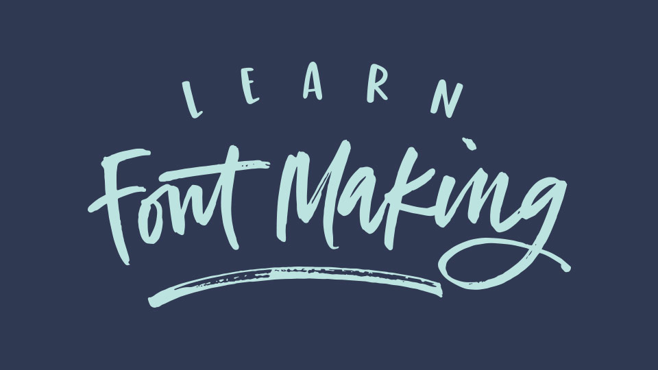
If you’d like to learn how to type with your own lettering by converting your lettering styles into custom, sellable fonts, check out my online course, Learn Font Making (enrollment opens once a year):
Final words about the different lettering styles
Above all, start practicing! The more you practice, the more diverse your lettering styles will become and the more muscle memory you’ll build. Practice drawing letters, creating different letter styles following the exercises above and play with different ideas, all while keeping consistency a priority. A little each day or each week can make an incredible difference over the course of just a few months!
Receive special offers on courses + products, a new design file every month plus instant access to the Resource Library!

Pick up over 50 design + lettering files as our gift to you when you join the Tuesday Tribe for free!
error
Congrats!
Please check your email to confirm.
You May Also Enjoy
 Procreate for Hand Lettering: A Brush Selection Guide Posted in Hand Lettering, iPad Lettering, Procreate
 Freebie: October 2019 Desktop Wallpapers Posted in Freebies, Desktop Wallpapers
 Freebie: September 2019 Desktop Wallpapers Posted in Freebies, Desktop Wallpapers
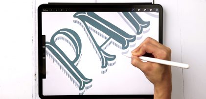 Decorative Serif Lettering in 4 Steps Posted in Tutorials, Typography, Hand Lettering, iPad Lettering, Style Studies
No comments