June 2019

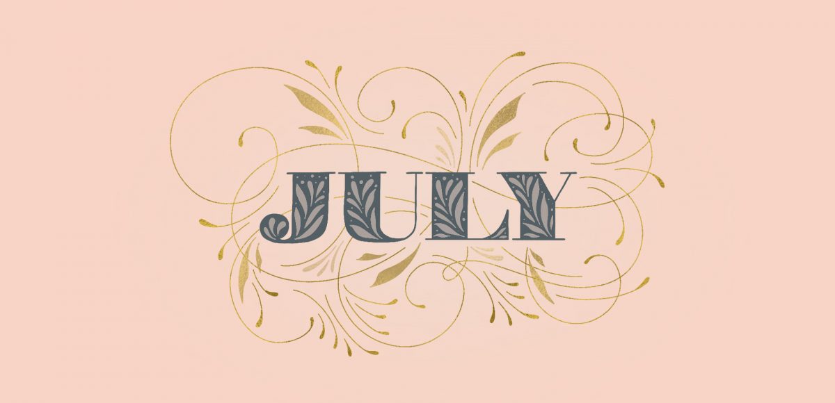
It’s the last Thursday in June, which means it’s time for your free July 2019 desktop wallpapers! This month’s wallpaper was entirely created in Procreate, with just the dates added in using Photoshop and my font, Miss Magnolia. If you checked out my free course, Procreate for Beginners, you saw me creating flourishes in the second project. This month, I wanted to go a little crazier with my flourishing and make it fancy with a touch of gold 😉 The gold is from my Procreate metallic texture kit and you can learn more about flourishing here. All of the lettering + doodles were made using my free Procreate Monoweight Brush (available in the Resource Library). For the dates, ‘R’ is for Thursday, to distinguish it from a same-sized Tuesday ‘T’ at a glance. 

The download includes the July 2019 desktop wallpapers in two common resolutions: 1280x1024px and 1920x1080px, with and without dates. I’ve left the year off of the ‘no-dates’ versions, so you can use it for any July in the future, too!

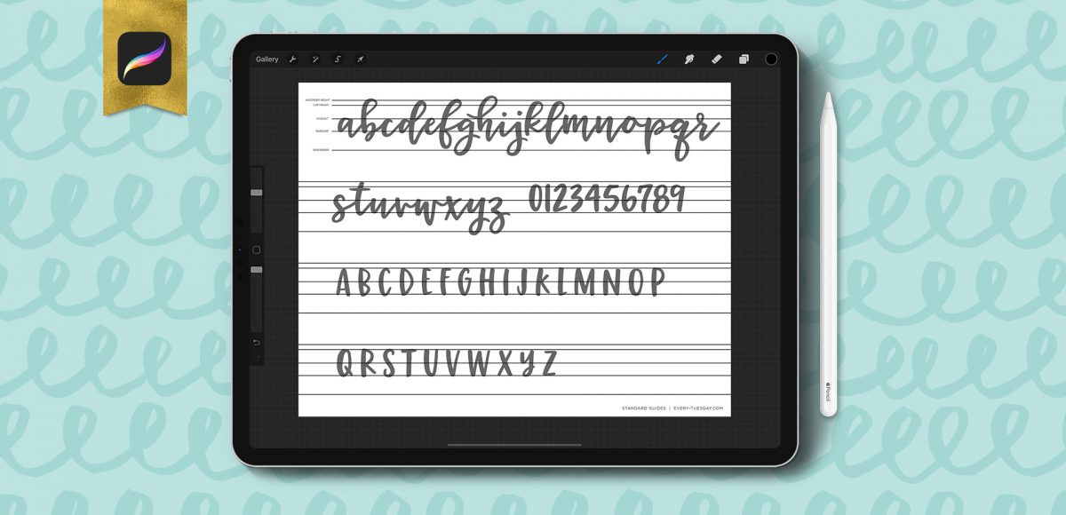
I have a big freebie for you this week: I’ve put together 10 different lettering guides, including italics! You can grab them as traditional, printable guides (use tracing paper or a lightbox with them), as well as a Procreate version. Since there are so many different ones in one Procreate file, I thought a video would help show exactly how to use them. Read on to grab your free Procreate lettering guides (and printable ones), as well as some simple tips with how to use them!

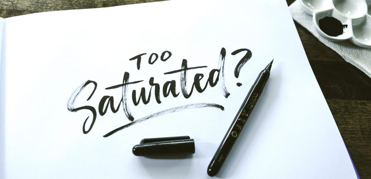
In my course, Learn Font Making, I take you through all the steps to prepare your lettering for font making, convert it into a working, professional font and I share my best tips for selling your font, too. I’m often asked by students is if I think the market is too saturated for new font makers. Although converting your lettering into a sellable font *is* a process, the fact the font making market is booming right now should not hold you back from starting; it should actually do the opposite. In this week’s video, I share my perspective about the saturation of the font market. I also share tips to stand apart from the crowd to get your fonts noticed by those buyers. Read on for it all!

I remember sitting in my Color Theory 2 class at SCAD (12 years ago!) and we were given an assignment we had to use gouache for. ‘Gouache?’ I thought, “Can’t be that different from acrylics, can it?”

It was the first time I had ever heard of it, let alone had any knowledge of how to use it. Since sitting in that classroom that day, I learned that 1. yes, it is definitely different than acrylics and 2. it’s actually pretty amazing.

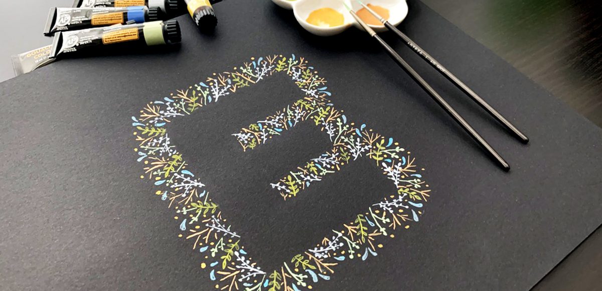
In this week’s tutorial, I’m taking you through gouache basics – how to mix colors, water ratios + what makes it so amazing to work with. Together, we’ll paint leafy gouache letters (or shapes!) that can be used for wall art, stationery or gifts! Read on to see it all!

GDPR Icon

Your Privacy Matters

We use cookies to customize and create content that’s most important to you. We’ll never share the info we collect.

View Privacy Policy