This coming Monday, I’ll be publishing my next Skillshare class, Lettering Layouts. Since we went over typing on a path in Illustrator on Tuesday, I thought it’d be fun to mix the concept of custom baselines with purely typographic layouts. The results are pretty incredible and can for sure seem intimidating to try yourself. This week, on top of a roundup of 6 stunning typographic layouts, I’m breaking each layout down. By doing this, it’s far easier to see how each layout was achieved and how you can begin incorporating similar methods, techniques and design elements into your own layouts moving forward. If you’ll be joining me in Monday’s class, this post is a big head start. Read on for more!
First Things First
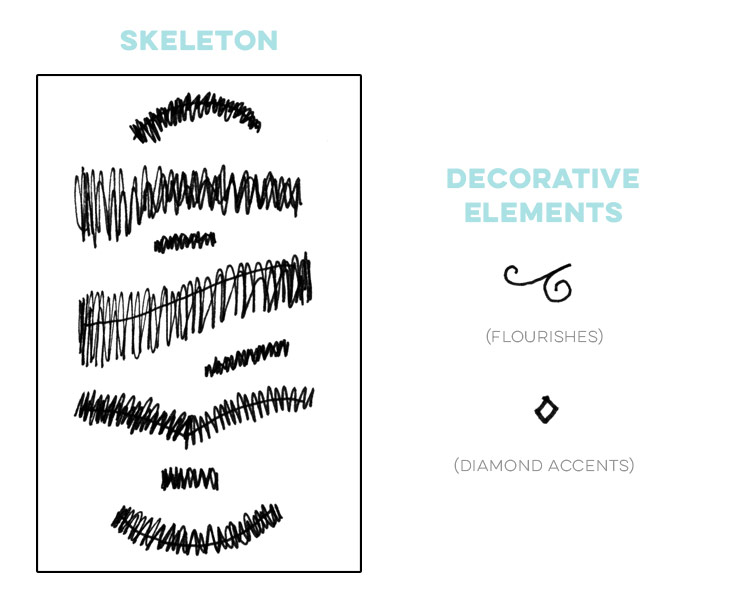
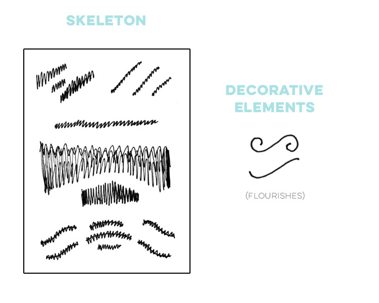
Below, you’ll find each typographic layout followed by a sketch of how I would break it down. I’ve left out the decoration in each ‘skeleton’, but still have them listed on the side, focusing only on the type’s placement, scale and baseline. All those scribbles you see represent the type or lettering in each layout. Compare the original to the sketch to get an idea of what I’m referring to as the layout’s ‘skeleton’. Practicing this technique with other layouts you admire will give you a great jump start on where to begin with making one that may be similar. Don’t get discouraged – layouts always take a fair amount of massaging. Be sure to also keep some tracing paper on hand! In my new class, we’ll go over how to perfect a layout from sketch to final and tracing paper makes this process SO much easier 🙂
Click on any image to be brought to its source. For more cool typographic layouts, check out my pinterest typography board!
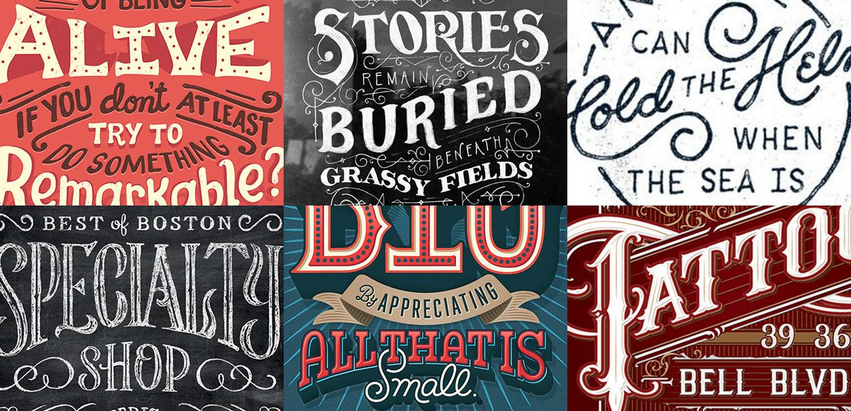
6 Stunning Typographic Layouts (+ what we can learn from them!)
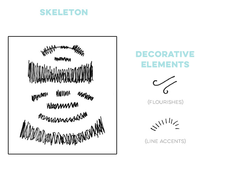
01. Untold Stories
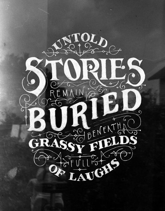
Type Layout Skeleton:
Notes:
- Levels of scale used (3): Large (‘Stories’ + ‘Buried’), Medium (‘untold’, ‘grassy fields’, ‘of laughs’) and small (‘remain’, ‘beneath’, ‘full’).
- Noticeably different weights used (2): light on the smallest scale typography, heavy on the large and medium scale type.
- The hard angles on many of the flourishes tie in nicely with some of the harder points found on many of the large and medium scale letters.
- Messaging is nicely contained between arc’d text at the top and reverse arc’d text at the bottom. Wavy and curved baseline type found in the middle throughout.
- First impression: ‘buried stories’.
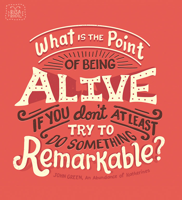
02. Alive
Type Layout Skeleton:
 Notes:
- There are 2 noticeable different scales of type: very large for ‘Alive’ and all other text is very similar in scale.
- 3 colors achieve instant messaging hierarchy. A medium bright background is used to call attention the layout. Light, bright color is used on the most important words and a dark, contrasting color is used for supporting words/messaging.
- All text is contained between arc’d text at the top and reverse arc’d text at the bottom.
- Simple decorative elements call your eye where to go when reading.
- First impression: being alive.
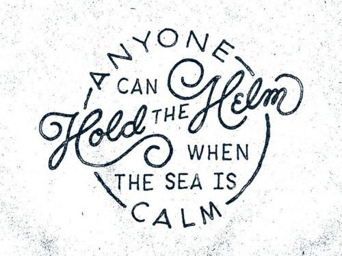
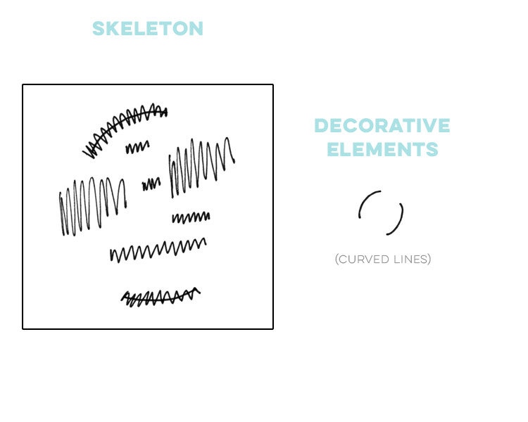
03. Hold the Helm
Type Layout Skeleton:
 Notes:
- Variations in scale (2): large (‘anyone’, ‘hold’, ‘helm’, ‘calm’) and medium (‘can’, ‘the’, ‘when the sea is’).
- Variations in text style (2): script and sans serif.
- Setting just ‘Hold’ and ‘Helm’ in script at the largest scale calls immediate attention and emphasis.
- Curved lines focus eyes to the center.
- Arc’d text is integrated into the circular lines that encompass the full typographic layout.
- First impression: ‘hold the helm’
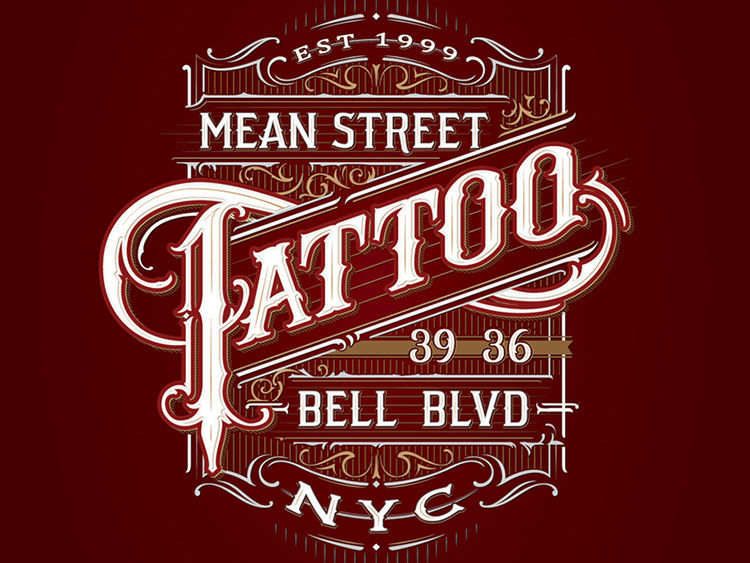
04. Mean Street Tattoo
Type Layout Skeleton:
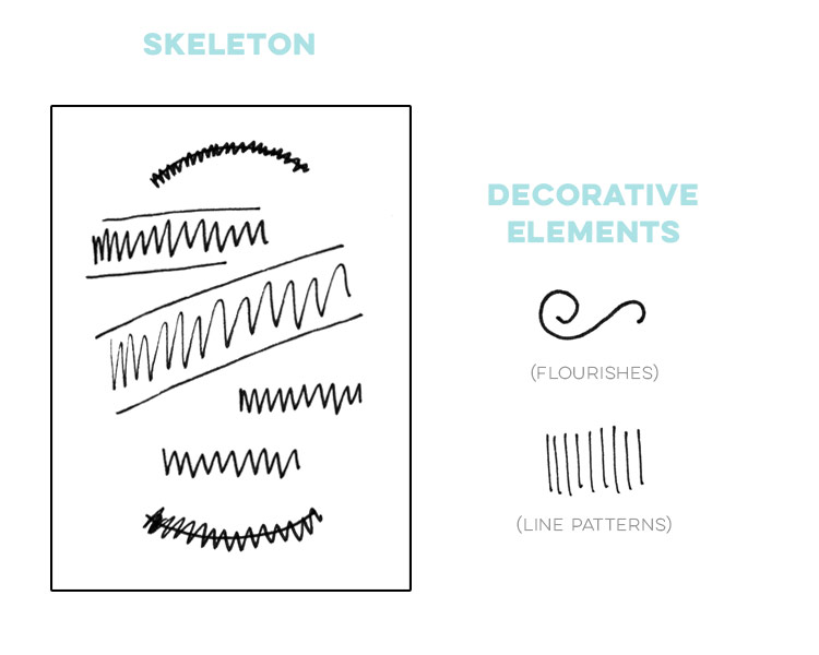
Notes:
- Different scales of typography (3): large (‘tattoo’), small (‘est. 1999’) and medium (everything else).
- Heavy use of text decoration reminiscent of traditional tattoos creates immediate relevance to the message.
- ‘Tattoo’ is the largest scale, it’s centered in the layout and is the only text set at a skewed angle. This draws immediate attention from the reader.
- The full layout is framed by decorative elements, but ‘Tattoo’ is the only word to break the frame.
- Main colors used (3): medium dark background, most decoration set in a muted tone, all typography extra bright and light for ideal readability.
- All text is serif, on point with the traditional tattoo theme.
- First impression: tattoo shop.
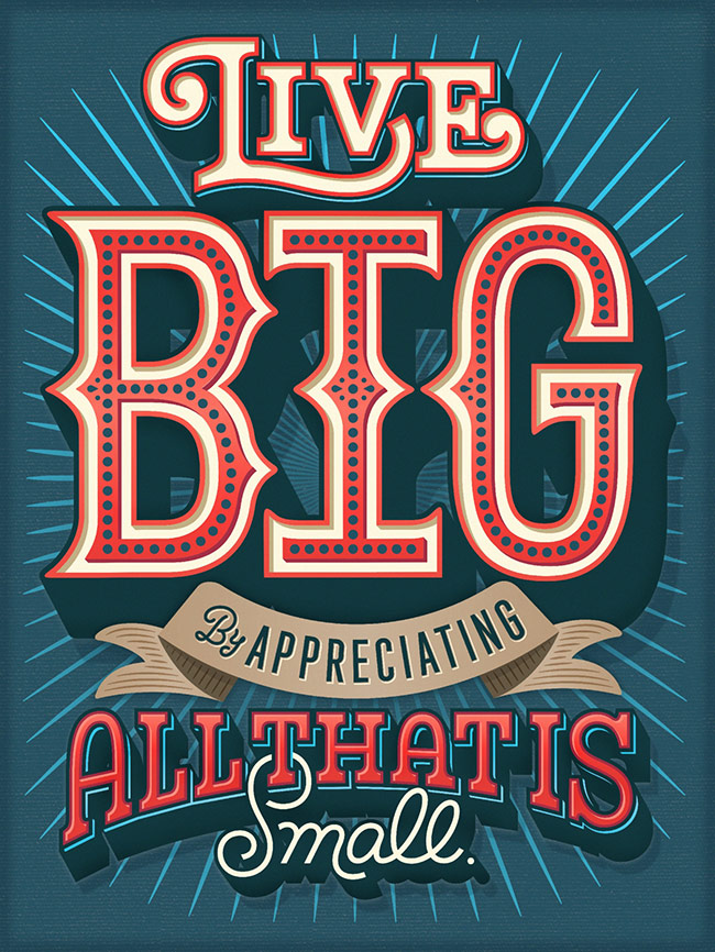
05. Live Big
Type Layout Skeleton:
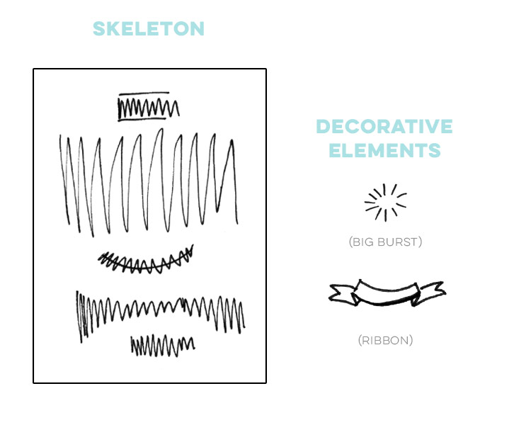 Notes:
- 3 different scales: large (‘big’), medium (‘live’, ‘all that is small’) and small (‘by appreciating’).
- 3 different text styles: sans serif (‘appreciating’), script (‘by’, ‘small’) and serif (‘live’, ‘big’, ‘all that is’).
- ‘Big’ is the primary focus of the layout. It’s the largest, most decorative word and the background burst element focuses its center behind the middle of the word.
- Main colors used (4): medium blue (background), red (text), white (text) and brown (ribbon).
- Strong, centered layout directs your eye immediately from top to bottom.
- First impression: big circus.
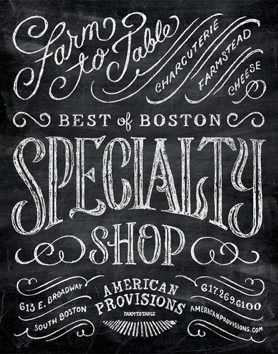
06. Specialty Shop
Type Layout Skeleton:
Notes:
- Largest text centered to focus the message.
- There a large variety of both scale and text style throughout the layout. This creates a feeling of nostalgia, or an ‘old timey’ feel.
- Simple decorative elements help to guide the eye throughout all the information presented.
- Texture enhances the layout with the absence of color.
- First impression: specialty shop.
Conclusions
The next time you create your own typographic layouts, keep in mind:
- You don’t need a bunch of different decorative elements to create a beautiful layout. Less is more!
- Use scale, weight and text styles wisely – they can be powerful to direct readers’ eyes where you’d like them to go and add emphasis to your message.
- Keep things simple and work your way up! Hold the Helm (#3 above) is basic from an element and styles perspective, but it is still visually effective.
Looking for more inspiration? Take a peek at my typography pinterest board!
Receive special offers on courses + products, a new design file every month plus instant access to the Resource Library!
Pick up over 50 design + lettering files as our gift to you when you join the Tuesday Tribe for free!
error
Congrats!
Please check your email to confirm.
You May Also Enjoy
 Holiday Hand Lettering Projects: Week 4 Posted in Tutorials, Typography, Hand Lettering, Holiday, Crafts
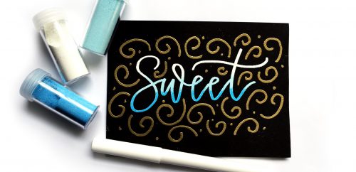 Create Quick and Easy Ombre Embossing Posted in Tutorials, Hand Lettering, Holiday, Crafts
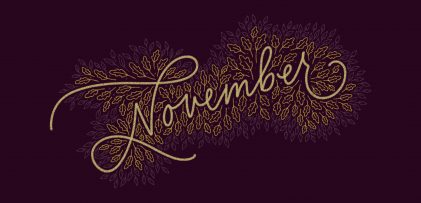 Freebie: November 2019 Desktop Wallpapers Posted in Freebies, Desktop Wallpapers
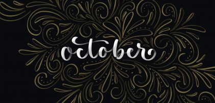 Freebie: October 2019 Desktop Wallpapers Posted in Freebies, Desktop Wallpapers
Angela McLeod | August 12, 2016
|
Hello Teela I look forward to taking your class over on Skillshare. I definitely love learning about layout.
Teela | Author | August 15, 2016
|
Yay! I can’t wait for you to see it 🙂
nahima machado | August 25, 2016
|
hello I can’t find out in your page tha shapes, decorations, types, etc about the course of lettering. help me?
Teela | Author | August 25, 2016
|
Hey! All the details about the course are right here 🙂
sadaf | August 29, 2016
|
loved it…thank you
Savana | October 1, 2021
|
These are all SUPER helpful. Thank you so much for sharing!