If you use Procreate for hand lettering, you’ve likely experienced the struggle of finding just the right brush for your needs. It can be an overwhelmingly time consuming task testing brushes and readjusting them only to try the next one, hoping for the best.
While nearly any brush in Procreate can be used for lettering, not all are designed specifically for it. Today I’m sharing the specific settings to look for in a lettering brush, a list of my favorite free and premium hand lettering brushes as well as some free practice sheets, too! Read on to get it all!
Calligraphy vs. Hand Lettering vs. Brush Lettering
Before we talk about specific settings, it’s important to decide which type of lettering styles you’d like to create! Although calligraphy, hand lettering and brush lettering can often be used interchangeably, their definitions are a bit different.
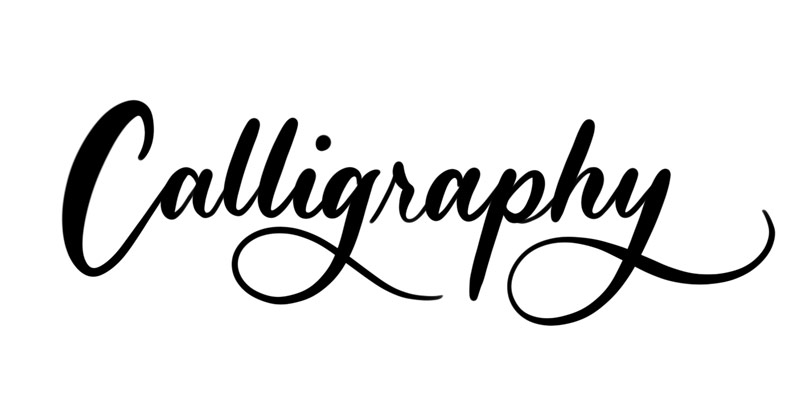
Calligraphy
Calligraphy is the art of creating beautiful writing using special tools, typically using flowing lines with a single stroke in a more structured way.
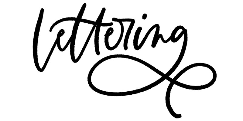
Hand Lettering
Hand lettering – or lettering – is essentially the illustration of letters, words and phrases. There are fewer ‘rules’ with lettering than with calligraphy and the tools that can be used are limitless. It may help to think of calligraphy as writing letters and lettering as drawing letters.
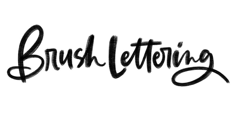
Brush Lettering
Brush lettering styles imitate the appearance of brush strokes, offering a more relaxed and playful style.
What to Look for in a Brush
Now that we’ve gone over the different ways to create letterforms and words, let’s talk about where the most important lettering settings in Procreate lie. We’ll talk more about using these to your advantage below, but for now, get familiar on where to find these and how they’ll affect how your brush behaves.
Streamline
This is probably the most important setting for most hand letterers. If you’re getting some shaky lines and you’d rather have super smooth strokes, this is the setting that will make it happen. To locate the setting, tap on any brush and choose the ‘stabilization’ category on the left and increase the streamline setting:
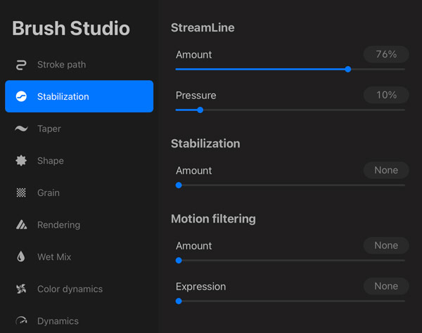
The higher the streamline, the smoother the line will be. If you tend to letter or write a little faster than average, you’ll want to stay between 65-85% rather than a full 100%. You’ll notice the streamline setting creates a kind of magnet effect of the stroke snapping to where you stylus draws. Because of this, if you hand letter quickly with a 100% setting, it’ll leave parts out trying to keep up with you.
Taper
Taper refers to how pointy the ends of your strokes will be.
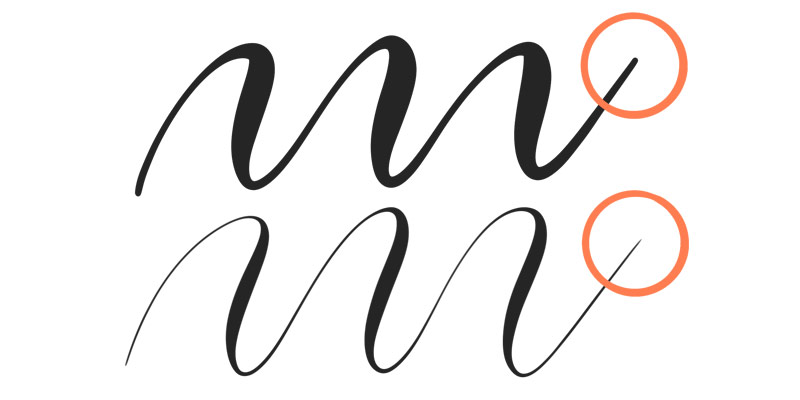
You can find your taper settings in a category of its own on the left. To have rounded ends, keep everything at 0.
To add points to the ends, adjust both the pressure taper and touch taper. Note there are two nodes that can be repositioned on the stroke images:

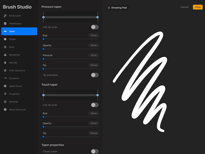
Pressure
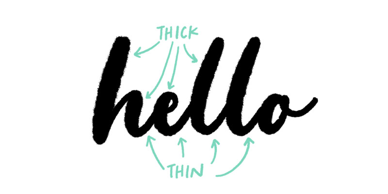
Pressure refers to how much your stroke weight varies based on the amount of pressure you put on your stylus. If you’re an experienced traditional calligrapher or hand letterer, you’re already familiar with thin and thick lines as they relate to your upstrokes and downstrokes.
In Procreate, use the pressure setting to make this happen digitally. There are two steps to getting this setting working the way you’d like. First, you need to define the change in size you’d like based on pressure. Once that is set, you need to define what the largest size you want to your brush to potentially go to as well as the smallest.
Step One: to set up size, tap on the Apple Pencil category on the left and increase the size percentage in the Pressure category at the top:
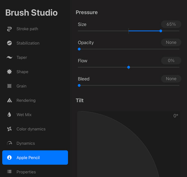
Step Two: now head into the Properties category on the left and locate the Brush Behavior area. Change the maximum and minimum size as desired.
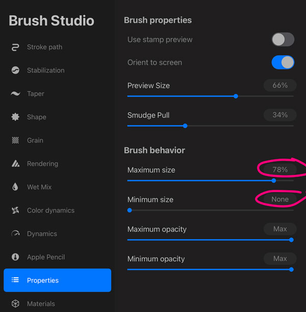
If your maximum and minimum are at max, you won’t notice any difference. The greater the distance between the two settings (max size being the larger one), the more obvious your size will change with pressure.
Tilt
Adjusting your tilt settings will make a major difference if you tend to hold your stylus at more of an angle vs. upright when you draw (think shading an area in with the side of a pencil’s tip). If you hold your stylus more upright, stick with the default 9º and see how you like it before altering.
You can find the Tilt settings in the Apple Pencil category on the left. You’ll notice a curve with an angled line you can adjust. Below it, you can also alter the amount of opacity, gradation, bleed and size based on that tilt.
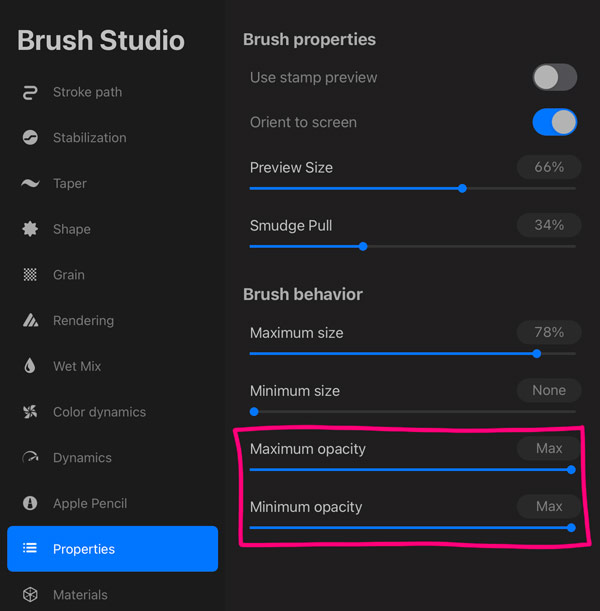
Brush Behavior
We touched on this earlier with our Pressure settings, but this is a setting you want to be familiar with when altering or creating custom lettering brushes. In the same way we altered size based on pressure, you can do the same with opacity, but it’s a two step process, once again utilizing the brush behavior area.
First, change the opacity percentage within the pressure settings:
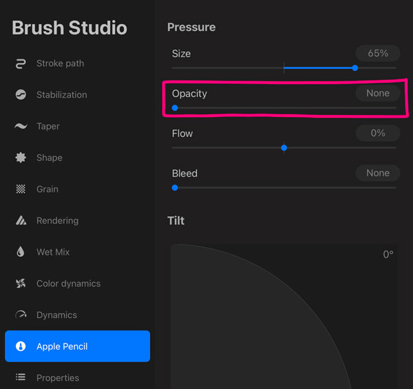
Next, head into the brush behavior settings once again and alter the opacity. If both are at max as shown, you won’t see any difference – they must be different for this to work.
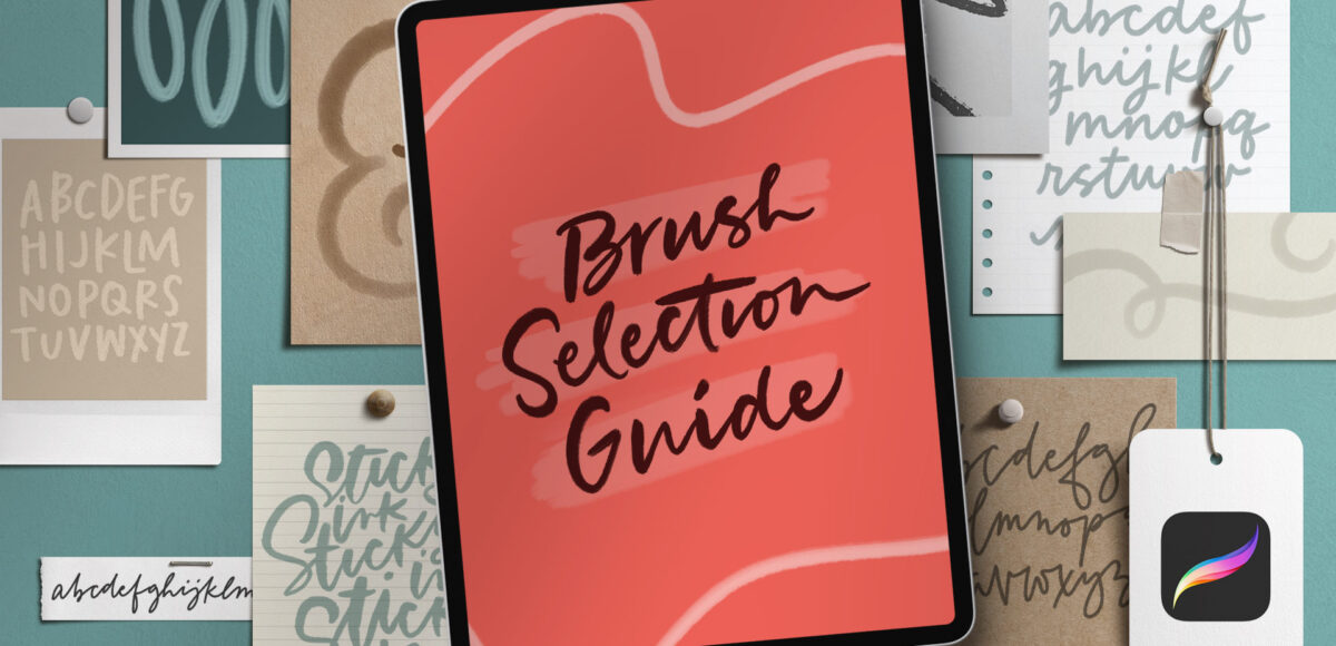
Brush Selection Guide: My Favorite Free and Premium Procreate Lettering Brushes
Mastering the art of creating thick and thin strokes is key to achieving visually stunning hand lettered compositions. Procreate offers a variety of default brushes programmed to specifically emulate the versatility of calligraphy and lettering pens and brushes.
Some of my favorite free default Procreate brushes for lettering and calligraphy are:
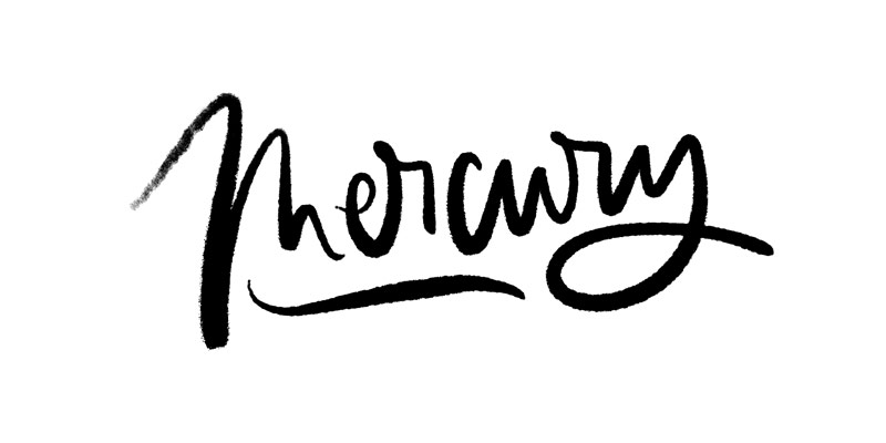
Mercury
where to find it: Inking category
why I like it: texture with low pressure gives it character, as well as the rough edges and high contrast pressure settings
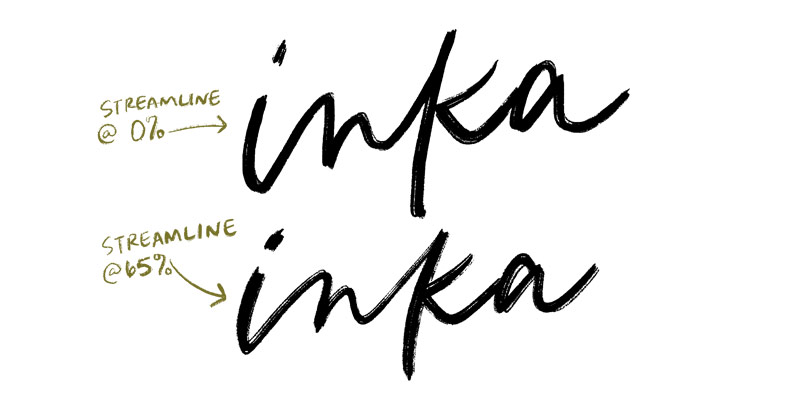
Inka
where to find it: Inking category
why I like it: really nicely defined texture that would vectorize well for font making.
what I’d change: the default doesn’t have a streamline set, so my preference is 65% which gives me much smoother lines, bringing out that texture even more
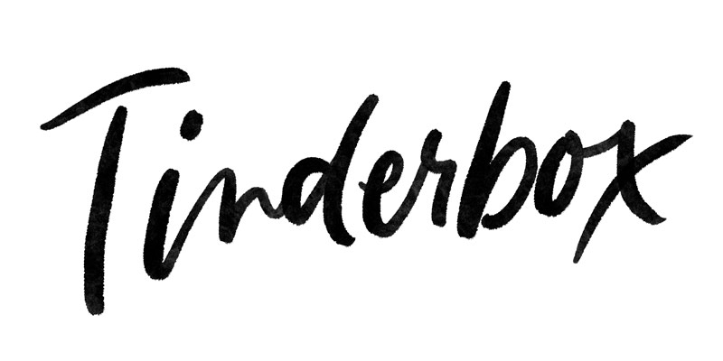
Tinderbox
where to find it: Inking category
why I like it: nice, subtle almost watercolor-like texture inside; easy to write without too much pressure contrast
what I’d change: Not crazy about the taper, so I may make those a bit more blunt
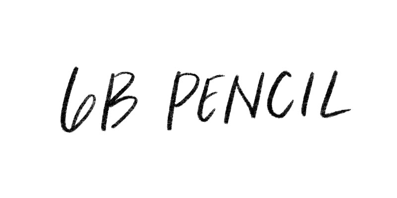
6B Pencil
where to find it: Sketching category
why I like it: nothing fancy – says exactly what it is. No streamline, so those shaky lines are charming for ipad lettering with a pencil. Great for a handwritten note feel.
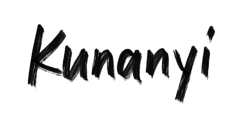
Kunanyi
where to find it: Calligraphy category
why I like it: if you’re looking for a messy brush for your lettering, put this on your list! The inconsistent texture is the cherry on top.
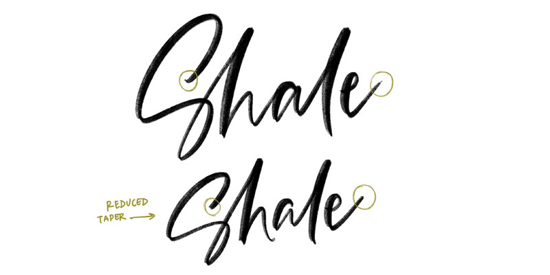
Shale
where to find it: Calligraphy category
why I like it: the reduced texture density along the left edge adds a lot of fun character as you letter
what I’d change: I’m personally not a fan of most pointed tapers, so I’d reduce it here
Practice with color changing brushes!
If you’re new to creating thick and thin strokes digitally, check out my Beautiful Lettering brush set which includes color changing practice brushes! You’ll notice the color changes based on pressure and the goal here is to have all of your down strokes to be thick and the same color and all of your upstrokes to be thin and the same color.
Once your colors are consistent, move on to the ‘pro’ versions of the same brushes which have a lower streamline setting and do not have the color change built in.
My go-to premium Procreate lettering brushes
As I’ve honed my lettering skills over the past 10 years, there were brushes I found myself using all the time and those that were fun, but I didn’t grab as often. When Procreate came out, I realized I could now create the lettering brushes of my dreams! Brushes that I never could find for traditional pen and paper lettering.
I meticulously programmed the following brushes to allow me to bring all of the lettering styles I had imagined to life. This is my personal dream collection of brushes and I continue to use these constantly. ✨
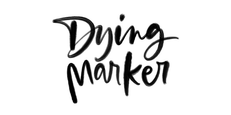
Dying Marker
where to get it: Ink Lovers Brush Set
why I like it: the marker may die, but my love of those streaky, messy + inconsistent textures never will!
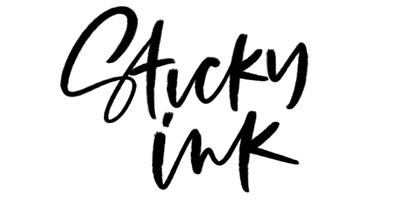
Sticky Ink
where to get it: Ink Lovers Brush Set
why I like it: I used to put sumi ink into a waterbrush to get custom inky brush stroke textures. It was a huge pain when the ink started to age, but that aging/sticky sumi ink brush stroke texture – couldn’t forget it.
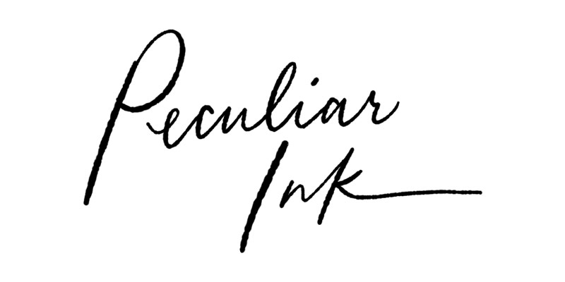
Peculiar Ink
where to get it: Ink Lovers Brush Set
why I like it: My ode to Jane Austen. Enough said 😍
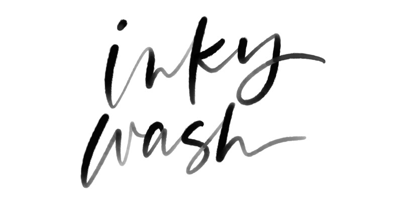
Inky Wash
where to get it: Ink Lovers Brush Set
why I like it: watered down ink is too pretty to not be represented and this is my favorite when I need that aesthetic!
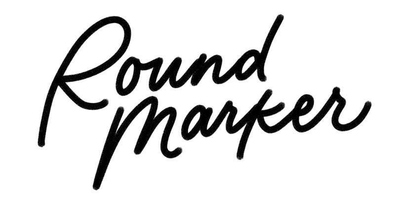
Round Marker
where to get it: Font Lovers Brush Set
why I like it: I like the way this brush makes me write. And that subtle grainy texture – especially as it gently fades at the ends – brings me joy every time.
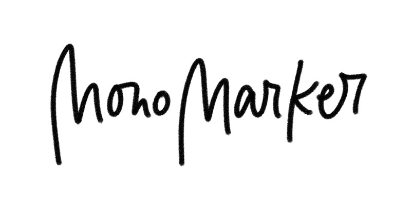
Mono Marker
where to get it: Font Lovers Brush Set
why I like it: a monoweight with grainy texture and rough edges? Obviously a must have.
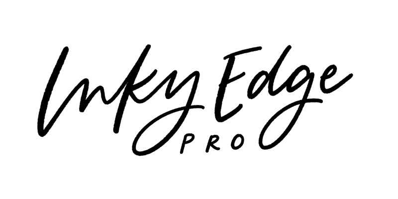
Inky Edge Pro
where to get it: Beautiful Lettering Brush Set
why I like it: this is one of my most used brushes. Just a hint of texture along the edge for character and it’s perfect for both lettering and doodling. This allows me to get a lot done without constantly switching between brushes when I’m working an idea out.
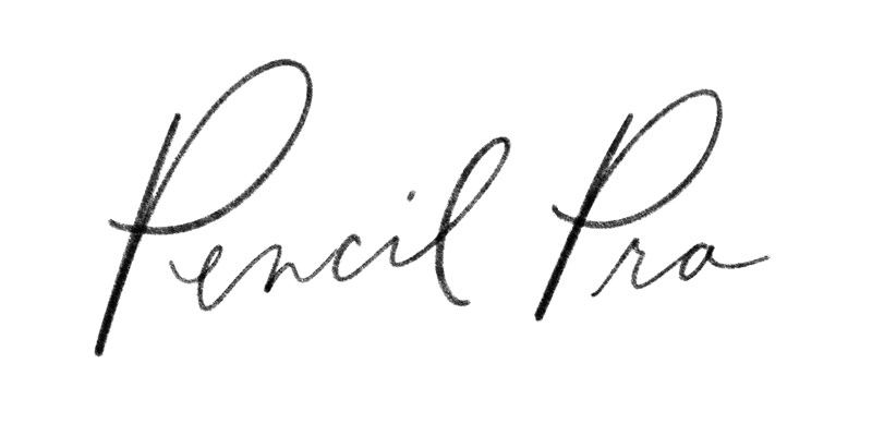
Pencil Pro
where to get it: Beautiful Lettering Brush Set
why I like it: this is my favorite lettering pencil brush. Everything you’d expect for a pencil’s texture, but with added streamline and denser graphite with pressure.
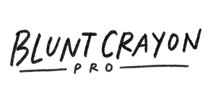
Blunt Crayon Pro
where to get it: Beautiful Lettering Brush Set
why I like it: when I want to create fun, more childlike lettering, I always try the blunt crayon pro first. I generally only use this one in all caps which makes the texture all the more obvious within those chunky strokes.
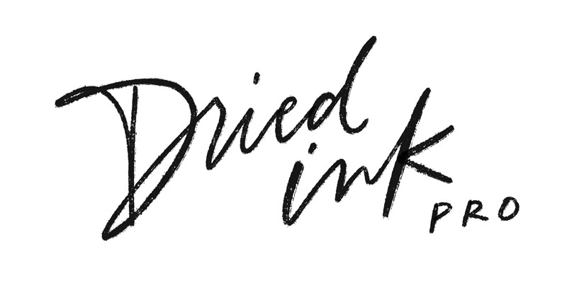
Dried Ink Pro
where to get it: Beautiful Lettering Brush Set
why I like it: Remember the movie ‘Drive’ with Ryan Gosling? The one with that horrendous title art? They should have hired a lettering artist and used this brush for it instead. That rougher edge aesthetic and low contrast stroke variation would have been perrrrfect. Just saying.
Which are your favorites?
Choosing brushes is all about having fun! Experiment with different brushes and practice controlling pressure on your stylus to achieve those eye candy, contrasted lines that bring your lettering to life. If you love a brush but need a slight tweak to a setting, now you know where to find it, too!
How Do You Start Hand Lettering?
Are you feeling overwhelmed yet? I promise there’s no need to be! If you’re a complete beginner, luckily, learning hand lettering can be broken down into simple steps and built upon as your hand lettering journey evolves. Here are some free resources and free lettering practice sheets to get you started.
Lettering for beginners: the basic strokes
This post includes a video tutorial as well as free printable and Procreate lettering practice sheets. Get comfortable with the 8 core hand lettering strokes to improve letter construction, then move on to creating your unique lettering style.
Lettering for beginners: basic lettering styles
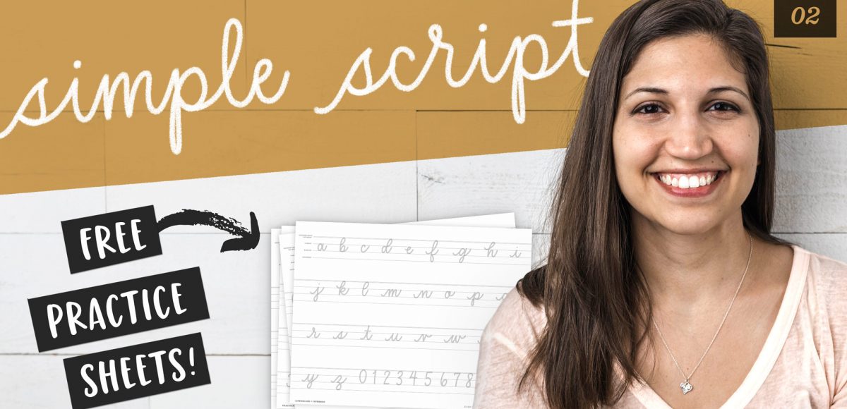
One of the best places to head after you have your core strokes down is the simple script style. This will build up muscle memory of the letterforms without the pressure (pun intended) of using varied weight strokes. This tutorial also includes free hand lettering practice sheets, so you’ll have everything you need.
How Do I Make My Hand Lettering Better in Procreate?
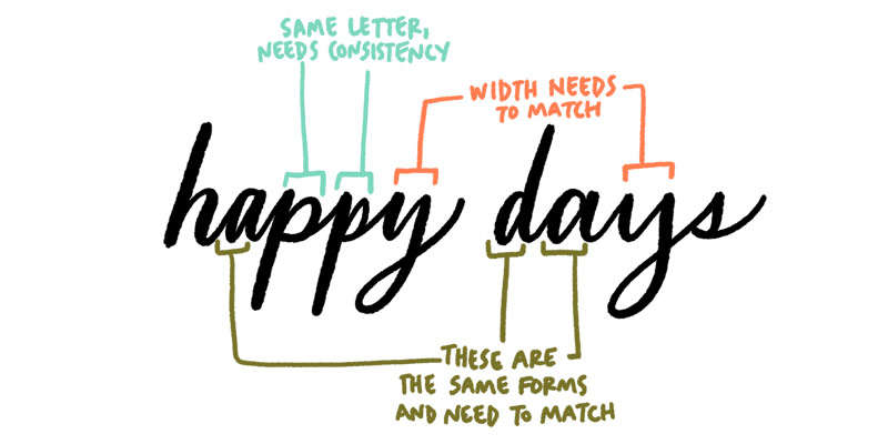
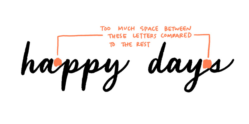
As with any skill, there are common pitfalls to watch out for when starting your hand lettering journey. Some of these include:
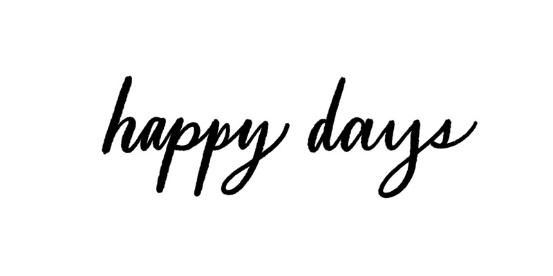
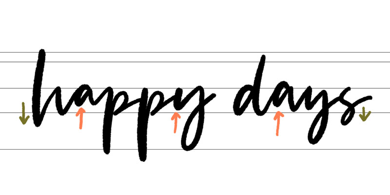
inconsistent letterforms:
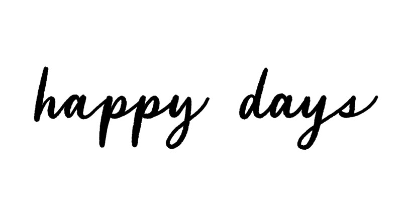
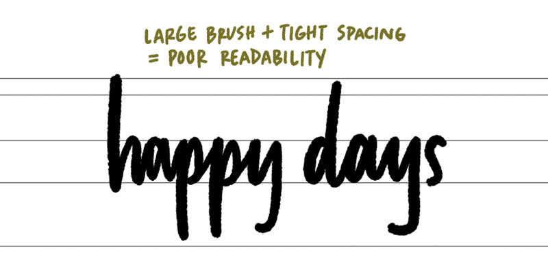
improper spacing:
and overly tight or rigid compositions:
Practice mindfulness and pay attention to the details, ensuring your hand lettering maintains a cohesive and balanced appearance.
Adding Personality to Your Hand Lettering
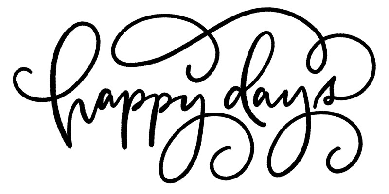
Hand lettering is a form of self-expression, allowing you to infuse your unique personality into each stroke. Explore different lettering styles, such as serif, sans-serif and script as well as infusing character, like bounce lettering:
flourishing:
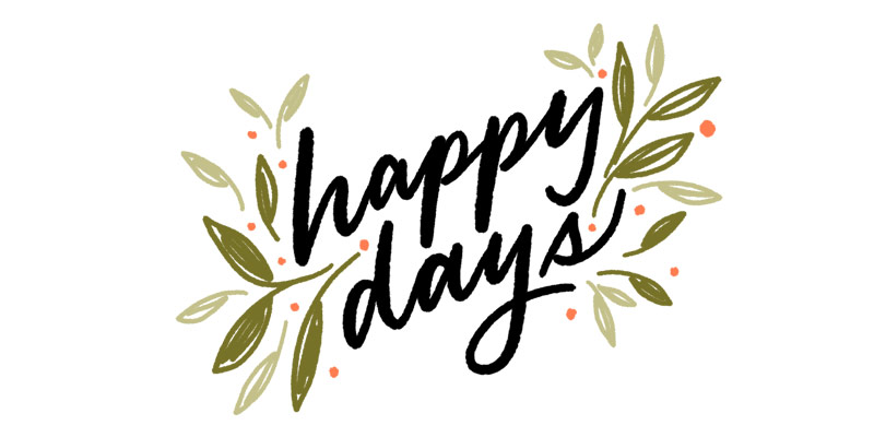
decorative embellishments:
and breaking common weight rules (be consistently inconsistent 😉):
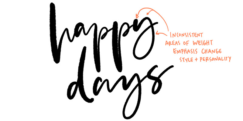
Focus on finding the ones that resonate with your unique vision. Don’t be afraid to experiment and combine different styles to create a signature look that sets your lettering apart.
Beyond the Hand Lettering Basics
If you’ve gone through my style studies series and you’re yearning for more, I’ve got you covered! In my online course, Beautiful Lettering, I take you from beginner to advanced lettering artist, sharing all of my tricks for developing trendy, sell worthy lettering styles.
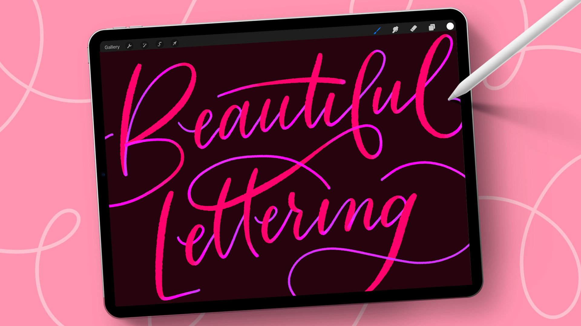
Create beautiful hand lettering projects and compositions alongside step by step videos, free practice sheets, brushes, flourishing and more. I originally coined the term Bounce Lettering in 2016 with the first course on it (fun fact!). In Beautiful Lettering in Procreate, I included an updated process for this now incredibly popular style and all of my best tips for achieving unforced, beautifully bounced, dancing letters. Master hand lettering and have fun creating sellable lettering styles at the same time.
How to Monetize Your Hand Lettering
Hand lettering is a skill that can be easily monetized and immediately set you apart as an artist! To get you started, here are a few ideas of how you can monetize this coveted skill:
Convert your hand lettering into sellable fonts and create passive income streams. Here’s how!
Incorporate into stationery designs to add personality and charm
Custom hand lettered logos
Freelance as a hand lettering muralist and custom signage artist
Sell svgs of your lettering as stand alone words and phrases to add to your passive income
Freelance custom lettering for clients (names, events, locations, special occasions, etc.)
Incorporate your lettering into designs you add to products (print on demand sites like Society6 are a great place to start!)
Create custom lettering and illustration compositions you license to companies
Offer it as an add on for freelance clients – need a logo? would you also like a custom hand lettered tag line?
Add to your graphic designs: product designs, social media, ads, event designs, packaging, etc.
Next Steps
To think you came here to learn more about lettering brushes, but now you’ve got a full roadmap to becoming a master hand letterer with multiple lettering passive income streams 🤩
With consistent practice, dedication, and the right tools at your disposal, you’ll be on your way to creating beautiful hand lettering compositions that showcase your unique style and captivate audiences. It’s time to grab your stylus and start lettering!
Receive special offers on courses + products, a new design file every month plus instant access to the Resource Library!

Pick up over 50 design + lettering files as our gift to you when you join the Tuesday Tribe for free!
error
Congrats!
Please check your email to confirm.
You May Also Enjoy
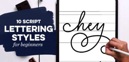 10 Easy Script Lettering Styles for Beginners Posted in Typography, Hand Lettering, Fonts, iPad Lettering, Style Studies
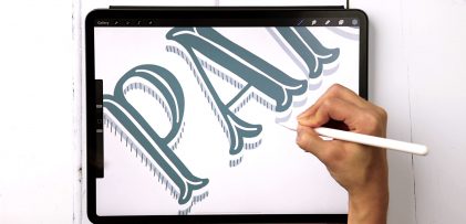 Decorative Serif Lettering in 4 Steps Posted in Tutorials, Typography, Hand Lettering, iPad Lettering, Style Studies
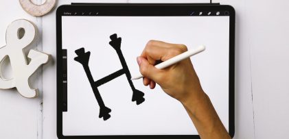 Serif + Sans Serif Lettering the RIGHT Way Posted in Tutorials, Typography, Hand Lettering, Beginner, Style Studies
 Style Studies: Simple Script (+ Free Practice Sheets!) Posted in Freebies, Tutorials, Hand Lettering, Printables, Beginner, Procreate, Style Studies
Ingrid Johnson | June 6, 2023
|
Hi Teela
I am really happy that you have such talent and skills in what you do re art on a whole
I do enjoy watching what you share and hoping that one day I will be able to grasp all the concepts and become an artist. Still learning. Thanks.. Blessings
Teela | Author | June 6, 2023
|
Thank you for being here!
Tim | June 6, 2023
|
Wow, a lot of very useful info!! THANKS !!
I’ll be keeping this for review/reminders as I tackle getting go know Procreate.
m-u-c-h appreciated !!
Tim
Teela | Author | June 6, 2023
|
Thanks, Tim!
Lori | June 6, 2023
|
I love all of this very useful information. Thank you Teela! ❤️
Teela | Author | June 6, 2023
|
Thanks so much for checking it out!
Heidi | June 28, 2023
|
So much great information and your tutorials are always so well-explained. Thank you!