Many of you know I teach a course on converting your hand lettering into a professional, sellable font. But what if you’re new to lettering and want to create a font? In this new monthly series, called Hand Lettering Style Studies, I will guide you through all the steps to create modern lettering styles that are on trend, with practice sheets included! Each month, a new video will be released plus *free* practice guides. If there’s a style you’d like to see in a future video, please leave it in the comments section! First up for this month: every hand lettering stroke you’ll ever need! Read on for the video + free practice sheets!
Pin it for later
Every Hand Lettering Stroke You’ll Ever Need (+ Free Practice Sheets!)
Mentioned in this video:
- This video was brought to you by Creative Market! Download their free goods of the week + pick up other high quality design graphics here!
Using an iPad:
- Procreate Signature Brush (free when you become a Tuesday Tribe member!)
- Looking for more Procreate lettering brushes? Here are my favorites 🙂
Using paper:
- Tombow Fudenosuke Hard
- Tombow Fudenosuke Soft
- I recommend placing tracing paper on top of the practice sheets so you can reuse them over and over! This is my favorite tracing paper.
Here are those free practice sheets I mentioned (click on the image to download):
If you’re already a free Tuesday Tribe member, you can pick them up asap in the Resource Library!
Ep.1: Core Strokes
Procreate practice sheets
- File type: procreate
- Size: 5.1MB
- Minimum software version: 4.0
Ep.1: Core Strokes
printable practice sheets
- File type: pdf
- Size: 676kb
- Minimum software version: n/a

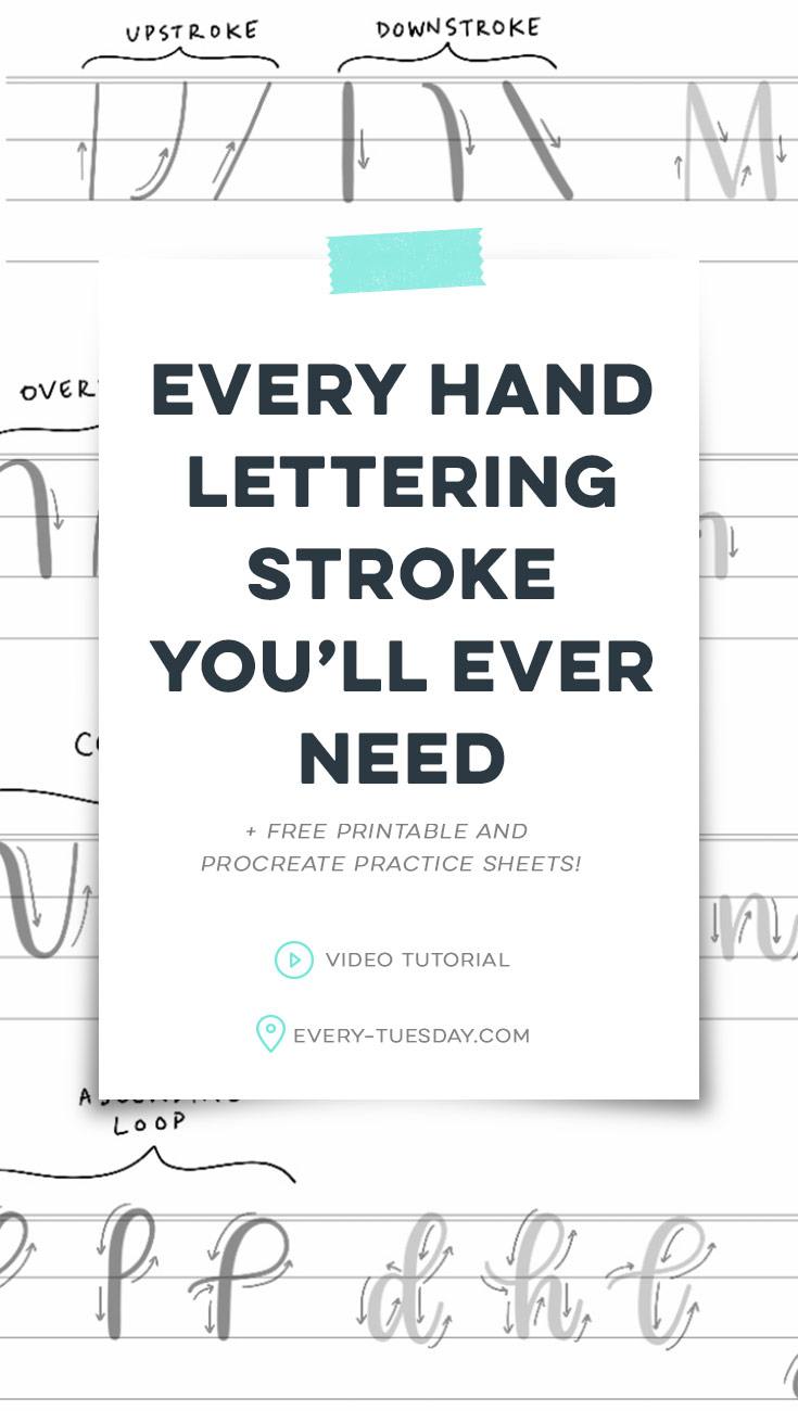
Here’s a quick written overview of every hand lettering stroke you’ll ever need:
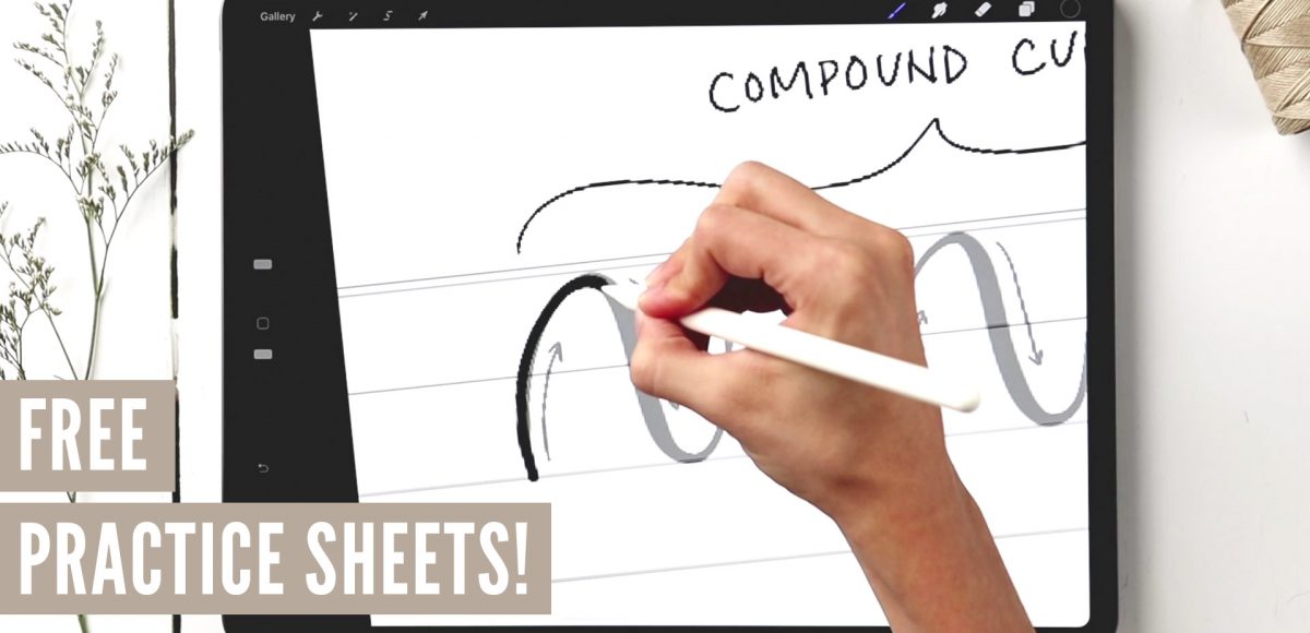
- There are 8 strokes: upstroke, downstroke, overturn, underturn, compound curve, oval, ascending loop and descending loop. Mastering these strokes will allow you to create uniform, well structured and consistent lettering for all of the styles you create in the future.
- Keep the same thickness and thinness throughout all of your letterforms for maximum consistency. Get comfortable with the amount of pressure you use for each. The more you practice, the quicker and easier this will become.
- Pay close attention to areas that transition from thick to thin or thin to thick. You want to avoid any abrupt changes in pressure; it should always be a smooth transition.
- Practice, practice, practice! These strokes will become fine tuned muscle memory the more you use them.
- See you next month for episode 2!
Receive special offers on courses + products, a new design file every month plus instant access to the Resource Library!

Pick up over 50 design + lettering files as our gift to you when you join the Tuesday Tribe for free!
error
Congrats!
Please check your email to confirm.


Jenny | October 22, 2019
|
Hi Teela! I would love to learn how to hand letter ornamental style letters (I think it’s sometimes referred to as Western fonts too), here’s an example: https://www.designtrends.com/graphic-web/fonts/western-font.html and also hand lettered block lettering like this: https://templatetrain.com/product/angeles-sans-serif-font/ and a serif hand lettered font please! I don’t have an iPad Pro, so I’m not using Procreate, so if possible it would be great to be shown how to draw these fonts with pencil/pen/marker on paper. I’m one of your students on your font making course btw, but I haven’t started it yet as I’m still learning how to do calligraphy (I’m enrolled in a lot of courses by Loveleigh Loops) and hand lettering, so this new tutorial series you’ve created is perfect for me!
Teela | Author | November 1, 2019
|
Yay! Thanks Jenny! Those links + your feedback are super helpful! I definitely plan to also show the written version with future videos, so it’s great to hear that you’d like to see that. Basic serif/sans serif is coming in December’s episode, then more decorative styles will follow those (had to get the basics in first!). I will definitely put what you mentioned on my list!
Amy | October 23, 2019
|
Hi Teela! Brand new here… I am using your Signature Brush with an apple pencil, but I can’t get the same wide ratio of thin-thick lines that your video shows. I also had this problem with the Flat Marker used in your Skillshare videos. My heaviest/thickest line just isn’t much thicker than my lightest/thinnest no matter how light or heavy I press. Could something be wrong with my settings? Or pencil? Any suggestions?
Teela | Author | November 1, 2019
|
Hey Amy!
Which iPad are you on and are you using an Apple Pencil?
Ksenia Carvalho | October 26, 2019
|
Teela, hi!
This is extremely useful! Thank you very much!
But I have a little problem: when I downloaded the file to Procreate it opened in portrait mode instead of the landscape one. Of course I could rotate the layers one by one but can I rotate all of them at once?
Teela | Author | November 1, 2019
|
Hey Ksenia! Return to your gallery, then tap back into the file and all should appear as you’d like 🙂
Roberta | October 30, 2019
|
Hi, i cant download the procreate file from my ipad… is that normal?
Teela | Author | November 1, 2019
|
Hey Roberta! You should be able to download it without any issue – Chrome is the easiest browser to download it if you’ve upgraded to ios13 (you’ll see it appear at the very bottom of your screen after you hit the download icon)
Lynda | September 30, 2021
|
Hi Teela! I am using your Signature Brush with an Apple Pencil 2 on the iPad Pro 12.9 5th gen, but am getting the same results as Amy from the above posts: I can’t get the same wide ratio of thin-thick lines that your video shows. My heaviest/thickest line just isn’t much thicker than my lightest/thinnest no matter how light or heavy I press. Could you help with this?
Teela | Author | October 4, 2021
|
Just replied to your email! 🙂