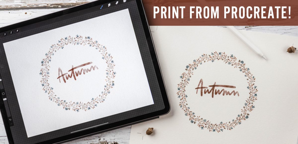
This is one of those questions that has a lot of variables, so I’m sharing my process specifically this week. The main variables include what kind of monitor you have, what kind of printer you’re using and what type of paper you’re printing on. There are SO many different combinations of those three items that it’s difficult to say, ‘do this and you’re set!’ I’ll break down everything to keep in mind, though, and share my best tips for how to print artwork from Procreate. Read on to see all my tips!
Pin it for later!
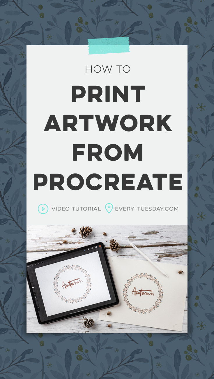
How to Print Artwork from Procreate
Mentioned in this tutorial:
- Canon printer scanner combo MG3620
- Canson watercolor paper (cut down to the size needed)
- Datacolor SpyderX Pro (for calibrating your monitor’s color)
- Photoshop (free trial available here)
- Last week’s tutorial: Paint a Fall Watercolor Wreath in Procreate
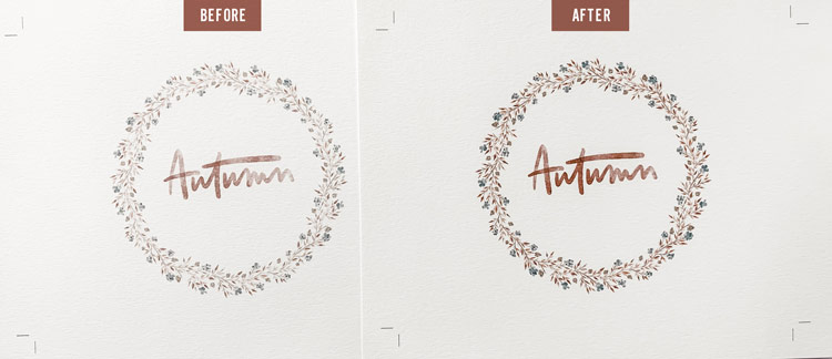
Here’s a look at the before and after for how to print artwork from Procreate. The before is printing straight from Procreate (no adjustments). The after is once a color calibration is made to the monitor and adjustments are made in Photoshop (levels, contrast, saturation + color balance).

Here’s what we did to print artwork from Procreate!
- You’ll first want to export your Procreate artwork as a psd from Procreate. Airdrop or email the file to yourself, then head to the computer and open that file up in Photoshop.
- In the video, you see me getting started by color calibrating my monitor with the SpyderX Pro. If you plan to print and sell work you originally make in Procreate, the SpyderX Pro is a gigantic help! I had no idea my own monitor naturally appeared more blue, so my printed artwork would always be a little off from what I was trying to match on my monitor. Calibrating your monitor’s color helps you to more accurately see + adjust your colors for print.
- Once your monitor is color calibrated, return to that opened file in Photoshop. If you used a watercolor paper texture in your file like I did, turn that layer off in Photoshop.
- Apply adjustments as needed. I originally used a levels and contrast adjustment.
Printing Process
- Print your artwork out on your printer. I cut down my Canson watercolor paper to the size needed. In my print settings, I set my quality/media to matte photo paper and upped the quality print to just under ‘high’. If you’d like to save on ink or paper, you can print a section of the artwork instead of the full piece; I liked getting an idea of my full piece (since it was small in size anyway), so I printed everything as if it were final.
- Take a look at your printed piece in good light and take notes of what still needs to change. This will likely never be perfect the first time, since different printers will print differently. What you see on your monitor also many not always be achievable with printer inks. After seeing my first print, I decided I needed to add some yellow to my piece (via a color balance adjustment) to make it feel more fall-like and get my orange areas to pop more. I also wanted my colors to appear more saturated, so a saturation adjustment was also needed.
- Make those adjustments and print again. Repeat as necessary.
- Violá! A beautiful printed piece originally made in Procreate!
Receive special offers on courses + products, a new design file every month plus instant access to the Resource Library!
Pick up over 50 design + lettering files as our gift to you when you join the Tuesday Tribe for free!
error
Congrats!
Please check your email to confirm.
You May Also Enjoy
 Create a Paper Cut Out Effect in Procreate Posted in Tutorials, Typography, Hand Lettering, iPad Lettering, Advanced, Procreate
 Create Easy Ribbons in Procreate Posted in Tutorials, Hand Lettering, iPad Lettering, Beginner
 New Course! Watercolor Lettering in Procreate Posted in Hand Lettering, Courses, iPad Lettering, Beginner, Watercolor
 Create Peeling Polaroids in Procreate Posted in Tutorials, Hand Lettering, iPad Lettering, Beginner, Procreate
Patricia Larenas | October 15, 2019
|
Hi Teela- just a quick question: did you have any layers selected in photoshop when you made the adjustments? Or were the layers grouped so that the adjustments affected all layers at once?
abundant thanks for your always helpful lessons! I really needed this one as I’m trying to solve how to do color calibration- yay!
Patricia
Teela | Author | October 16, 2019
|
Hey Patricia! Nope, no layers selected, just make sure your adjustments are at the very top of your layers palette (so have the top-most layer selected before you start adding in adjustments) – then the adjustments you make will be applied to all layers underneath them 🙂
Sarah | October 30, 2019
|
Why is it necessary to print from photo shop? Can you not print directly from Procreate?
Teela | Author | November 1, 2019
|
You can, but you should never expect your printing results to come as close to what you see on screen unless you follow the Photoshop steps.
Lisa | October 30, 2019
|
Thanks for the great tutorial! I always get stuck on color management no matter how much I read about it…
I noticed you have yours set as “Printer Manages Color”, is that how you always do it?
(Loved your interview on the Honest Designer’s Podcast! I appreciate you sharing your story)
Teela | Author | November 1, 2019
|
Hey Lisa! Yep! That’s how I always have mine 🙂 Thanks for checking out the podcast!
Saundra | July 13, 2023
|
If you weren’t printing a watercolor piece out on to actual watercolor paper, or if you are using a pod service (card isle, printify etc), would you leave the watercolor paper texture on? When I printed on regular matte paper, the version that included the texture layer came out muddy. Any advice?
Teela | Author | August 16, 2023
|
Totally personal preference! If you do a test print at home and aren’t crazy about it, take it off before printing with an online service