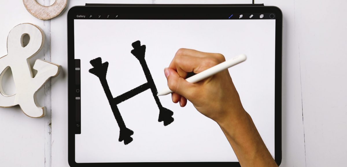
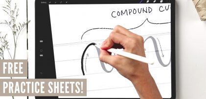
Welcome to Episode 3 of Style Studies! This month, we’re finishing the foundations portion of this series so you’ll be prepared for all of the more decorative + modern styles coming next year! Getting a solid understanding of basic serif and sans serif styles will be something you can always rely on in design layouts in the future. I can’t emphasize enough how much I’ve used what I’m sharing in this episode throughout my career. They may not be the sexiest styles, but they’re the most reliable ones you’ll ever use. As with every episode, printable and Procreate practice sheets are included for free, below. So let’s jump in to how to create serif + sans serif lettering the right way!
Pin it for later!
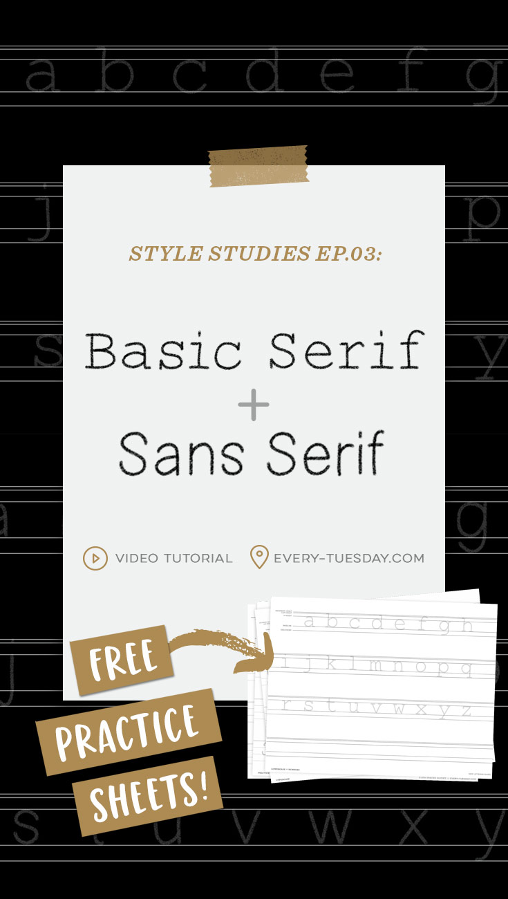
Serif + Sans Serif Lettering the RIGHT Way
Mentioned in this video:
- Microns (or any hard fineliner)
- Free Monoweight Brush (when you become a free email subscriber)
- Mono Marker
- Past Style Studies episodes can be found here
Ep. 3 Style Studies: Sans Serif
Style Studies - Ep.3: Sans Serif Printable
Sans serif printable practice sheets
- File type: PDF
- Size: 1.1 mb
- Minimum software version: n/a
Style Studies - Ep.3: Sans Serif Procreate
Sans serif Procreate practice sheets
- File type: procreate
- Size: 11.6 mb
- Minimum software version: 4
Ep. 3 Style Studies: Serif
Style Studies - Ep.3: Serif Printable
Ep.3: Serif Printable
- File type: PDF
- Size: 1.2 mb
- Minimum software version: n/a
Style Studies - Ep.3: Serif Procreate
Ep.3 Procreate practice sheets
- File type: procreate
- Size: 12 mb
- Minimum software version: 4

Here are some quick takeaways for serif + sans serif lettering the right way:
Sans Serif
- Highly geometric with oval counters and bowls
- Strict adherence to guidelines
- Consistent/uniform in weight
- Feeling is informational
- Versatile for both headlines and supporting text. Scientific research has shown sans serif is best for readability of long blocks of text for viewing on screen.
Basic Serif
- Highly geometric with circular counters and bowls
- Strict adherence to guidelines
- Consistent/uniform in weight
- Serifs + letter thicknesses are the same for the slab style
- Feeling is informational
- Versatile for both headlines and supporting text. Scientific research has shown serif is best for readability of long blocks of text in print.
Other historical variations of serifs:
- Old Style: low contrast, bracketed serifs
- Transitional: slightly more contrast than in Old Style, bracketed serifs
- Modern: high contrast, bracketed or unbracketed serifs
- Slab: no contrast, unbracketed
Receive special offers on courses + products, a new design file every month plus instant access to the Resource Library!

Pick up over 50 design + lettering files as our gift to you when you join the Tuesday Tribe for free!
error
Congrats!
Please check your email to confirm.


No comments