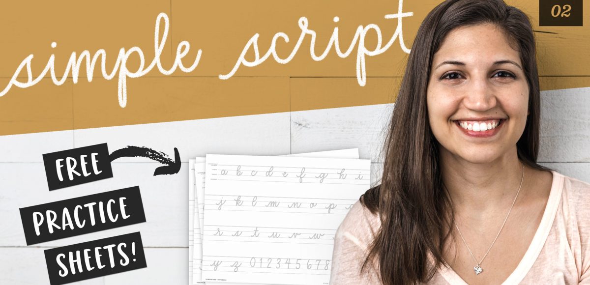
Welcome to episode no.2 of my new monthly series, Hand Lettering Style Studies! If you missed episode 1, you can catch it here 😉 This week, we’re talking about the simple script lettering style. This one is really important if you plan to create any variation of script lettering in the future. You’ll learn all of the basics: how each script character is formed, the order of the strokes and how to keep the style consistent. Refer to the style overview for the best applications to use this style on, too! Grab the free printable and Procreate practice sheets below to follow along!
Pin it for later!
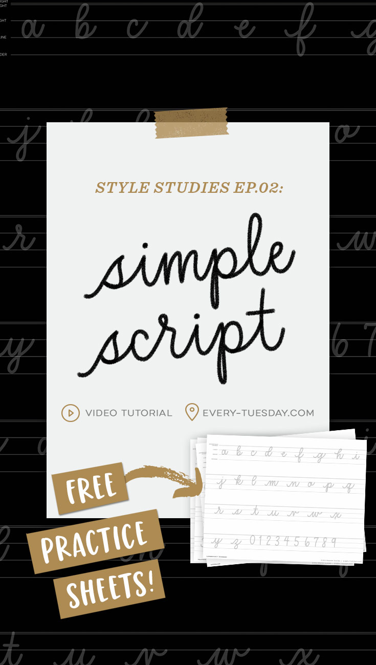
Style Studies: Learn the Simple Script (Free Practice Sheets!)
Mentioned in this video:
- This video was brought to you by Creative Market! Download their free goods of the week + pick up other high quality design graphics here!
Using an iPad:
- Procreate Monoweight Brush (free when you become a Tuesday Tribe member!)
- Mono Marker (part of my Font Lovers Procreate Lettering Brush Set)
Using paper:
- Sakura Microns
- Arteza Fineliners
- Tombow Mono Drawing Pens
- Or any fineliners (hard tip pen) you love!
- I recommend placing tracing paper on top of the practice sheets so you can reuse them over and over! This is my favorite tracing paper.
Here are those free practice sheets I mentioned (click on the image to download):
If you’re already a free Tuesday Tribe member, you can download them directly from the Resource Library!
Printable
SS - Ep.2: Printable
printable practice sheets
- File type: PDF
- Size: 711 kb
- Minimum software version: n/a
Procreate
SS - Ep.2: Procreate
Procreate practice sheets
- File type: procreate
- Size: 5mb
- Minimum software version: 4.0

Here’s a quick written overview of the simple script lettering style:
- This style has a monoweight thickness (no variation in stroke weight), which makes it perfect for beginners.
- It has a very friendly and approachable feel. It’s extremely versatile because of its approachability, simplicity and readability.
- Ideal applications to use it on include greeting cards, branding, invitations and packaging.
- The most difficult parts of executing this style is keeping all of your letters upright and any characters that include the ‘oval’ stroke (see episode 1), need to be consistent in width.
- Vary up the thickness of your fineliner’s tip for bolder or lighter weight outcomes (perfect for mixing with other lettering styles).
- See you next month for episode 3!
Receive special offers on courses + products, a new design file every month plus instant access to the Resource Library!

Pick up over 50 design + lettering files as our gift to you when you join the Tuesday Tribe for free!
error
Congrats!
Please check your email to confirm.



Sahar Heumesser | November 28, 2019
|
I cant wait for Episode.03 🙂 LOVE this series. tnx for the input.