HomePosts Tagged "initial"

initial Tag

I remember sitting in my Color Theory 2 class at SCAD (12 years ago!) and we were given an assignment we had to use gouache for. ‘Gouache?’ I thought, “Can’t be that different from acrylics, can it?”

It was the first time I had ever heard of it, let alone had any knowledge of how to use it. Since sitting in that classroom that day, I learned that 1. yes, it is definitely different than acrylics and 2. it’s actually pretty amazing.

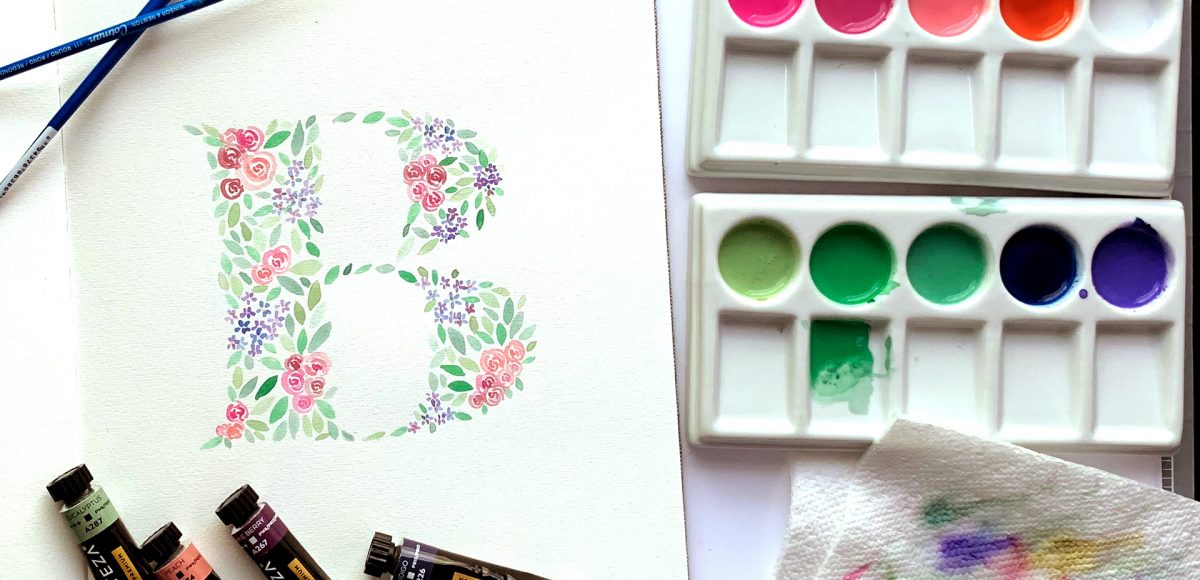
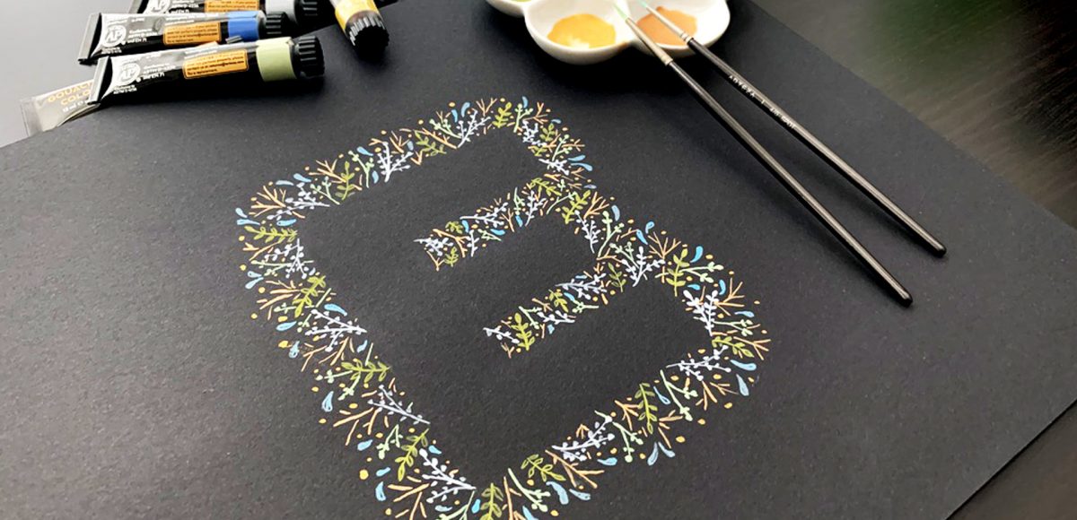
In this week’s tutorial, I’m taking you through gouache basics – how to mix colors, water ratios + what makes it so amazing to work with. Together, we’ll paint leafy gouache letters (or shapes!) that can be used for wall art, stationery or gifts! Read on to see it all!

In the US, Mother’s Day falls on May 12th this year. After giving birth to our daughter on December 28th, this will be my first Mother’s Day as a mom! I wanted to celebrate by creating artwork that can be used as a greeting card as well as wall art! In this week’s tutorial, I share my process on how to paint a watercolor floral initial. All you need is your favorite font, watercolors and some watercolor paper. No prior watercolor floral skills necessary! Read on to see how!

Welcome to Part 2 of how to create 3D typography from scratch! In this final video, we take everything we created in Part 1 using Illustrator and bring it into Photoshop. Using Photoshop, we’ll add custom shadows and texturize those shadows to add extra visual interest and dimension. At the end of this video, you’ll have your own custom, print ready 3D typography you can use for social media profiles, posters, prints and monogrammed stationery. Let’s get started!

Happy Tuesday! First of all, I have to tell you that I’ve been completely overwhelmed by all of the kind comments from last Friday’s post. My heart is bursting with gratitude. Thank you so very much for making this past weekend one I’ll never forget!

My co-workers gifted Spencer and I this amazing typography book as a going away gift last week and I have a serious problem with putting it down! There’s something that completely pulls you in when you lay eyes on the shadow type in the book – each layer so carefully planned, highlights and shadows in perfect contrast with one another along each angle and curve. Handmade type back in the day was so killer. I’m jealous of those craftsmen and craftswomen type masterminds. Of course, I couldn’t help myself with creating my own, digital form, inspired by pages from the book. In this week’s tutorial, we’ll create our own multi-layered 3D typography from scratch in Illustrator. In part 2 next week, we’ll bring that typography into Photoshop to add texture and enhance highlights + shadows to complete our type. Let’s gets started!

GDPR Icon

Your Privacy Matters

We use cookies to customize and create content that’s most important to you. We’ll never share the info we collect.

View Privacy Policy