HomePosts Tagged "serif"

serif Tag

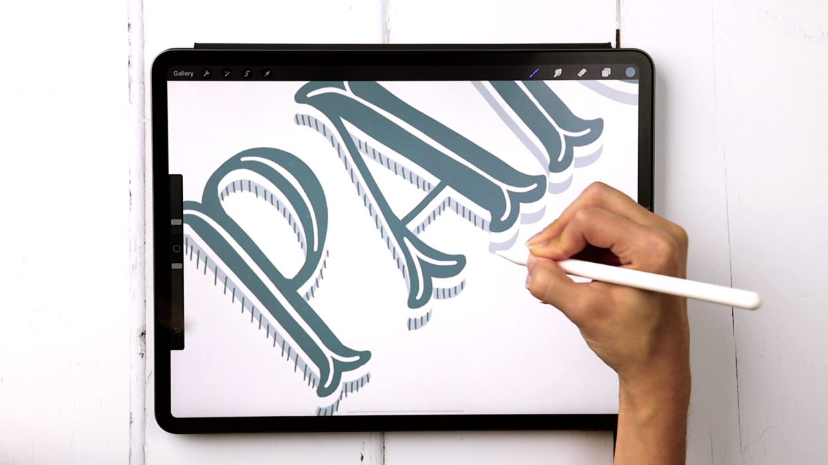
Welcome to episode 4 of Style Studies! Style Studies is my monthly series where I walk you through a popular hand lettering style and provide free printable and Procreate practice sheets so you can follow along! This month, we’re diving into decorative serif lettering in 4 easy steps with a style I’m calling Party Slab. This style is a heavy slab serif, that lends itself well to extra decoration, like inline details and creative shadows. It’s best used in headlines, set in all caps and has a festive and fun feeling. Read on to grab the practice sheets and create it yourself!

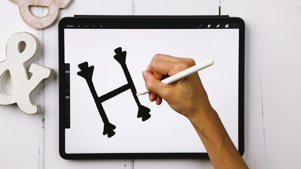
Welcome to Episode 3 of Style Studies! This month, we’re finishing the foundations portion of this series so you’ll be prepared for all of the more decorative + modern styles coming next year! Getting a solid understanding of basic serif and sans serif styles will be something you can always rely on in design layouts in the future. I can’t emphasize enough how much I’ve used what I’m sharing in this episode throughout my career. They may not be the sexiest styles, but they’re the most reliable ones you’ll ever use. As with every episode, printable and Procreate practice sheets are included for free, below. So let’s jump in to how to create serif + sans serif lettering the right way!

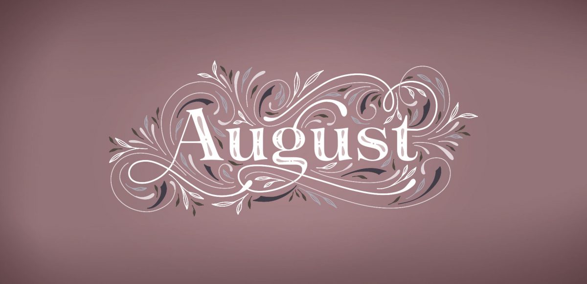
It’s the last day in July, which means it’s time for your free August 2019 desktop wallpapers! This month’s wallpaper was entirely created in Procreate, with just the dates added in using Photoshop and my font, Miss Magnolia. For more on Procreate flourishing + basics, check out my free course, Procreate for Beginners! I really enjoyed altering my flourish style a bit for July’s wallpaper, so I wanted to play around some more for August! All of the lettering + doodles were made using my free Procreate Monoweight Brush (available in the Resource Library). For the dates, ‘R’ is for Thursday, to distinguish it from a same-sized Tuesday ‘T’ at a glance. 

The download includes the August 2019 desktop wallpapers in two common resolutions: 1280x1024px and 1920x1080px, with and without dates. I’ve left the year off of the ‘no-dates’ versions, so you can use it for any August in the future, too!

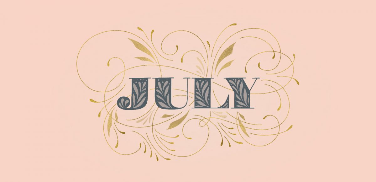
It’s the last Thursday in June, which means it’s time for your free July 2019 desktop wallpapers! This month’s wallpaper was entirely created in Procreate, with just the dates added in using Photoshop and my font, Miss Magnolia. If you checked out my free course, Procreate for Beginners, you saw me creating flourishes in the second project. This month, I wanted to go a little crazier with my flourishing and make it fancy with a touch of gold 😉 The gold is from my Procreate metallic texture kit and you can learn more about flourishing here. All of the lettering + doodles were made using my free Procreate Monoweight Brush (available in the Resource Library). For the dates, ‘R’ is for Thursday, to distinguish it from a same-sized Tuesday ‘T’ at a glance. 

The download includes the July 2019 desktop wallpapers in two common resolutions: 1280x1024px and 1920x1080px, with and without dates. I’ve left the year off of the ‘no-dates’ versions, so you can use it for any July in the future, too!

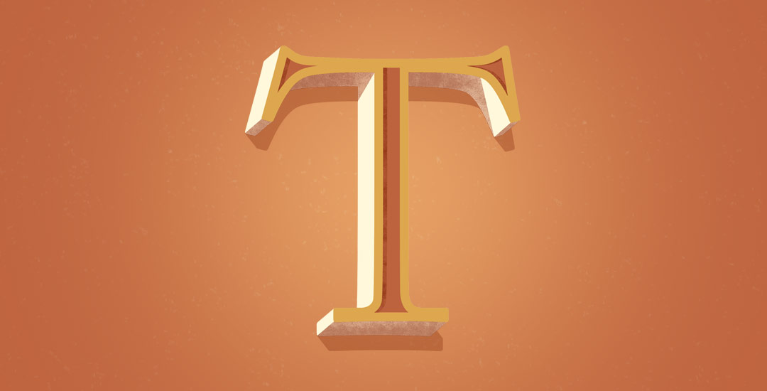
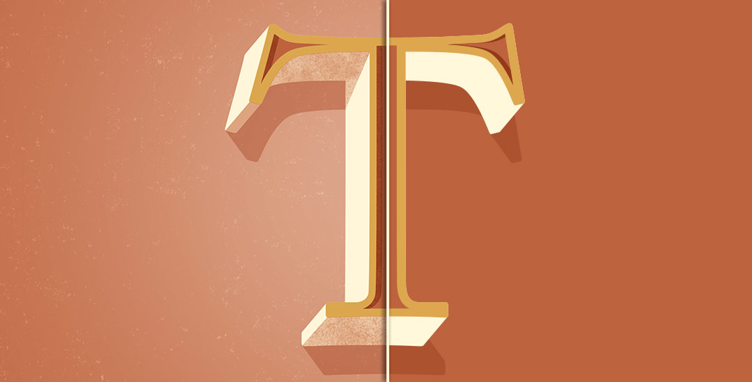
Welcome to Part 2 of how to create 3D typography from scratch! In this final video, we take everything we created in Part 1 using Illustrator and bring it into Photoshop. Using Photoshop, we’ll add custom shadows and texturize those shadows to add extra visual interest and dimension. At the end of this video, you’ll have your own custom, print ready 3D typography you can use for social media profiles, posters, prints and monogrammed stationery. Let’s get started!

Happy Tuesday! First of all, I have to tell you that I’ve been completely overwhelmed by all of the kind comments from last Friday’s post. My heart is bursting with gratitude. Thank you so very much for making this past weekend one I’ll never forget!

My co-workers gifted Spencer and I this amazing typography book as a going away gift last week and I have a serious problem with putting it down! There’s something that completely pulls you in when you lay eyes on the shadow type in the book – each layer so carefully planned, highlights and shadows in perfect contrast with one another along each angle and curve. Handmade type back in the day was so killer. I’m jealous of those craftsmen and craftswomen type masterminds. Of course, I couldn’t help myself with creating my own, digital form, inspired by pages from the book. In this week’s tutorial, we’ll create our own multi-layered 3D typography from scratch in Illustrator. In part 2 next week, we’ll bring that typography into Photoshop to add texture and enhance highlights + shadows to complete our type. Let’s gets started!

GDPR Icon

Your Privacy Matters

We use cookies to customize and create content that’s most important to you. We’ll never share the info we collect.

View Privacy Policy