
Welcome to week #4 of the Every-Tuesday Font Project! See the previous 3 weeks here. This past week was spent vectorizing the lowercase portion of the alphabet in Illustrator in the same manner the uppercase was vectorized last week. Since the uppercase portion has a pretty smooth/clean aesthetic compared to the original live trace, I worked to maintain that same cleanliness with similar weight contrasts throughout the lowercase. One of the biggest lessons this week was that creating consistency throughout the lowercase is definitely more challenging than with the uppercase. There are far more details in the lowercase letterforms that you don’t really realize until you get into it. For example: the weight contrasts and curvature of the ‘c’ should be the same as in the lowercase ‘o’ should be the same in the lowercase ‘e’, etc. This created quite a few differences in the original drawn letters to the cleaned versions, but when placed together to form simple words, the font really started to come to life! The personality I had intended is coming through and it has me really excited about getting this into Glyphs Mini. As with last week, I took a bunch of timelapse videos of my Illustrator work where you can see me pulling portions of other letterforms to define new ones. Read on to see it all!
UPDATED NOTE: This project was my first ever attempt at creating a custom font. My process has changed significantly since this was first posted, so take this only as inspiration and not as a recommended font making process.
Time lapse marathon (each letter took an average of 8 minutes to clean up)
b + c
e +f
g
m + n
o through q
s
v through z
In those time lapses, you can see me checking how the letters look together in simple words. Here are a few lowercase examples – it’s been really fun being able to mix with the uppercase!
Before + After
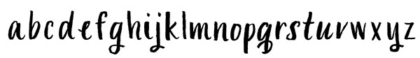
Scan of the lowercase before:
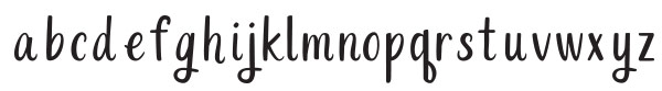
Fully cleaned + vectorized (after):
Next Steps
The lowercase took way longer than I was anticipating, so I’m pushing the numbers and extra characters (like periods, commas, hyphens, quotations, accents for other languages, etc.) for next week. Still planning to finish on time, will just include those along with next week’s work.
Here’s the breakdown of what’s left!
Week4-Week5: finish vectorizing font numbers + characters, move everything into Glyphs Mini. Begin manually adjusting tracking/kerning for both uppercase + lowercase. Name the font!
Week5-Week 6: Complete final editing/adjustments, save the font + share!
Here are the past weeks’ Font Project posts once more:
Week 1
Week 2
Week 3
I’ve been tagging everything with #etfontproject over on my Instagram if you’d like to follow along as I post process shots. Happy to have you here whether you’re watching the process unfold or participating with me! Would love to see anything you do if you are participating! Remember to use #etfontproject 🙂
See you next Friday!
Receive special offers on courses + products, a new design file every month plus instant access to the Resource Library!

Pick up over 50 design + lettering files as our gift to you when you join the Tuesday Tribe for free!
error
Congrats!
Please check your email to confirm.
You May Also Enjoy
 Every-Tuesday Font Project: Week 5 Posted in Typography, Hand Lettering, Fonts, Illustrator, Hand Drawn
 Every-Tuesday Font Project: Week 3 Posted in Typography, Hand Lettering, Fonts, Illustrator, Hand Drawn
 Every-Tuesday Font Project: Week 6 Posted in Typography, Hand Lettering, Fonts, Hand Drawn
 Every-Tuesday Font Project: Week 2 Posted in Typography, Hand Lettering, Fonts, Hand Drawn
tanosha | January 31, 2017
|
You are so amazing Teela, I am so lucky to meet you on youtube 🙂