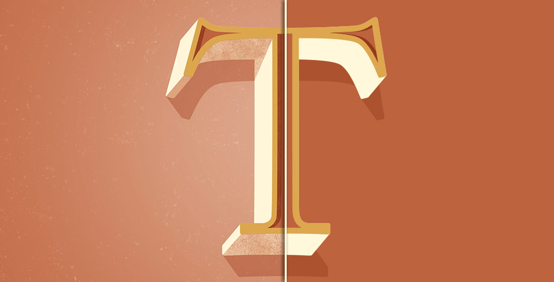
Happy Tuesday! I thought I’d add a more advanced tutorial to the mix since we’ve really laid all the foundation in earlier tutorials. Plus, this one’s really fun and with just a few quick steps, you end up with a pretty cool outcome. In this week’s video, we’ll add vector dimension to typography by taking some hand lettering created with the Wacom tablet (like in this or this tutorial), and we’ll add vector gradients to simulate shadows to bring in that vector dimension. The end result is a 3d looking piece of your own typography, plus you can use the same technique for any kind of artwork, not just typography – think logos, patterns, icons and illustrations! Let’s get started!
How to Add Vector Dimension to Typography
Receive special offers on courses + products, a new design file every month plus instant access to the Resource Library!

Pick up over 50 design + lettering files as our gift to you when you join the Tuesday Tribe for free!
error
Congrats!
Please check your email to confirm.


Tanja | May 19, 2015
|
I really enjoy your tutorials on youtube, Teela! 🙂
TeelaC | Author | May 19, 2015
|
I’m so glad! Thanks for watching! 🙂
Erin | May 19, 2015
|
This is so cool. Thanks for this tutorial!
TeelaC | Author | May 20, 2015
|
Thanks for checking it out! 🙂
yasmin | May 20, 2015
|
by far one of my most fave blogs. you are killing it! Wondering if you were going to do a Skillshare class on creating prints to sell. your style of teaching is one of the best I have encountered. thanks so much!!
TeelaC | Author | May 21, 2015
|
Wow, thank you so much, that means a lot! I’ll look into creating a class for that, it’s a great idea! thanks, Yasmin! 🙂
Kristin | May 21, 2015
|
Thank you Teela! Really appreciate these, I am learning a lot & feel inspired!
TeelaC | Author | May 21, 2015
|
I’m so glad! Thanks for checking them out! 🙂
Matt | May 23, 2015
|
Thank you Teela!! Your blog has really inspired me to advance my typography skills! I think it would look even better with a shadow on the middle bend of the E!
Teela | Author | May 24, 2015
|
I’m so glad to hear that! If I had looped the E in the center – totally, but it’s not clear there’s an obvious overlap the way it was drawn (my thinking for leaving it off). But great idea for a redo! Thanks for watching 🙂