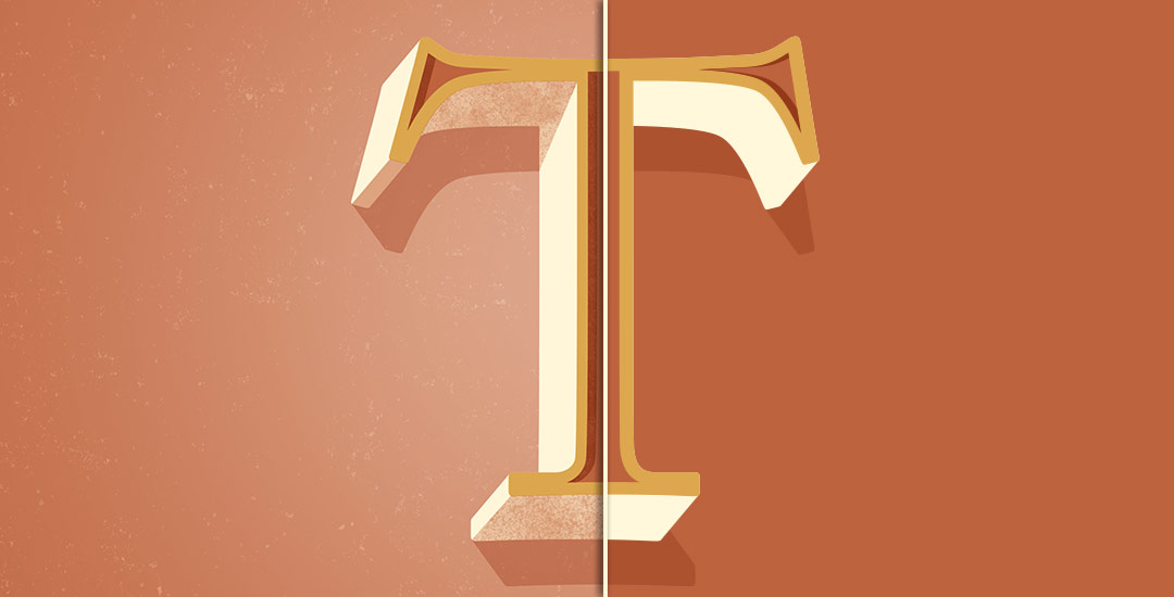
Welcome to Part 2 of how to create 3D typography from scratch! In this final video, we take everything we created in Part 1 using Illustrator and bring it into Photoshop. Using Photoshop, we’ll add custom shadows and texturize those shadows to add extra visual interest and dimension. At the end of this video, you’ll have your own custom, print ready 3D typography you can use for social media profiles, posters, prints and monogrammed stationery. Let’s get started!
Assets used + mentioned in this tutorial:
– Grit Textures (use Grit Texture Pattern #1 on your background)
– Kyle’s Dry Media for Photoshop (use Perfect Pencil Basic 6px for shadow textures)
– Mini Grit Textures (free texture alternative)
How to Create 3D Typography from Scratch, Part 2
Receive special offers on courses + products, a new design file every month plus instant access to the Resource Library!

Pick up over 50 design + lettering files as our gift to you when you join the Tuesday Tribe for free!
error
Congrats!
Please check your email to confirm.


Emily | October 25, 2015
|
Hi Teela,
I’m just starting to learn to use Illustrator and have found all your tutorials tremendously helpful for a beginner, especially as practice for learning all the functions and their applications. Thank you so much for creating them! Is there a reason why for this particular project we start out in Illustrator and move over to Photoshop? The answer may be obvious for someone who is more experienced with the two applications but not me…
Teela | Author | October 27, 2015
|
Hey Emily! Sure! No problem 🙂 Using Illustrator, we were able to keep everything relating to type vector (it’s always best to keep type that way to have it appear as crisp as possible) – Illustrator also gives a lot more control over how type is handled, so creating the shadow inside the type and the extra width to the letter was far simpler to accomplish in Illustrator. When you move into photoshop, that’s where you can start diving into texture brushes. We could have created our own texture brushes in Illustrator – but that’s a far longer process and with textures, you have a lot of anchor points which makes for gigantic files. Moving it over to Photoshop kept the file size down and enabled a lot more capabilities when it came to custom painting texture and applying layer styles.