Last year, I bought myself a big pack of Coliro Colors FineTec metallic watercolors for my birthday. I had experimented with their gold collection earlier and couldn’t wait to have more colors to play with. The rest of the year, I obsessed with using them on new lettering pieces, custom greeting cards for friends and family – anything I could think of. The way they glimmer in the sunlight is so beautiful, I was constantly looking for ways to create other shiny outcomes 🙂 I broke them out again the other day and realized I never shared my blending methods in a tutorial, so it was time for that to change! These watercolors get thick + dry pretty fast, so blending can be a little more complicated than traditional watercolors. In this week’s tutorial, I walk you through 3 blending effects using metallic watercolors with all of my favorite, long-tested tricks 😉 Read below for them all!
Pin it for later!
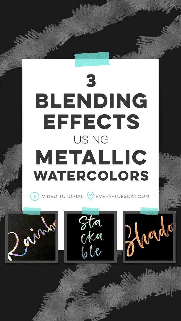
3 Blending Effects using Metallic Watercolors
Mentioned in this tutorial:
- FineTec Metallic Watercolors
- Astrobrights Cardstock (Eclipse Black)
- Fine Tip Pentel Waterbrush
- Heat Tool (to speed up drying – optional)
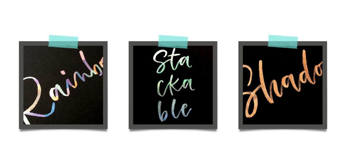
Here are the outcomes from the 3 blending effects we created using metallic watercolors:
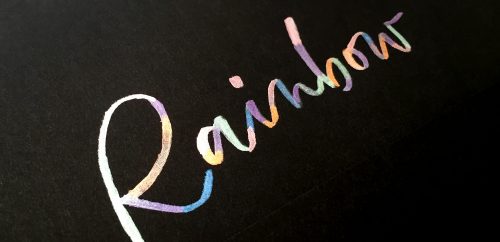
1. Rainbow/Color Blocking

2. Stackable/Vertical Ombré

3. Shadow/Depth

Here’s what we did to create 3 blending effects using metallic watercolors in written form:
1. Rainbow/Color Blocking
- Create your base lettering using a diluted version of white or silver. Allow to fully dry.
- Add in each color, one at a time in small to medium ‘blocks’ on top of your base lettering. Allow the color to fully dry before moving on to the next color.
- Repeat until finished. Done!
2. Stackable/Vertical Ombré
- Create your (stacked) base lettering using a diluted version of white or silver. Allow to fully dry.
- For an ombré/subtle color blend, choose colors that are similar to each other. Start with your first color, painting half way down all the letters in the top row.
- While the previous color is still wet, paint the bottom half of those colors using the next color. Dot or dab into the previous color for a smooth transition.
- Use the second color for the top half of the second row of letters. Repeat for as many rows as needed. Done!
3. Shadow/Depth
- Create your lettering with the color you’d like – brighter colors work best! Make sure you apply the watercolor thicker than usual, so when you integrate shadows, the contrast really stands out.
- Once dry, with the clean/almost dry tip of your waterbrush, begin lifting up color from your shadow areas. Wipe whatever paint you pick up onto a paper towel and continue through the rest of your word until you have shadows in all of your letters. Allow to dry.
- Repeat lifting for more contrast if desired after the initial first pass. Done!
Receive special offers on courses + products, a new design file every month plus instant access to the Resource Library!

Pick up over 50 design + lettering files as our gift to you when you join the Tuesday Tribe for free!
error
Congrats!
Please check your email to confirm.
You May Also Enjoy
 3 Watercolor Texture Tricks Using Brush Pens Posted in Tutorials, Color, Textures, Beginner, Watercolor
 10 Lettering Shadows Anyone Can Do Posted in Tutorials, Typography, Hand Lettering, Resources, Beginner
 Paint a Watercolor Jewel Using Brush Pens Posted in Tutorials, Illustration, Crafts, Beginner, Watercolor
 Create a Paper Cut Out Effect in Procreate Posted in Tutorials, Typography, Hand Lettering, iPad Lettering, Advanced, Procreate
No comments