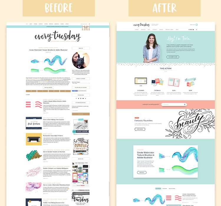
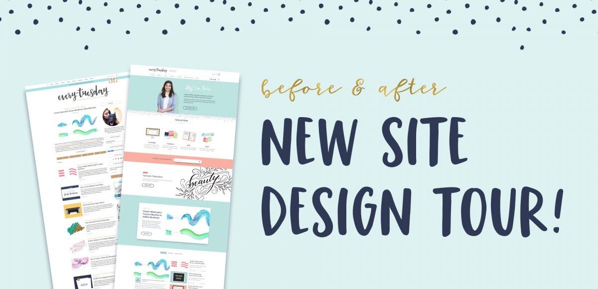
Wow. Today is a pretty big day. Our brand new site design, 6+ months in the making, is now live! This was a joint effort between Spence and I (though way more Spence than me) and it’s finally up! We didn’t hire any outside help, just hustled between the other things we were doing for the past half year (which is partly why it took much longer than we anticipated). We had a few goals in mind as we dove into this project, so today I wanted to share a site design tour, as well as our process + experience throughout the redesign.
Pin it for later!
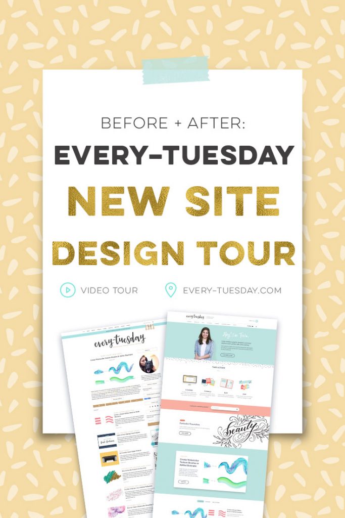
Every-Tuesday New Site Design Tour
Our main objectives for this site redesign were:
- Easier navigation when searching for particular topics
- Communicating all of the offerings of the site more directly
- Allow users to find what they need as fast as possible
- Create a better user experience throughout the nav and page layouts
- Strengthen the appearance of the Every-Tuesday ‘brand look’ throughout
- Create consistency with language, appearance and experience on every page
Keeping all of this in mind, we went searching on ThemeForest for a wordpress theme that might be a good match, or a starting point we could build from. I came across the Read&Digest theme and really liked many components of the blog and navigation. We purchased the theme and Spence got to work (this was around July of last year).
While we liked the new direction we were headed in, it felt weird changing some pages but not others. The inconsistencies started bothering both of us. While this was happening, I was preparing for the first exclusive course on Every-Tuesday, Brush Lettering with Watercolor.
The ‘aha’ Moment
Now, y’all know I love me some watercolor. Creating that course’s info page was one of the most fun collaborations Spence and I experienced to that point. Literally everything was beautiful, colorful and fun. When we stepped back and looked at the page, our ‘aha’ moment occurred. How I felt when I looked at it is how I wanted readers to feel no matter which page they ended up on within Every-Tuesday. We agreed we needed to change course with the redesign (this was around the middle of October). Definitely a tough pill to swallow, but necessary.
The Hustle
The months that followed were filled with the Fantastic Flourishes course launch (which maintained consistency with Brush Lettering with Watercolor), the holidays, two new font releases (Espresso Roast and Miss Magnolia), and now I’m just finishing up my newest course, Learn Font Making. While all of that was happening, Spence was watching coding tutorials for advanced php so he could better edit and customize the Read&Digest theme, and making custom pages from scratch (like our new about page).
We’ve been pulling long hours for a really long time, haha.
Looking Ahead
We are both breathing a little easier today because it was *such* a big deal to get this live. We’ve put a lot of love, time and attention into all of the pages you see and I hope that when you look at it, you see we were thinking of you the entire time. We still have a list of new features we’re planning to add in this year (so there’s still more to come!), but I’m pretty stoked about where we are.
Thank you for joining us on this ride, and if there’s ever anything we can do to make things even better, don’t hesitate to let us know 🙂
xoxo
Receive special offers on courses + products, a new design file every month plus instant access to the Resource Library!
Pick up over 50 design + lettering files as our gift to you when you join the Tuesday Tribe for free!
error
Congrats!
Please check your email to confirm.


ANgela Mcleod | February 28, 2017
|
I love the New site! I dont know why but it will onLy let me type in All caps.
Teela | Author | February 28, 2017
|
Thanks so much for the head’s up! Must have slipped through the cracks – all fixed now 🙂 And so glad you like the site!
Marie | February 28, 2017
|
My first impression is that I like the new site too! (Although, same problem, only letting me post in ALL CAPS. I noticed this problem yesterday when I posted a question on an older tutorial post)..
I’ll know more once I’ve *lived* in the site for a while. But it seems even less cluttered than your last site, if that’s possible. Congratulations!
Teela | Author | March 1, 2017
|
Thanks Marie!
Marie | February 28, 2017
|
Actually, it only lets me compose the comment in ALL CAPS but it appears to be okay once it’s posted.
wendy l. | February 28, 2017
|
Love it! So nice and cohesive, very engaging and inviting. AND I’m not typing in all caps 🙂 lol.
Teela | Author | March 1, 2017
|
Ha, yay! All fixed 🙂
Wendy L. | February 28, 2017
|
Hey Teela, my password is still intact so I have access to my brush watercolor class – YAY! But my question is, I am already a subscriber to your newsletter, so I got the goodie pack and freebies, but I don’t recall having a password for that – how do I access that part on your site? Thanks.
Teela | Author | March 1, 2017
|
I place the password at the bottom of every monthly recap email, so if you have any of those sitting in your inbox, you can grab it directly from there 🙂
wendy L. | March 2, 2017
|
Thanks !! 🙂
Neesha Merani | February 28, 2017
|
love your new site – so gorgeous!! CONGRATS!
Teela | Author | March 1, 2017
|
Thanks so much Neesha!
Angela | February 28, 2017
|
The new site looks amazing.
Teela | Author | March 1, 2017
|
Thanks Angela! 🙂
Jo | February 28, 2017
|
What an exciting day for you—site launch and birthday! Happy birthday and big congrats on the launch of your (and Spence’s) labor of love! The site reflects the hours of thought and coding that went into its development. It looks wonderful and is easy to navigate. Well done!
Teela | Author | March 1, 2017
|
Thanks so much, Jo! Yes, it’s definitely been quite a day – I’m so glad all of that work shows through, thanks for checking it out! 🙂
Tuyen | February 28, 2017
|
Hello Teela! I love the new website design! It’s colorful and so easy to navigate! Your posts are so helpful and I look forward to them every week!
Teela | Author | March 1, 2017
|
Yay! I’m so glad! Thanks Tuyen!
Becky Sanft | February 28, 2017
|
Teela, the site looks amazing! Eye-catching & beautifully functional – great job! Thanks so much for all the freebies & everything I’ve learned from you.
Teela | Author | March 1, 2017
|
My pleasure! Thanks for checking it out, so glad you like it!
Grace Garton | February 28, 2017
|
Hi Teela, what a beautiful website, so much personality.
Wonderful to hear how you and your partner worked together on the design and coding.
Very impressed with the navigation of the site, very well organized and looks great to!
Fun user experience!
Teela | Author | March 1, 2017
|
Thanks, Grace! Definitely everything I was hoping to hear, so glad you like it! 🙂
Katie Hair | March 1, 2017
|
Love, love, love the new site design. So beautiful and clean.
Annette | March 3, 2017
|
The new site is fresh and pretty. You two did a great job!
Teela | Author | March 7, 2017
|
Thanks Annette!