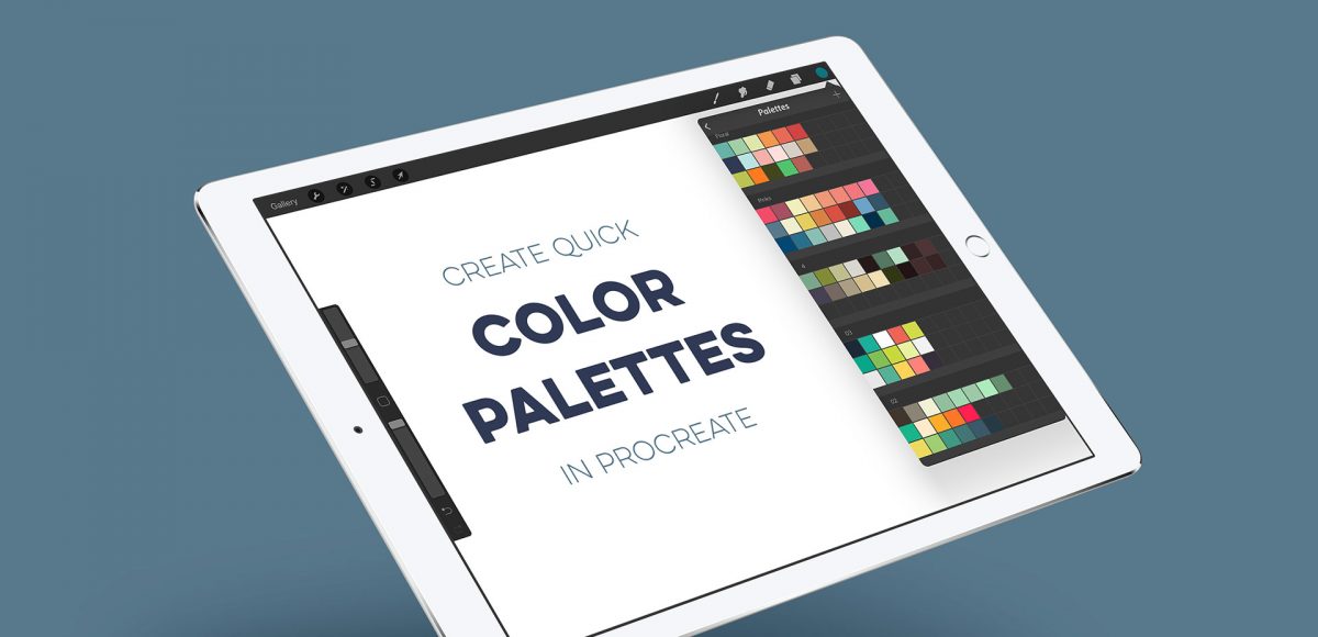
Create Quick Color Palettes in Procreate
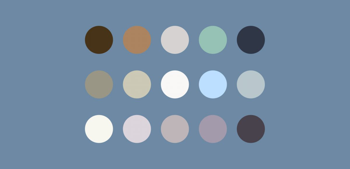
When I first started using Procreate, I just selected the colors I needed at the time and went on my merry way. Once I became more comfortable with the program, accessing quick, harmonious color palettes dramatically changed (and improved) the feel of all of my artwork moving forward. Spending the time to experiment with and decide on the right color combos became increasingly more time consuming, though. Thinking about how I choose color palettes for my graphic design artwork, I realized I could utilize the same tools, but in a different way using Procreate. In this video, I’ll share how I now put together quick color palettes in Procreate in a matter of minutes. Once you see how easy it is, I promise, you’ll never look back!


