Home2017September

September 2017

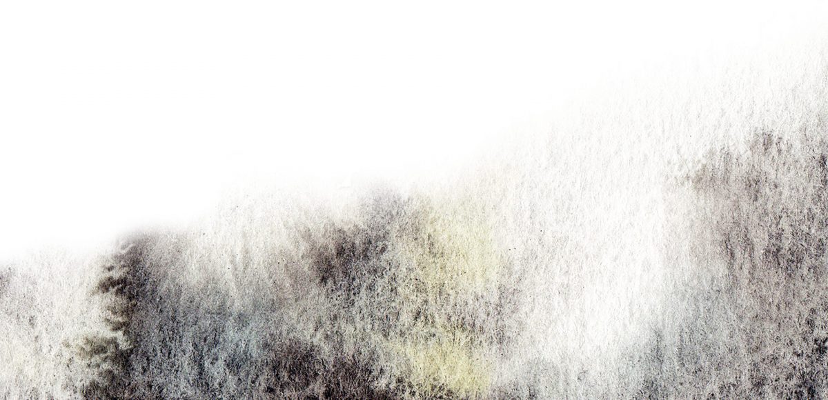
It’s the last Thursday in September, which means it’s time for your free spooky/eerie October 2017 desktop wallpapers! I’ve been away from my watercolors a little more than I’d like, so it was time to bring them back for October! The ‘spooky’ texture was created using a saltwater wash with this Winsor & Newton pan set and a no.8 round brush. ‘October’ is set in my font, Hawthorne Script, and the dates are set in my other font, Espresso Roast (caps style). The texture was scanned in and everything was combined + enhanced in Photoshop.

The download includes the October 2017 desktop wallpapers in two common resolutions: 1280x1024px and 1920x1080px, with and without dates. I’ve left the year off of the ‘no-dates’ versions, so you can use it for any October in the future, too!

If you love lettering and watercolors, you’ve probably come across the watercolor galaxy effect. Whether just as a beautiful texture, or incorporated into lettering, it’s eye catching. Made from a variety of cloud-like colorful textures, it’s further detailed with doodled stars. There’s nothing like creating this traditionally with watercolors, but you can achieve this same look in Photoshop. In this tutorial, I take you through my process of creating and applying this watercolor galaxy effect to lettering, all within Photoshop. This is a bit of an advanced tutorial, so we’ll move through things quicker and with less detail than usual since there’s a lot to cover. Let’s dive into this galaxy!

As much as I love having digital calendars at my disposal, there’s still something about things written in by hand. If you feel this way too, this tutorial’s for you. In this video (perfect for beginners), we’ll create a printable calendar that fits any 8.5″x11″ or A4 sized paper. We’ll be making use of some handy Illustrator tools and by the end, you’ll have a watercolor floral calendar design fully created using Illustrator. We’ll use a watercolor floral bouquet from my kit here, but I also have a free mini kit you can pick up below if you’d like 😉 Let’s get started!

When I first started using Procreate, I just selected the colors I needed at the time and went on my merry way. Once I became more comfortable with the program, accessing quick, harmonious color palettes dramatically changed (and improved) the feel of all of my artwork moving forward. Spending the time to experiment with and decide on the right color combos became increasingly more time consuming, though. Thinking about how I choose color palettes for my graphic design artwork, I realized I could utilize the same tools, but in a different way using Procreate. In this video, I’ll share how I now put together quick color palettes in Procreate in a matter of minutes. Once you see how easy it is, I promise, you’ll never look back!

I first realized how big of a deal enamel pins were when I worked on the Coca-Cola sponsorship of the 2014 Olympic Winter Games. The design studio I was working at had a giant collection of pins from past Olympic Games and they were incredible. Lately, I’ve been seeing them more and more and thought a tutorial on how to create the concept art for one would be fun. In this tutorial, I walk you through the exact steps I took when presenting enamel pin concepts to a client for approval. The goal was to give a general impression of how the pins would look once created. Once the client had approved them, our production director got in touch with a manufacturer who provided the info we needed to prepare production files. This video details the very first step of that process – read on to see!

GDPR Icon

Your Privacy Matters

We use cookies to customize and create content that’s most important to you. We’ll never share the info we collect.

View Privacy Policy