March 2017

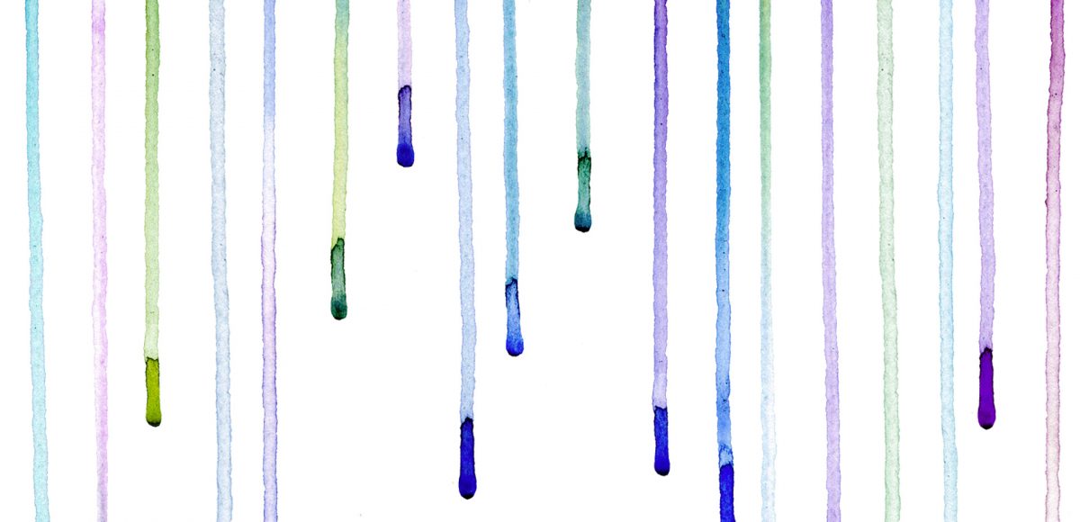
It’s time for your free April 2017 desktop wallpapers! This month’s (April showers) wallpaper was created using this Winsor & Newton watercolor pan set to carefully drip different colors on this Canson watercolor paper. I then scanned it and enhanced the colors using photoshop, then typeset April + the dates using my font, Miss Magnolia.

The download includes the wallpapers in two common resolutions: 1280x1024px and 1920x1080px, with and without dates. I’ve left the year off of the ‘no-dates’ versions, so you can use it for any April in the future, too!

I secretly love creating tutorials that appear more difficult than they actually are. This week’s tutorial is exactly that, but also perfect for beginners with a really cool outcome. In this tutorial, we intertwine text and vector elements to draw attention to our messaging and make it visually striking at the same time. Read on for all the details!

Happy Tuesday! I know we’ve been a little Illustrator crazy over here, but it’s hard not to love a program that has so many rescalable benefits! However! I definitely have not forgotten about Photoshop, so today I’ve got a video that I think will really help with your black and white photo enhancements. I’ve got two options for you this week: enhancing existing black and white photos, and best practices for converting a color photo into a black and white one. There are a few *really* simple steps you can take to bring them more to life, and this tutorial is perfect for beginners! Read on to get started with your own!

Ok, friends! Today is *the* day. My newest online course, Learn Font Making, is now open for enrollment (for one week only!).

When I started learning how to create hand lettered fonts, I definitely had the impression it was some super secret skill. I searched tirelessly for helpful tutorials that weren’t filled with a ton of ‘expert font making’ language I couldn’t understand. It was really hard to piece together little things I learned here and there, and I was still left with a lot of unanswered questions. Once I figured out the process, I knew I had to share it in a way anyone could learn. So! That’s what this class is: all step-by-step, beginner friendly with no confusion and as straightforward as possible.

I am knee deep in preparing the launch of the new font making course (be sure to check back here next week!), so this week’s tutorial is a quick, but super handy tip for choosing color. There are many times I find myself needing quick color palettes in Adobe Illustrator, where I just need something beautiful that fits the mood. Adobe Color’s website has always been the perfect help for me whenever I’ve been in a color pinch. If you’re a Creative Cloud subscriber, it couldn’t be easier to grab a color palette, tweak it and start using it directly in Illustrator. Here’s how!

It’s time for your free March 2017 desktop wallpapers! I apologize for the tiny delay in this one going up – we had to move all of the site’s content over to the new design last week, so I wasn’t able to post anything new while that happened. As long as you still like these, I’ll keep makin em! 🙂

This month’s wallpaper was created with this Winsor & Newton watercolor pan set and a no.4 round Winsor & Newton Cotman brush. I used my newest font, Miss Magnolia, to typset ‘March’ (as well as the dates) and applied the gold foil texture from my Glitz + Glam kit. You’ll notice a subtle watercolor paper texture on the background too, which is part of the Watercolor Textures Vol. 3 kit 🙂

The download includes the wallpapers in two common resolutions: 1280x1024px and 1920x1080px, with and without dates. I’ve left the year off of the ‘no-dates’ versions, so you can use it for any March in the future, too!

GDPR Icon

Your Privacy Matters

We use cookies to customize and create content that’s most important to you. We’ll never share the info we collect.

View Privacy Policy