
In my online course, Lettering Layouts, we talk about how to pair different styles of lettering and creates beautiful, impactful messages with them. Sometimes it can be tough just coming up with some different lettering ideas, though! To make things a little easier, this week I’m sharing 10 super easy hand lettering enhancements anyone can do. We’ll slowly increase in complexity as we go along, but you’ll see quickly how easy they are to apply. I’ve also included a free pdf of everything we covered below 😉 All you need is a pen and/or pencil and some paper, so let’s get lettering!
Pin it for later!
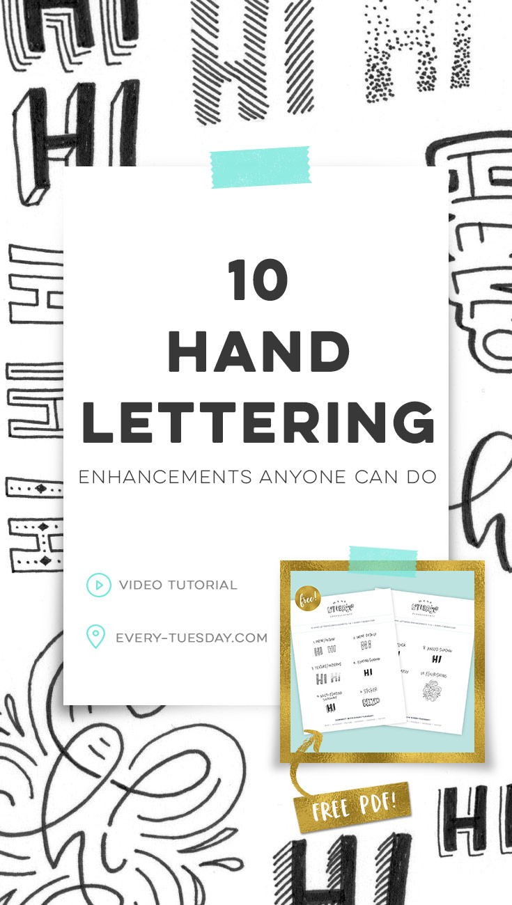
10 Hand Lettering Enhancements Anyone Can Do
Mentioned in the tutorial
- Lettering Layouts course
- Fantastic Flourishes course
- Need lettering supplies? Here are some of my favorites 😉
I mentioned a free pdf cheat sheet of each enhancement covered, so here it is!
10 Hand Lettering Enhancements
cheat sheet
- File type: pdf
- Size: 1.1 MB
- Minimum software version: n/a

Here’s a summary of the 10 hand lettering enhancements we talked about in the video:
- Inline/Outline: Draw basic serif or san serif letterforms. Outline the letterforms and leave the originals in place for an inline look, or erase for a blocky/outline look.
- Inline Details: Similar to inline/outline, with your outlined forms, create decorative embellishments where the inline previously existed.
- Texture/Pattern: Now that you’ve successfully made an outline or ‘blocky’ text, experiment filling it with texture and/or pattern! With a pen, it’s easy to add some stippling, cross hatching, stripes, etc. If you have some paint handy, add watercolors, inks or acrylics.
- Floating Shadow: Floating shadows are an easy way to imply depth. First, establish your light source and be sure all lines you draw coordinate with that light source. Keep all of your lines the same space from your blocky lettering for the strongest effect.
- Multi-floating Shadows: Take your floating shadow one step further by creating 2 or three more beyond the original for extra depth. Experiment with changing thickness, distance and color for added variety.
- Sticker: Now that you’re familiar with establishing a light source, you can create a sticker effect! Create your outline (like in enhancement #1) but this time, keep your letters close together so each letter’s outline touches the outline next to it. Add extra weight directly to the edges where a shadow would occur in relation to the light.
- 3D Block: Going back to our light source, create a floating shadow, but this time connect it back directly to your letter.
- Angled Shadow: Now that you have an idea where your 3D block would fall, instead of drawing the structure of the blocks, create angled lines where they would be. This creates a raised, soft 3D feeling without being blocky.
- Faux Calligraphy: For those who’d prefer to keep things scripty, add extra weight to your downstrokes, maintaining thin upstrokes for maximum contrast. For the strongest effect, make sure all downstroke weight is consistent in thickness and all upstrokes are consistent in thinness.
- Flourishing: Take your script or faux calligraphy script further by adding in some flourishes! Flourishes take some practice to perfect, but you can definitely get started with some simple ones. Follow the curves of your letterforms how they naturally maneuver, considering how you could incorporate a curl or loop at the beginning or ends of your letterforms. Don’t get carried away where it becomes too busy or unreadable though! For more on taking your flourishing further, check out my course!
Receive special offers on courses + products, a new design file every month plus instant access to the Resource Library!

Pick up over 50 design + lettering files as our gift to you when you join the Tuesday Tribe for free!
error
Congrats!
Please check your email to confirm.
You May Also Enjoy
 Is the Market Too Saturated for New Font Makers? Posted in Typography, Hand Lettering, Fonts, Business, Courses, Beginner
 The Making of the Skinny Jeans Font Trio Posted in Tutorials, Typography, Hand Lettering, Fonts
 How to Prepare Lettering for Font Making Posted in Tutorials, Typography, Hand Lettering, Fonts, Courses, Beginner
 3 Simple Tips for Pairing Type Posted in Tutorials, Typography
Danielle | October 3, 2017
|
Thanks Teela!
Elle | October 3, 2017
|
This was super helpful Teela! I’ve gone through an entire course from basics to flourishing for hand lettering, but i see people doing the floating shadows and other enhancements and I wasn’t sure how to do it! So this helped a little. Going to check out your lettering layout class–I think it’s on skillshare right? Yah! Glad I can make some more progress.
Hertta | October 31, 2017
|
Thank you Teela <3
Sandra Bakhache | November 21, 2017
|
Thanks so much! You make it look so easy!