Twenty Nine
Holy moly. I turn 29 tomorrow. This year is a big year! I'm marrying that handsome fella in September and I have so many things planned for the blog, youtube, and maybe some other little surprises peppered
8 Comments
LETTERING + GRAPHIC
DESIGN LEARNING
Holy moly. I turn 29 tomorrow. This year is a big year! I'm marrying that handsome fella in September and I have so many things planned for the blog, youtube, and maybe some other little surprises peppered
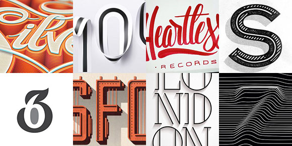
Welcome to Typins #3! This post is where I share my recent favorite typography pins from pinterest. Here are 8 more inspiration-inducing pins to get your type on 😉
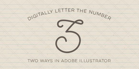
Happy Tuesday! I’ve had a few requests for more lettering tutorials, so I’m here to deliver! I’ve also made a lettering playlist which you can check out here where I’ll keep them all together 🙂
In this week’s quick tip video tutorial, we’ll digitally letter the number 3 two ways. For the first way, we’ll be using this Wacom tablet (or any of these) and the brush tool in Illustrator. After that, we’ll digitally letter the same number 3 from scratch using just the pen tool. We’ll go over the best way to plot your points and basic point handle adjustments using the direct select tool in Illustrator. Let’s get started!
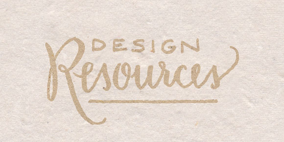
Happy Friday! Just wanted to drop a little note that I've added a full design resources page to the blog which you can see here or get to from the main nav. These are all products
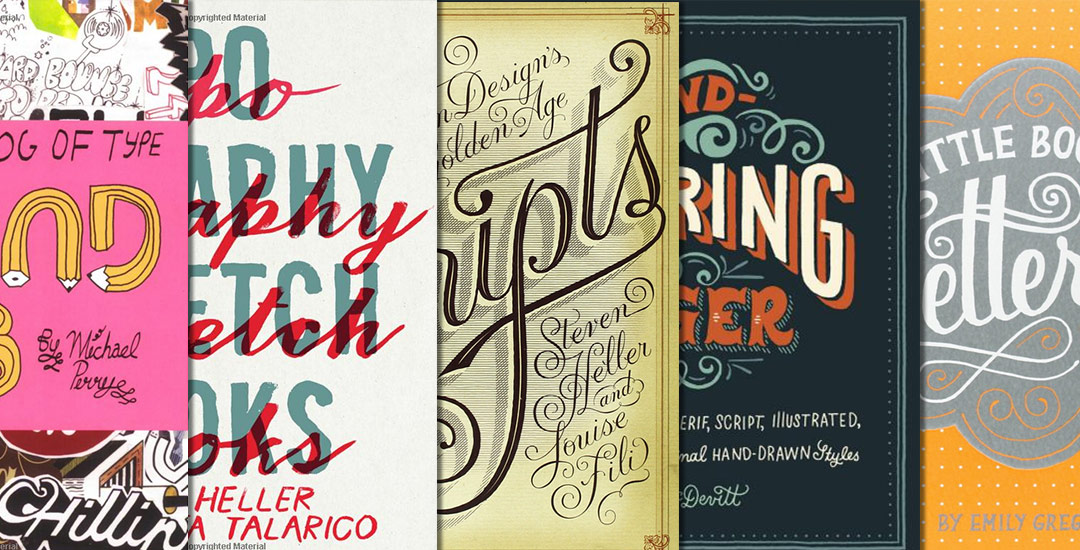
If you haven’t guessed it by now, I’m a little bit obsessed with typography! Every year around my birthday (next Saturday!) or around the holidays, when my family asks what they could gift me, I always ask for some kind of book relating to lettering or type. I love these books because, although there is sooooo much online, there are always gems buried deep within those book jackets or paperback covers. And while it’s common to come across a lot of recycled material online, it’s nice to be inspired by something different. So if you’re looking for some lettering books to inspire your next project, here are some of my favorite lettering books – and I own all of them…except for #5, that’s getting delivered tomorrow 🙂
In last week’s tutorial, I shared how I’ve shown logo options to freelance clients in the past. This week’s video discusses what happens after the logo has been approved by your client. We’ll take the approved logo and save it in file formats for print and web to cover any scenario for your client. We’ll be using Illustrator for all of the formats, and we’ll go over why that is. Below, you’ll find a checklist you can use as reference for your current or future projects. Let’s get started!
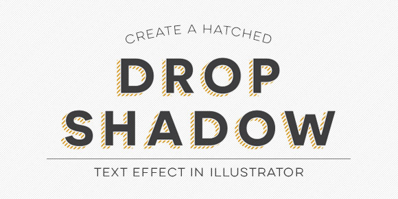
Hatched drop shadow text effects are becoming more common in typefaces these days – Trend was one of the first to offer a layered font with a faux hatched drop shadow which motivated others to offer them. But what if you want a hatched drop shadow on the font you’re using, not trend? What if it’s for a one-off headline where lots of text doesn’t need it, it just needs to look beautiful in one powerful instance? That’s when we start making art instead of adjusting type, which is why this week’s tutorial isn’t on a text layer style; we’ll be customizing our hatched drop shadow to fit an artistic style.
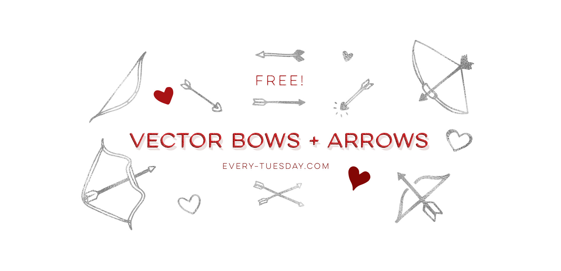
It might be because of the Valentine’s season, but for whatever reason, I had this song stuck in my head this past weekend. Before I knew it, I was doodling, so this week’s freebie is a set of hand drawn bows + arrows. A few hand drawn hearts are also thrown in for good measure 🙂
So, you’ve been hired by a client to create a new logo for their brand. They’ve given you a brief on what they need it to feel like, what the brand stands for and maybe even provided you with some examples of things they like. You’ve promised them 3 options to choose from and after research, sketches, and some tweaking, you have the 3 options you want to present to them. But you don’t just want to give them 3 jpgs and ask them to choose, that’d be crazy! How do you present your options in a professional way to make the client feel like you really cared about their project and thought about the logo’s future use? In this week’s video, I share a real example of a pdf I created to show logo options to a past client.
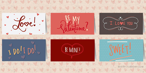
Valentine’s Day will be here NEXT Saturday! What?! It’s probably time to share some free hand lettered mini valentines!
You can go through all the work of designing something beautiful, but when it’s time to print, how can you be sure the print execution matches the beauty of the design? I’ve gotten a few requests on what the step by steps of design to print are once the design is finished, so I’m here to give answers!
We use cookies to customize and create content that’s most important to you. We’ll never share the info we collect.