
I’m preparing to update/redo my entire portfolio site, so I’ve been on the hunt for the perfect theme for quite awhile now. The problem is, so many themes I come across are full of flashy parallax driven gimmicks. Don’t get me wrong; an unexpected smooth moving parallax effect still gives me the ooo’s and ahh’s, but it’s been tough finding ‘the one’ that doesn’t completely overdo it for me. I don’t think it’s that I’m too picky, I actually think it’s because with all of the options to get funky, it’s harder to get simple. All that said, I think I’m getting really close to making a decision. Here are my top 4 favorites that don’t require you to sign on for a subscription… I’m looking at you, squarespace! (Your themes are beautiful, but I’m too smart to get roped into another subscription!)
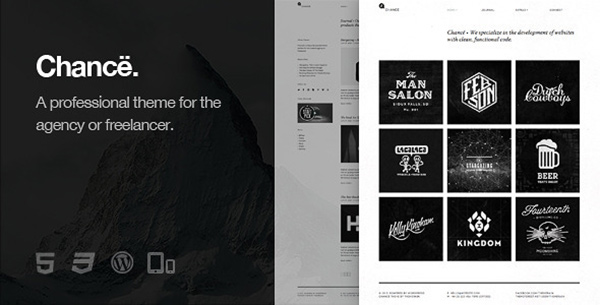
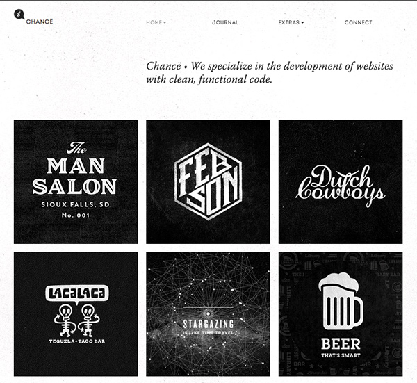
1. Chance
I’ve been looking at this one since the week after it came out. I always like to wait and see what all the guinea pig buyers think/comment/rate before I dive in (clearly I’ve waited this long, so I was willing to wait a few..months more).
What I like about this theme:
– the homepage shows your work in one gridded view. It makes the visitor get a good overview of the work as soon as they arrive, and hopefully something peaks their interest enough to keep them there even longer.
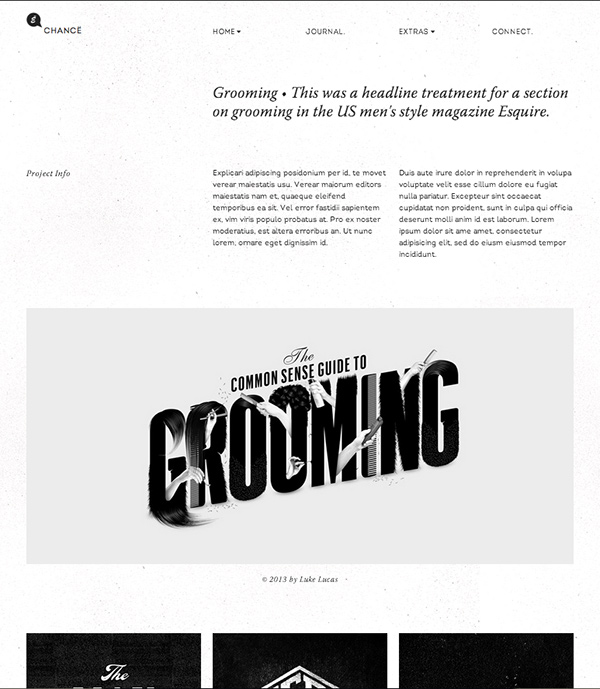
– project page – I loveee how when you look at one project, you get the project’s description, and then photos of the project right below it. One of the things I look for in every portfolio theme is for the remainder of the portfolio to appear right after a project. Don’t make me go searching for more if I like what I see, you know? Show me right away! Chance does this.
What I dislike about this theme:
– there’s no About page. Maybe it’s an artsy thing about being all introverted and letting the work be who we are, but we’re more than that! At least give me the chance to prove it 🙂
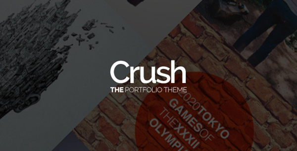
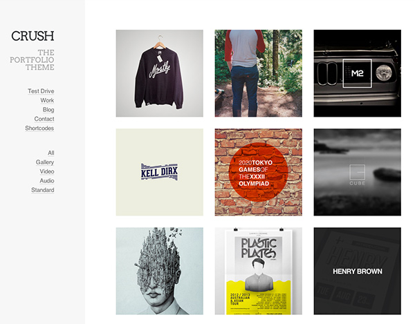
2. Crush
This one’s a beauty. And it just came out (only 3 days old with 50 sales!), so I’m in the wait and see phase (have to at least see a rating!). I’ve seriously got my fingers crossed because this one’s giving Chance a pretty big run for the money 🙂
What I like about this theme:
– the homepage shows your work in one gridded view. I don’t know if I’m a side nav or top nav type of girl, but I dig what I see here. I like that the links are very secondary to all the goodness that’s going on in the middle.
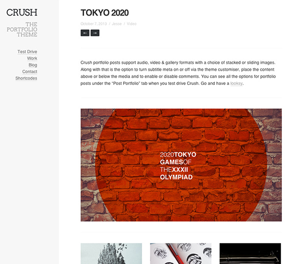
– project page – my favorite description > project > other projects setup. I also really like that it has the arrows at the top so you can scroll through the whole portfolio in order if you’d like, too.
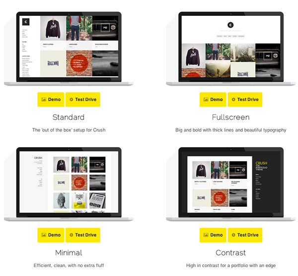
– lots of options with this baby (last screenshot). The screenshots I took are of the one that appeals most to me, but full screen lovers are well taken care of with this theme, too.
What I dislike about this theme:
– there’s no About page. C’mon amazing wordpress portfolio makers! I’m really bummed this one doesn’t have one, otherwise this would easily be ‘the one’
3. Handbook
Big fan of the typography on this theme. The type, cleanliness, and the ability to give a little intro (a decent backup plan for an about page) drew me into this one.
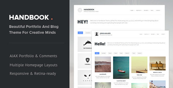
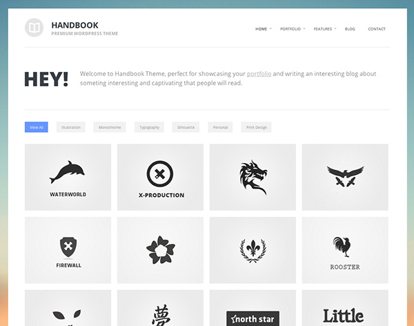
What I like about this theme:
– the homepage shows your work in one gridded view. I also like the tags at the top that give you the ability to filter through larger portfolios. The image background is also a nice option to customize this theme.
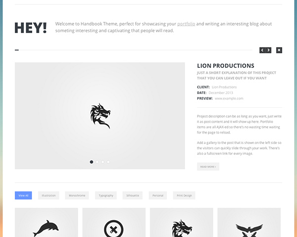
– project page – I like that you still get your portfolio options below, but:
What I dislike about this theme:
– the project page doesn’t show all of the project in one fell swoop. I need to click to advance through it (it also seems limited to that rectangular size. what if I have a big portrait poster? It forces it to be little. sad). I also dislike that there’s a ‘read more’ at the [what you think is] the end of the project description. It suddenly becomes a click within a click within some clicks. Too much for me.
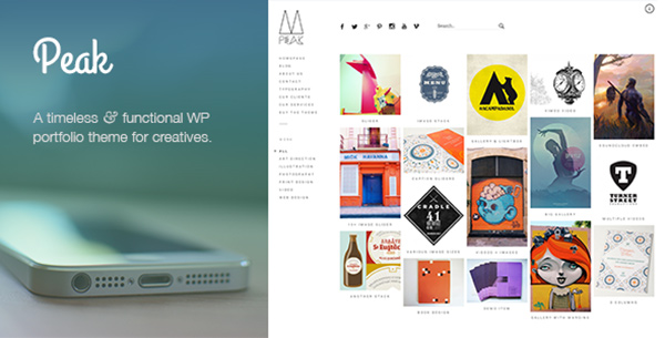
4. Peak
Released today! This gem is going to get a lot of sales, I can tell! And I can’t wait to see what buyers have to say about it!
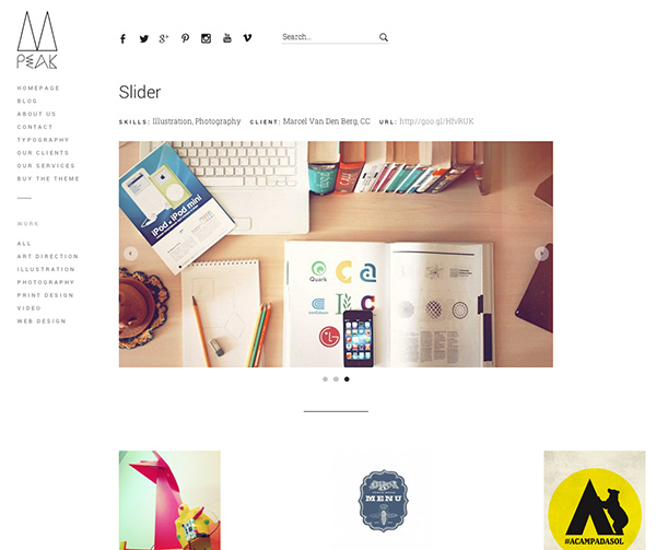
What I like about this theme:
– A little more of an artsy homepage with the type choices, the ‘x’ menu selection + black social icons, but I’m into it. I like that there’s a search function, too. Everything’s very straightforward. I’m here, I like what I see, and I know how to do what I want to do next.
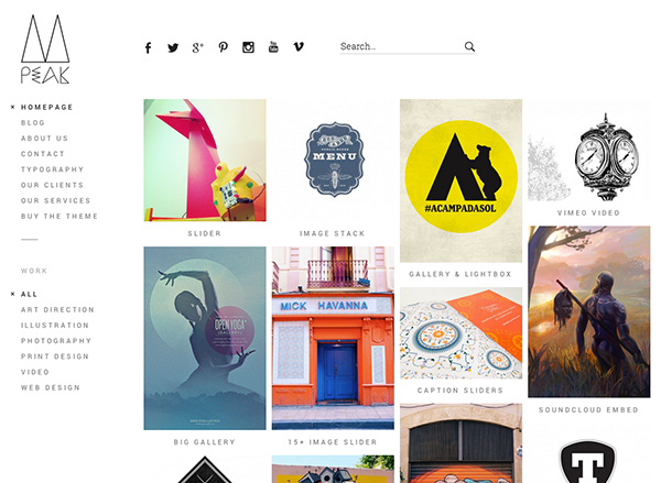
– …and that’s clicking on a project. Love all the project viewing options (listed below all of the homepage portfolio items)! If I don’t like the image slider (as pictured in the screenshot), the preview of the theme makes it clear to me I can also stack all of my images, which I really like.
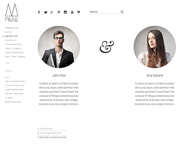
– Amazing. An About page! And a beautiful one at that. Love.
What I dislike about this theme:
– the only thing I really wish I saw was the ability to write a project description. From the looks of it, I can only list out skills, client, + url. I don’t think this would be an impossible thing for a buyer to figure out though. I think for this being the only flaw, it’s worth the risk.
My mistake – project descriptions are included! My first click throughs didn’t show any, but they’re definitely there (see here or here). Very nice 🙂
In Conclusion
When it comes to purchasing a portfolio theme, there are a few things on my checklist that make me stop, or keeps me clicking:
(this is in order of my decision making process)
– A lot of my favorite designers are using the homepage portfolio grid on their sites for good reason – it makes their work obvious at first glance and gives you a lot to look at (hopefully keeping you around), so this is something I look for for myself, too.
– Project page – well, first of all getting to a project page: the crazy fast zooms when you hover over a portfolio image makes my eyes buggy. I hate when my eyes are buggy, so I avoid all crazy fast zooms. I want you to take your time and enjoy the work. The crazy zooms feel like I’m being rushed, or I’m rushing you. But back to the project page – a theme can’t, under any circumstances, use lightbox. It’s outdated, and it’s just not cool anymore. I like to have my images stacked, with my other portfolio items in their homepage-looking grid at the very end of the scroll. I also like to have an area where I can give a description of the project. If I spent 6 months on a major portfolio project (like I did last year), I want to be able to tell you more about it than who my client was, what skills I used and a url where you can see more. Those are all nice to share, but there is so much more to tell a potential new employer or any viewer of the project looking to learn more. Plus, it lets you show a little of your personality, and gives readers the chance to understand all that you put into it. Maybe that’s just the writer in me, but whenever I look at work, I always read descriptions.
– About page. This isn’t a deal breaker, but sometimes it’s a deal maker if the homepage and project pages are working for me. In every site I’ve ever had, the about page always ranks within the top 2 pages clicked once arriving to my site. Kind of a big deal.
– typography – I love when I see a site with beautiful typography. It immediately sets a site tone which is pretty important, whether you write a lot or not.
Once these points are covered, the decision gets pretty easy. These points obviously play to my personal aesthetic, but I think all of us looking for a creative portfolio theme are looking for a combination of these to some degree. Now I just need to decide which I’m going to go with!
Receive special offers on courses + products, a new design file every month plus instant access to the Resource Library!

Pick up over 50 design + lettering files as our gift to you when you join the Tuesday Tribe for free!
error
Congrats!
Please check your email to confirm.
You May Also Enjoy
 How to Choose the Right WordPress Website Theme Posted in Tutorials, Web Design
 Roundup: 5 Clean and Creative Resume Templates Posted in Roundups, Branding, Resources, Business
 Create a Flat iMac Icon in Adobe Illustrator Posted in Tutorials, Illustrator, vector
 How to Customize Your WordPress Theme Posted in Tutorials, Web Design
Joseph | January 21, 2014
|
I think you forgot hoarder :)..
Nice article BTW.
TeelaC | Author | January 22, 2014
|
ha, not a portfolio theme! Thanks for reading 🙂