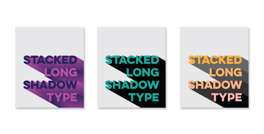
Happy Tuesday! This week’s tutorial comes courtesy of Brittany, who shared this photo with me, which I agreed would make a great quick tip tutorial! As a bonus, I’m sharing how to create multi-colored long shadow typography, in case you’d like to use more than one color for your shadows 🙂 We’ll create every version quickly in Illustrator using one simple tool and a couple of extra time saving options. This is perfect for gig posters, MTV-esque retro designs, greeting cards, or paired with simple icons. Read on to see it all!
Create Stacked Long Shadow Typography
Font used:
Eveleth
Free alternative: Novecento Sans Wide Medium
Receive special offers on courses + products, a new design file every month plus instant access to the Resource Library!

Pick up over 50 design + lettering files as our gift to you when you join the Tuesday Tribe for free!
error
Congrats!
Please check your email to confirm.



Debbie | January 19, 2016
|
Nice! Thanks for this tutorial! I used it to make a header image for a blogpost that’s going to be published tomorrow. I tweaked it a little bit so it would fit my blog colours. My first project after doing a beginner Illustrator class on Skillshare.com.
#proudofmyself
KELSEY | February 6, 2016
|
Thanks for this tutorial! I was wondering how text like this was created. One thing that happened to me when I went to blend my two layers, my edges were really jagged, like little blocks stacked on one another. Is there a way to fix that? I had the setting set to smooth…
Teela | Author | February 8, 2016
|
Hey Kelsey! When your two colors that you’re blending aren’t different enough, you’ll get a jaggy result since the blend doesn’t take quite so far to get from one color to the other. A workaround for this would be to use two very different colors to get the smoother blend, then, use your direct select tool (keyboard shortcut ‘a’) and click on your first shape and change it to the color you’d like, then do the same with the second shape. That should give you the smooth blend you’re looking for 🙂
KELSEY | March 3, 2016
|
Thank you! I will give it a go!
Dasha | April 23, 2016
|
Hello Teela,
Thank you for the tutorials – I’m learning tons! They are amazing!
I’ve got a question about the solid colour shadow. Is there a way to create it without as many shapes in between (as they seem to be redundant with solid colour). Or is this the only way? I’d like to create a shadow for a script word.. and to get a blend without gaps between the narrow parts of the letter is a bit of night mare.
Perhaps there is a different approach/tips for creating a solid/fat shadows for scripts. I hope that makes sense.
I’d hugely appreciate any tips.
Many thanks! Dasha
Teela | Author | April 26, 2016
|
I think I understand – you can reduce the distance of your two blended pieces, and if you blend colors that are total opposites, you’ll get a less jaggy blend – then you can go in and apply a solid color, or a gradient afterwards. You can also expand the solid color (object > expand) then, with everything selected, hit the ‘unite’ icon in your pathfinder palette for one solid shape 🙂