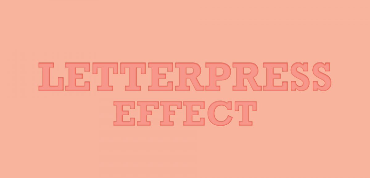
Last week, we created a realistic foil stamp effect using only illustrator and a seamless foil texture. This week, we’re borrowing some of the same tips, but simplifying. If you don’t have a texture on hand, but still want to add an element of cool, a letterpress effect is a great option. The letterpress effect simulates the impression a polymer plate makes on paper when it’s pressed into it. Letterpress has become increasingly popular over the last 5 years, but fun fact: letterpressing was never meant to be a final print effect. Letterpressing first began as a ‘test’ print before metal plates were developed which create stronger, deeper (and more expensive) impressions. In this week’s tutorial, adjust the settings for however strong of an impression you’d like as we create a letterpress effect entirely in Illustrator.
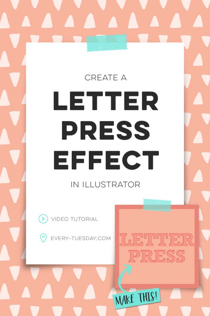
How to Create a Letterpress Effect in Illustrator
Here are the exact color builds and settings from the video:
- Background color (CMYK): 0/35/34/0
- Fill #1: 0/50/38/0, inner glow: overlay, dark grey; opacity: 75%; blur: .04 in, edge
- Fill #2: 0/50/38/12, transform: vertical -.02 in
- Fill #3: 0/20/19/0, transform: vertical .01 in; opacity: 80%

Here are a few tips to remember when you create your letterpress effect in Illustrator:
- Start off with the background color you plan to apply your letterpress effect to. All of your other fill settings will have to be lighter or darker than your background for the impression to seem as real as possible.
- Your first fill (the main color of your text or object) should be slightly more vibrant than your background. The inner glow should always be a dark overlay.
- Your second fill (the shadow) should be slightly darker than your background and text color; your highlight (fill #3) should be the lightest version of your color.
- To apply the same effect to other vectors/type, save it as a graphic style using the graphic style palette.
- Export your graphic style using the palette options to use with new documents in the future. To import a graphic style, use your graphic style options. Toggle down to: open graphic style library > other library and select your file.
Receive special offers on courses + products, a new design file every month plus instant access to the Resource Library!

Pick up over 50 design + lettering files as our gift to you when you join the Tuesday Tribe for free!
error
Congrats!
Please check your email to confirm.






Marie | November 1, 2016
|
I love the letterpress effect. Thank you for posting this 🙂
Teela | Author | November 5, 2016
|
Yay! I’m so glad 🙂
Celine | November 2, 2016
|
Hi Teela, thank you for this again amazing tutorial. I was wondering if you could do a tutorial or a course on how to create a mock ups from a photo, for stationery or poster. I have been looking for such thing for a while without luck. Thank you :).
Teela | Author | November 5, 2016
|
Hey Celine! I made a full class on it, so it should cover anything you’re looking for 🙂 Let me know if you still have questions!
Celine | November 7, 2016
|
Thank you Teela!
Eve Impremta Barcelona | June 1, 2017
|
Good post, is a very beautiful effect, I love letterpress and this effect is great! You have done a remarkable tutorial, congratulations for your blog, thank you!