Ever dreamed of creating your own hand lettered font? Actually typing with *your* letterforms? I promise there are fewer better feelings when it comes to loving lettering than that 😉 But where do you even begin? How do you create those initial letters so you can convert them into a font? While the topic of how to prepare your lettering for font making is covered extensively in my course, Learn Font Making, I wanted to share a bit of my process in this week’s tutorial. In this video, we’ll talk about how to prepare lettering traditionally (writing utensil + paper) so you get all the characters you need for your font. If you’d prefer to prepare lettering on an iPad instead, that’s covered specifically inside the course. For now, read on for the traditional method!
Pin it for later!
How to Prepare Lettering for Font Making
Mentioned in the video
- Learn Font Making course
- Font making resources list
- Pentel Fude Brush Pen (extra fine)
- Tombow Fudenosuke (soft)
- Free lettering guides
- Espresso Roast font
- Intro to Font Making: Font Features

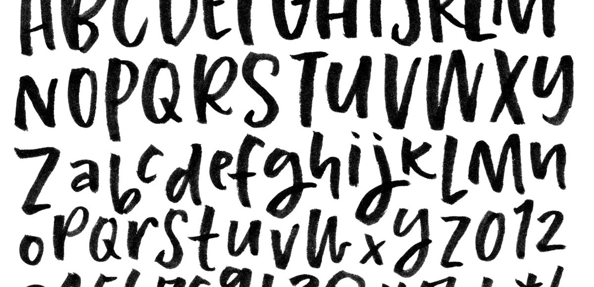
Here are some helpful tips to create lettering that will feel like a consistent, well made font!
- Pay close attention to the weight of your upstrokes and downstrokes. Maintain consistency as much as possible – all upstrokes the same weight/all downstrokes the same width/weight.
- How big are your loops? Is the descender of your ‘g’ large, but your ‘y’ condensed and skinny? Decide which you prefer and apply to all.
- Notice how tall your ascenders are/how long your descenders are. Be sure your lengths match up.
- How ‘closed’ are your counters? Counters are the negative/enclosed space in letters like ‘e’, ‘a’, and ‘o’.
- Are you incorporating texture into your style? Make its presence consistent.
- What feeling to you get when you look at your style? Write out some common words and be sure that same feeling resonates.
- It may take a little time to get letters that are fully consistent that you’re happy to move forward with. Don’t get discouraged – you’re saving yourself a lot of time in the long run if you make adjustments now. Once you have that consistency set, you can expect the font you make to leave a strong, well balanced and consistent impression on potential buyers.
Receive special offers on courses + products, a new design file every month plus instant access to the Resource Library!

Pick up over 50 design + lettering files as our gift to you when you join the Tuesday Tribe for free!
error
Congrats!
Please check your email to confirm.



Brittany | September 26, 2017
|
I can’t wait to see what font you come up with next!!!!! love them\
Donna Boeke | November 15, 2017
|
I appreciate your help. Your tips are easy to follow and I can see progress in my lettering style..