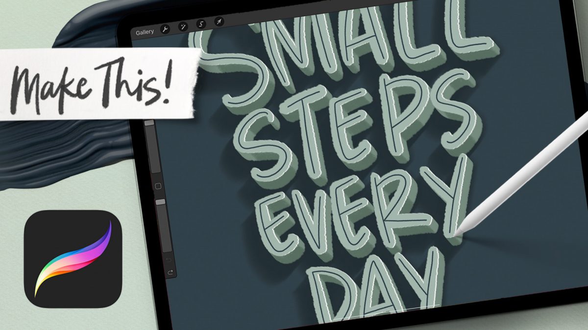
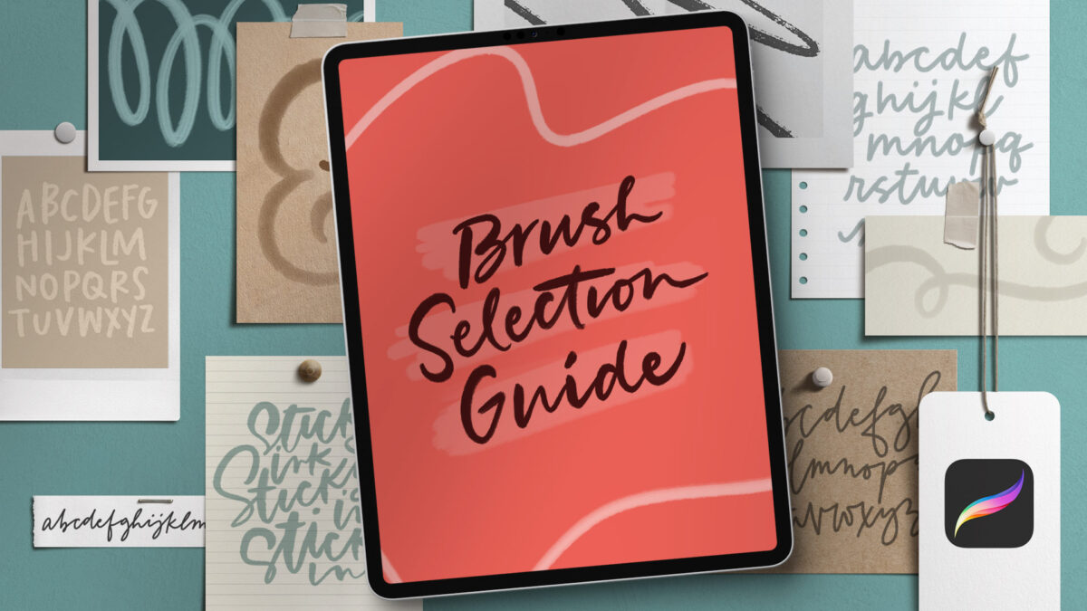
HomePosts Tagged "lettering style"

lettering style Tag

If you use Procreate for hand lettering, you’ve likely experienced the struggle of finding just the right brush for your needs. It can be an overwhelmingly time consuming task testing brushes and readjusting them only to try the next one, hoping for the best.

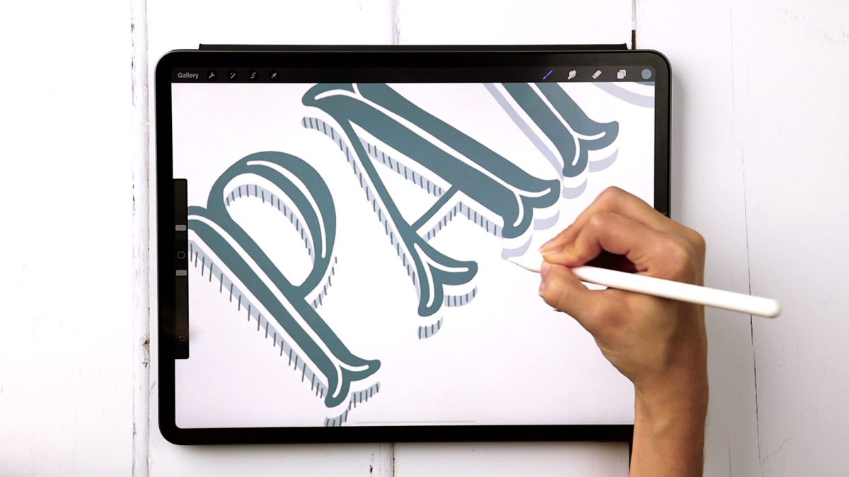
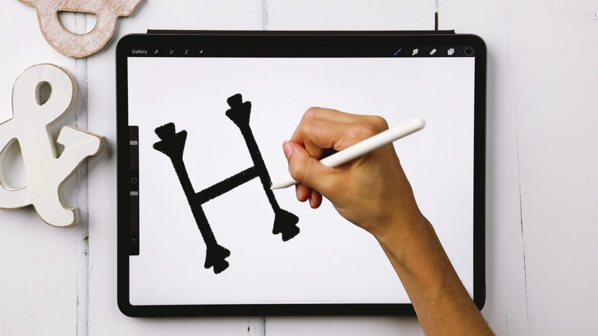
While nearly any brush in Procreate can be used for lettering, not all are designed specifically for it. Today I’m sharing the specific settings to look for in a lettering brush, a list of my favorite free and premium hand lettering brushes as well as some free practice sheets, too! Read on to get it all!

Happy Tuesday! This week, we’re focusing on embellishing lettering with some simple, but striking 3D effects! We’ll begin by centering stacked lettering, adding an inline, then we’ll add in that 3D goodness with an extrusion, extrusion details, an extrusion long shadow and we’ll finish it off with a hairline highlight.

Welcome to episode 4 of Style Studies! Style Studies is my monthly series where I walk you through a popular hand lettering style and provide free printable and Procreate practice sheets so you can follow along! This month, we’re diving into decorative serif lettering in 4 easy steps with a style I’m calling Party Slab. This style is a heavy slab serif, that lends itself well to extra decoration, like inline details and creative shadows. It’s best used in headlines, set in all caps and has a festive and fun feeling. Read on to grab the practice sheets and create it yourself!

Welcome to Episode 3 of Style Studies! This month, we’re finishing the foundations portion of this series so you’ll be prepared for all of the more decorative + modern styles coming next year! Getting a solid understanding of basic serif and sans serif styles will be something you can always rely on in design layouts in the future. I can’t emphasize enough how much I’ve used what I’m sharing in this episode throughout my career. They may not be the sexiest styles, but they’re the most reliable ones you’ll ever use. As with every episode, printable and Procreate practice sheets are included for free, below. So let’s jump in to how to create serif + sans serif lettering the right way!

Welcome to episode no.2 of my new monthly series, Hand Lettering Style Studies! If you missed episode 1, you can catch it here 😉 This week, we’re talking about the simple script lettering style. This one is really important if you plan to create any variation of script lettering in the future. You’ll learn all of the basics: how each script character is formed, the order of the strokes and how to keep the style consistent. Refer to the style overview for the best applications to use this style on, too! Grab the free printable and Procreate practice sheets below to follow along!

I wanted to try something new this week! I thought it would be fun to show how to create something analog/traditionally, then how to recreate that same artwork in Procreate. Two tutorials in one 😉 For this video, we’ll create watercolor block lettering with some traditional methods, then we’ll move into Procreate after. Read on for the full tutorial!

Many of you know I teach a course on converting your hand lettering into a professional, sellable font. But what if you’re new to lettering and want to create a font? In this new monthly series, called Hand Lettering Style Studies, I will guide you through all the steps to create modern lettering styles that are on trend, with practice sheets included! Each month, a new video will be released plus *free* practice guides. If there’s a style you’d like to see in a future video, please leave it in the comments section! First up for this month: every hand lettering stroke you’ll ever need! Read on for the video + free practice sheets!

Almost two years ago, I created some freelance lettering for a ‘spicy’ greeting card company called Get Feisty. One of the styles requested was what I call wave lettering, or lettering that looked like waves from far away. I hadn’t lettered in that layout style before, but it was a fun challenge figuring out my process for it. After a few (or 20+) tries, I had a solid process and it has become one of my favorite layout styles. In this week’s video, I’m sharing the exact process I use to create wave lettering. Read on for the simple materials and full video below!

GDPR Icon

Your Privacy Matters

We use cookies to customize and create content that’s most important to you. We’ll never share the info we collect.

View Privacy Policy