
I wanted to try something new this week! I thought it would be fun to show how to create something analog/traditionally, then how to recreate that same artwork in Procreate. Two tutorials in one 😉 For this video, we’ll create watercolor block lettering with some traditional methods, then we’ll move into Procreate after. Read on for the full tutorial!
Pin it for later!
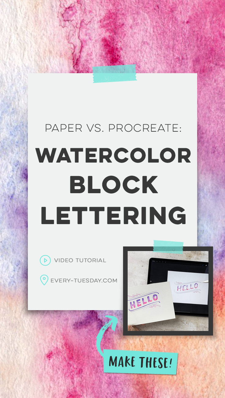
Paper vs. Procreate: Watercolor Block Lettering
Mentioned in this video:
- On Paper:
- In Procreate
- Deep tooth watercolor paper texture (available for free when you become a free Tuesday Tribe member!)
- Watercolor Lettering Brush Pack (the pack is recommended, though you can also experiment with the default brushes in the ‘water’ category in Procreate)
- Procreate Watercolor block lettering color swatch
- Watercolor Lettering in Procreate online course

Here’s a quick written recap of what we did to create watercolor block lettering on paper and in Procreate!
On paper:
- Sketch out your lettering on watercolor paper using a hard pencil (I used an HB in the demo, but would recommend a 2H or 3H)
- Use masking fluid on your sketch for all of the areas you don’t want your watercolor to appear. Allow to fully dry.
- Using watercolor brush pens, paint the top and bottoms of all of your letters, leaving space between them for blending. Grab your waterbrush and blend out the top color and then the bottom color, then blend the two together. Repeat for each letter + allow to dry.
- Peel off all of your masking fluid and erase away any remaining pencil marks.
- Draw in any doodles or details using fineliners. Erase away any remaining pencil marks.
- Done!
In Procreate:
- Create a new document any size you choose (I used screen size). Hit the gear > add > insert a photo and use the deep tooth watercolor paper texture (link above).
- Sketch out your design on a new layer.
- On a layer above your sketch layer, create your lettering. Reduce the letter’s opacity, make a selection of it, then create a new layer right above it and change that layer’s blend mode to multiply.
- Paint purple at the tops of the letters and pink at the bottom, leaving space between for blending. Once the purple and pink are painted, grab the smudge brush water bleed.
- Smudge the two colors together so they blend, just like watercolor. Add final details by choosing the smudge brush ‘texturizer’ and tapping randomly throughout your letters. Deselect and turn off the base lettering layer.
- Create a layer mask on your blended lettering layer and draw in your inlines.
- Add final details + doodles on a new layer. Turn off your original sketch layer.
- Done!
This post contains affiliate links. This means I may make a commission at no additional cost to you if you choose to purchase the products listed. I only promote products I’ve personally used, trust and believe in. Thank you in advance for supporting the free content on Every Tuesday!
Receive special offers on courses + products, a new design file every month plus instant access to the Resource Library!

Pick up over 50 design + lettering files as our gift to you when you join the Tuesday Tribe for free!
error
Congrats!
Please check your email to confirm.
You May Also Enjoy
 Create Easy Ribbons in Procreate Posted in Tutorials, Hand Lettering, iPad Lettering, Beginner
 Create Easy Floral Wreaths in Procreate Posted in Tutorials, Hand Lettering, Hand Drawn, Illustration, iPad Lettering, Beginner
 Create a Watercolor Glitter Lettering Effect in Procreate Posted in Tutorials, Hand Lettering, Textures, iPad Lettering, Beginner, Watercolor
 iPad Lettering: Using Multiple Procreate Textures Posted in Tutorials, Typography, Hand Lettering, Textures, iPad Lettering
Maribeth | October 29, 2019
|
#2 – I am a Procreate user, but I loved seeing both versions because I love all your tutorials and have learned so much from you. Thank you!
Rachel | October 29, 2019
|
I like both methods (though I have yet to try the first…I need the masking fluid but Amazon won’t let me add it to my cart). There is something about the old fashioned way with paper and paint that is always so beautiful and fun!
I love Porcreate though, so #2 would have to be my favorite. I love that you can take your “paint” with you anywhere and there’s no mess to cleanup! : )
Teela | Author | November 1, 2019
|
Totally agree!
Denise | October 29, 2019
|
I love #2 and would absolutely love more tutorials like this. I’ve learned so much from all of your tutorials and I just LOVE showing my 22-year-old daughter how to do something on the iPad that she didn’t know how to do. Thanks for making me look smarter than her (sometimes)! Thanks again Teela!
Teela | Author | November 1, 2019
|
Aww, yay! thanks Denise!
Jenny | October 30, 2019
|
Hi Teela, I liked watching both processes, I think it’s important to understand how the traditional way is created so we can create a convincing replication of the textures in digital form. I’m not a Procreate user but I would like to be, I appreciate how you explain how to use the app as you are making the example. I think my comment from the ep 1 of your new monthly series got removed because I included links from other websites (I was using the links as visual aids to explain the kind of lettering I was mentioning I would like to see demonstrated in the monthly lettering series), so I’ll just mention it here in case you didn’t get to read it before, I just wrote that I would like to see ornamental style (western style) lettering, sans serif lettering and serif style lettering demonstrated (it would be great if you could demonstrate this with paper and in digital format). I’m enrolled on your font making course but I haven’t started it yet because I’m still learning calligraphy. It would also be great to see how lettering is written on a curve or within a banner shape, with some tips regarding how we should deal with the kerning or tracking aspects especially if the lettering is writing a quote. Thanks, Jenny.
Teela | Author | November 1, 2019
|
Thanks Jenny! Getting caught up on my comments and so sorry I missed yours from before! Got it on my list now! ❤️