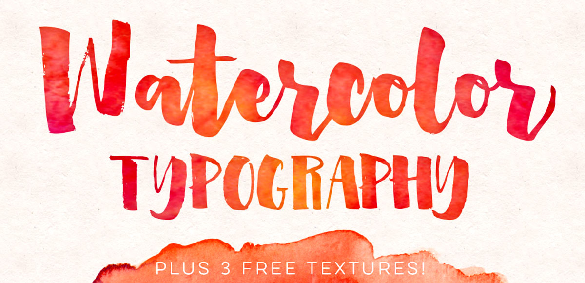
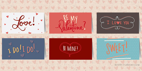
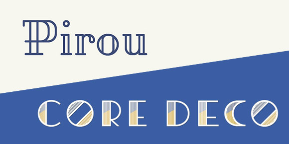
HomePosts Tagged "typography" (Page 13)

typography Tag

I’ve started using Pirou lately as a headline on some Canva layouts I’ve created, and I’m really liking it! I typically pair it with a regular to medium weight sans serif to create some contrast since Pirou has so much character. Because Pirou is free, I was wondering what kind of buyable fonts were similar that might offer some nice extensions of this look. I discovered Core Deco the other day and I’m getting very tempted – especially because it’s 80% off right now, which means each variation is only $4. Though I wouldn’t completely consider Pirou deco, I really like the different vibes Core Deco gives off + it’s fun to play around with phrases in the type editor on myfonts. Here are a couple of previews with links if you’d like to check them both out a little more 🙂

It’s hard not to see watercolor textures everywhere these days! And it makes sense why – they’re beautiful and add such a personal, handmade touch to anything they’re on. That’s why in this week’s tutorial, I’m pairing them with my favorite thing – typography. The same rules apply if you’d like to add watercolor textures to hand lettering, too for an even greater handmade look. As a bonus, I’m including 3 free high res watercolor textures so you can play around with your own type or hand lettering. Let’s get started!

Happy Tuesday! This past weekend was reallllly busy for me! I designed our wedding invitations and recorded a Skillshare class on the entire process from start to finish: all of the research, sketches, lettering experiments, then finally setting up and saving the file correctly so it’s ready to hand off to my letterpress printer. You can watch the free intro to the class (called Laying out Your Lettering for Letterpress) here and just for my blog readers and YouTube watchers, I’m sharing one the other videos today. This video covers the sketching process of lettering based on research which determined the look and feel we were going for (Southern rustic). If you’re interested in seeing the rest of the class, you can sign up for Skillshare free of charge for an entire month using this sign up link.

Brush script style fonts have been gaining in popularity – from hand drawn versions to vector point-perfect variations. Brush script styles lend themselves to applications with character and personality, an artsy organic feel, or just an extra human touch. This versatility gives brush scripts a well deserved spot in any font library. Here are a few for free and for a fee to round out your brush script font collection.

There are a lot of tutorials out there on how to create hand lettering, but far fewer on what you can do once you create your lettering. In this week’s tutorial, we’ll create a hand lettered photo composition using just photoshop. We’ll start with placing and coloring our lettering on a chosen photo, then go over the basics of masking and applying environmental shadows to give the final piece a polished look. As a bonus, I’m including the lettering used in the tutorial so you can follow along exactly if you’d like. Let’s get started!

Happy Tuesday! I’ve had a few requests for more lettering tutorials, so I’m here to deliver! I’ve also made a lettering playlist which you can check out here where I’ll keep them all together 🙂

In this week’s quick tip video tutorial, we’ll digitally letter the number 3 two ways. For the first way, we’ll be using this Wacom tablet (or any of these) and the brush tool in Illustrator. After that, we’ll digitally letter the same number 3 from scratch using just the pen tool. We’ll go over the best way to plot your points and basic point handle adjustments using the direct select tool in Illustrator. Let’s get started!

If you haven’t guessed it by now, I’m a little bit obsessed with typography! Every year around my birthday (next Saturday!) or around the holidays, when my family asks what they could gift me, I always ask for some kind of book relating to lettering or type. I love these books because, although there is sooooo much online, there are always gems buried deep within those book jackets or paperback covers. And while it’s common to come across a lot of recycled material online, it’s nice to be inspired by something different. So if you’re looking for some lettering books to inspire your next project, here are some of my favorite lettering books – and I own all of them…except for #5, that’s getting delivered tomorrow 🙂 

Hatched drop shadow text effects are becoming more common in typefaces these days – Trend was one of the first to offer a layered font with a faux hatched drop shadow which motivated others to offer them. But what if you want a hatched drop shadow on the font you’re using, not trend? What if it’s for a one-off headline where lots of text doesn’t need it, it just needs to look beautiful in one powerful instance? That’s when we start making art instead of adjusting type, which is why this week’s tutorial isn’t on a text layer style; we’ll be customizing our hatched drop shadow to fit an artistic style.

I think this blog makes it pretty obvious I’m a big fan of anything handmade 🙂 And I loveeee typography – it’s the reason I got into design in the first place. So, if we put those two together, we get this post! Handmade fonts are gaining popularity in a big way, especially on Creative Market (the best seller from all of last year was a handmade font!). So here are 8 handmade fonts to add to your collection, all of which happen to be super affordable, too!

Happy Tuesday! In this week’s tutorial, we’ll create a retro text effect in Adobe Photoshop from scratch, inspired by the 80’s. I’m also giving away the exact style we create as an .asl file (layer style file) and in the tutorial I’ll show you how to save your own layer style and install it so you can have the exact settings that were mentioned. So it’s a 2 for one this week! Tutorial + freebie 🙂

GDPR Icon

Your Privacy Matters

We use cookies to customize and create content that’s most important to you. We’ll never share the info we collect.

View Privacy Policy