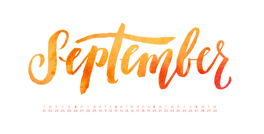
HomePosts Tagged "typography" (Page 12)

typography Tag

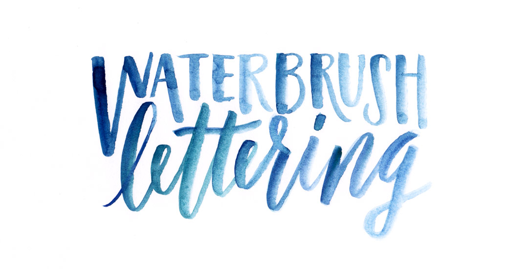
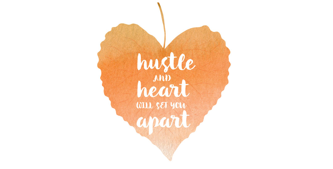
Happy September! I made the realization the other day that I haven’t changed my desktop wallpaper in nearly two years! With my current waterbrush obsession, I decided to take our relationship to the next level by creating some new waterbrush script artwork for my desktop! This week I’m sharing the love by giving away these hand lettered September desktop wallpapers so we can all ring in fall properly. Choose to have yours with or without dates in two common resolutions, previews below!

If you’ve been following my Instagram, you know how obsessed I’ve been lately with lettering using a waterbrush! It combines two strong passions of mine – watercolor and typography and I can’t get enough! Since I’ve been experimenting like a crazy woman, I wanted to share some tips I’ve learned over the past few weeks. I’m no expert by any means, but I’ve gotten into a rhythm and I’ve been really happy with how I’ve improved by remembering a few simple things. If this is something you’d like to try, my hope is that this video will save you time, money and supplies. Speaking of supplies, everything mentioned in the video that I’m currently using is listed below the vid 😉 For more on brush lettering with watercolor, check out my master course!

As the summer begins to wind down, things are already feeling busier! I’m finding myself constantly searching for a sheet of paper to scribble notes on, to-do reminders, or phone numbers to call. If this is you too, you might want a prettier sheet of paper to make your list a bit more achievable..I know I do! For that reason, this week’s freebie is a set of 3 watercolor notecard printables – print two notecards per any 8.5″x11″ or A4 cardstock or regular paper. The final printed size for each notecard is 5.5″x8.5″, full preview + download link below!

Welcome to Typins #5! This post is where I share my recent favorite typography pins from pinterest. I’m obsessed with (and if you’re here, I’m sure you are too!) and have boards for general typography (phrases, quotes, full words) written beautifully, just letters and just numbers. I pull from those boards for these posts, so there’s even more over there if you’re craving a bigger type fix 🙂  Here are 8 of my current favorite pins to get your type on!

Happy Tuesday! Chalk lettering is still going strong these days, from outdoor signage, to indoor wall murals, to photographed magazine ads. But! What if you want a digital, more permanent and quickly editable outcome without all the mess (or dealing with the perfect lighting setup for photography)? There’s actually a super quick way to accomplish a chalk typography style in Photoshop in just a few simple steps. In this week’s tutorial, I share my exact process of taking a nothing-special pencil doodle or sketch and transforming it into white chalk, then colored chalk typography. Use this same method for illustrations too! Whatever you can doodle, you can change into the digital chalk look, and in only ~10 minutes! Try doing that with real chalk 😉 Let’s get started!

Happy Tuesday! This week’s tutorial comes courtesy of Kamron’s request on how to replicate a line gradient typography effect, like this one. While you could create this effect in a similar way as this retro type effect tutorial in Photoshop, the blend tool in Illustrator performs the effect quicker (in my opinion), AND you end up with vectors that can scale infinitely without losing resolution. Win, win 🙂 This is one of the quicker type effects we’ve created, making it the perfect solution when you need a nice type effect in a pinch!

I came across Pawel Norbert‘s paint streak typography a while back and completely fell in love with it. There’s so much color, so much energy, so much personality displayed in just a single letter. With the addition of the Mega Paint Streak asset pack I created a few weeks back, Pawel’s work came rushing back to mind, as it paired similar textures with my most favorite element of design: typography. In this week’s tutorial, I share how I would create a similar type of paint streak typography using Photoshop. Once created, we’ll add shadows + highlights to finish it off with some extra dimension. You’ll be able to use the artwork you create to either gift, sell as a customized art print, wallpaper your desktop, or keep it for yourself + display it on your own wall! Not too shabby for ~15 minutes! Let’s get started!

It’s time for another Text Drive post! To be honest, there’s nothing I love typing with more than a beautiful script. There’s something about the way all the letters connect so seamlessly, so beautifully, all at the same time. While brush scripts are definitely in the spotlight these days, there’s something to be said for more subtle, personality driven, simple scripts… Scripts that have *just* enough decoration where you scale them up or zoom out a bit and take them in. Bonus points when you’ve got a great quote to typeset 🙂 As with all text drive posts, here are two similar fonts, one for free (Daydreamer) and one for a fee (Mulberry Script) as well as a little summary of what I love about each and what fonts I’d pair them with!

Have a photograph you love and wonder how to make it into an art print you could gift or sell? In this week’s tutorial (brought to you courtesy of Yasmin’s suggestion!), we’ll create an art print based on a photograph by taking a photo of an object and recreating portions of it in Illustrator. We’ll add some watercolor texture and even a nice quote using a beautiful brush script font. This is a quick way to practice your Illustrator skills and create something personal you could gift or sell at the same time! Start by picking out a photo of an object or use the same one as I am (link below) and let’s go!

Welcome to Typins #4! This post is where I share my recent favorite typography pins from pinterest. I’m obsessed with (and if you’re here, I’m sure you are too!) and have boards for general typography (phrases, quotes, full words) written beautifully, just letters and just numbers. I pull from those boards for these posts, so there’s even more over there if you’re craving a bigger type fix 🙂  Here are 8 of my current favorite pins to get your type on!

Happy Tuesday! I thought I’d add a more advanced tutorial to the mix since we’ve really laid all the foundation in earlier tutorials. Plus, this one’s really fun and with just a few quick steps, you end up with a pretty cool outcome. In this week’s video, we’ll add vector dimension to typography by taking some hand lettering created with the Wacom tablet (like in this or this tutorial), and we’ll add vector gradients to simulate shadows to bring in that vector dimension. The end result is a 3d looking piece of your own typography, plus you can use the same technique for any kind of artwork, not just typography – think logos, patterns, icons and illustrations! Let’s get started!

Can you believe Mother’s Day is next Sunday! NEXT Sunday! Mother’s Day never gets forgotten in my family – My mom was born on Mother’s Day (the year she was born, her birthday – May 13th – was Mother’s Day) and then my youngest sister was also born on May 13th, so she was born on my mom’s birthday AND it was Mother’s Day that year! It was so coincidental the local newspaper wrote an article about us, so we still have the clipping of me at 4 years old sitting on the hospital bed with my brother, my 2 sisters, my dad and mom. My Dad’s dad was born on New Year’s Day and my Mom’s dad was born on Christmas – so it actually gets even crazier, but we’ll save that for another time 😉

Anyway! In celebration of moms, this week’s freebie is a printable hand lettered Mother’s Day card. It’s sized 6″x4″ folded, so it’ll fit in any A4 envelope. Send it out early and get extra points! 🙂

GDPR Icon

Your Privacy Matters

We use cookies to customize and create content that’s most important to you. We’ll never share the info we collect.

View Privacy Policy