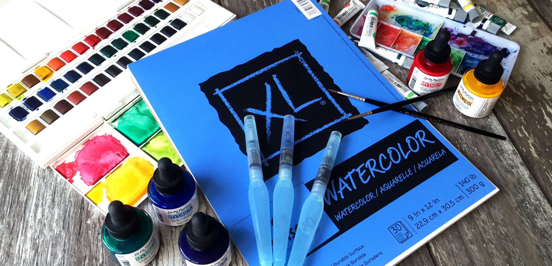
HomePosts Tagged "typography" (Page 7)

typography Tag

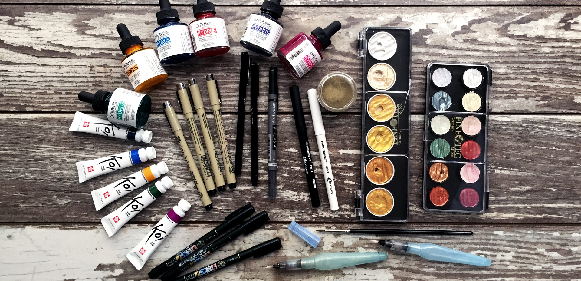
One of my favorite parts about this year was experimenting with more art supplies than I ever have before. I definitely didn’t love everything I tried, but I do have a list of favorite art supplies from 2016. I thought it would be nice to compile them this week into one nice, review-like list. If you’re looking to try some new ones in 2017, I hope this will help with the decision making. Reading actual (unbiased) user reviews is always so helpful for me, so that’s exactly what I wanted to offer. See the full list below!

Since Procreate’s latest update is less than a month old, it’s time for a new iPad lettering tutorial! If you checked out my iPad Lettering class from a couple versions earlier, you saw how fun it is to work with Procreate textures. One texture works wonderfully, but things can get a little trickier when you want to get other textures involved. In this week’s tutorial, I’m sharing one quick trick that makes introducing other textures super simple. In this tutorial, we’ll use a foil and watercolor texture, plus add a little holiday flair for good measure 🙂 Read on to see how!

Happy December! Now that the holiday season is in full swing, I wanted to offer up a fun hand lettering technique for your (any time of the year) stationery, too! This ombre embossing effect is SO eye catching *and* I have a technique that avoids mixing your embossing powders together. Using this technique, you’re able to maximize the life of your powder purchases and create beautiful outcomes, too. Plus, look at the colors on black! I love the vibrancy and contrast embossing straight onto black produces. Swoon. Read on to see it all!

Happy Thursday! This week was a big week as I finally completed and released the Espresso Roast font trio. As you can imagine, a trio of fonts that all work together and pair stylistically is not a quick accomplishment. This was my first time creating a font trio, so I wanted to post a little about my process to help any aspiring font makers out there 🙂 Here’s a peek inside, along with a font previewer, so you can play with Espresso Roast directly in the post!

Last week, we created a realistic foil stamp effect using only illustrator and a seamless foil texture. This week, we’re borrowing some of the same tips, but simplifying. If you don’t have a texture on hand, but still want to add an element of cool, a letterpress effect is a great option. The letterpress effect simulates the impression a polymer plate makes on paper when it’s pressed into it. Letterpress has become increasingly popular over the last 5 years, but fun fact: letterpressing was never meant to be a final print effect. Letterpressing first began as a ‘test’ print before metal plates were developed which create stronger, deeper (and more expensive) impressions. In this week’s tutorial, adjust the settings for however strong of an impression you’d like as we create a letterpress effect entirely in Illustrator.

This past January, we created a foil stamp effect in Photoshop, and I’ve recently had a few requests on how to accomplish the same look in Illustrator. With the holidays fast approaching, now you’ll have plenty of time to use it in Illustrator, too! Not only can this look be applied to typography like in the example, but you can also export it as a graphic style. Exporting graphic styles allows the foil stamp effect in Illustrator to be applied to any vector element, as well. Pretty powerful stuff. At the end of the video, I share how to export those graphic styles to use them in new documents or share them with others. Read on to see it all!

With the launch week of Brush Lettering with Watercolor coming to a close, I thought it would be fun to tie colorful letters into a quick tip design tutorial. And what better way to talk about type anatomy than getting colorful with it? 🙂 This is actually kind of perfect for hand letterers and graphic designers alike. For hand letterers, an intimate understanding of letterforms is essential, keeping qualities consistent for balanced, harmonious styles. For graphic designers, understanding style pairings and their character traits creates more strategic, thoughtful designs.

Over my (almost) 10 year career as a graphic designer, there’s definitely a short list of type characteristics that serve as an excellent base if you’re just starting. In this week’s video, I walk you through those base type anatomy qualities, with full descriptions throughout the video. Download the free cheat sheet below to reference later!

One of my favorite uses for the hand lettering I create is vectorizing it and using it digitally. When it’s digital, you don’t just have one copy anymore; you have unlimited copies. Unlimited copies leaves the door to digital and physical prints massively wide open. By taking a few simple steps, you can quickly digitize your lettering, clean it up in Illustrator and create a print ready file in a matter of minutes. Like I said, one of my favorite things 🙂 This week, I share my full process on how I do it by creating a hand lettered birthday card in Illustrator!

If you’re an Every-Tuesday subscriber, then you already received this brush lettering with watercolor supply list in your inboxes yesterday 🙂 It’s too useful of a resource not to share, so I wanted to also bring it into the blog this week. Having the right supplies can be a serious road block when you’re just getting started, and a costly one at that. After going through my fair share of supply testing (and cash), I’ve compiled a list of my absolute favorites. For those on a budget, or if you’re not sure if this is for you, I’ve also included a separate list of comparable, lower priced items 😉 My newest master course, Brush Lettering with Watercolor is now open if you’d like to put these supplies to use!

I’ve only recently started incorporating Illustrator texture brushes into my work, and I regret not doing it sooner! Illustrator texture brushes offer so much hand made feel with such little effort, you almost feel like a magician 😉 To get started, all you need is any kind of vector texture like this set of inky brush strokes or these mini grit textures (both free!). From there, we convert them into Illustrator art brushes with specific settings and we’re done! This will be such a great addition to your regular workflow if you love including extra texture into your work. For the tutorial, we’ll create some inky and gritty typographic drop shadows in just a few quick minutes. Read on to see it all!

I think it’s pretty fair to say that diy embossing is reallllly popular right now. It’s easy to see why; First, there’s watching colorful powder stick magically to invisible ink. Next, there’s witnessing it look completely different (especially metallics) once heat is applied. The results look like they came from a pro print shop! I haven’t come across many videos of a watercolor/embossing combo, so it was time for that to change 🙂 I recently started applying embossing designs to my watercolor lettering and it makes for some really tactile + impressive outcomes.  This week I wanted to have some fun by sharing watercolor lettering with DIY embossing 3 ways. Everything used in the video listed with links below!

GDPR Icon

Your Privacy Matters

We use cookies to customize and create content that’s most important to you. We’ll never share the info we collect.

View Privacy Policy