Home2016October

October 2016

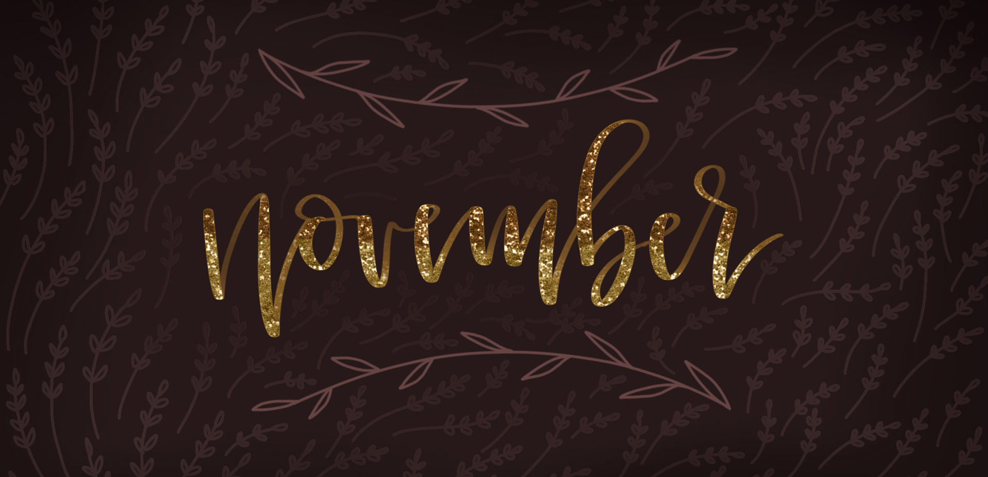
Today’s the last Thursday in October, so it’s time for your free November 2016 desktop wallpapers! This month’s wallpaper was hand lettered on an iPad Pro using an Apple pencil. Here are a few more details: the glitter texture is from the Procreate Metallic Texture Kit. The brushes used were a slightly modified (default) studio pen and brush pen in Procreate. This download includes the wallpapers in two common resolutions: 1280x1024px and 1920x1080px, with and without dates. I’ve left the year off of the ‘no-dates’ versions, so you can use it for any November in the future, too!

This past January, we created a foil stamp effect in Photoshop, and I’ve recently had a few requests on how to accomplish the same look in Illustrator. With the holidays fast approaching, now you’ll have plenty of time to use it in Illustrator, too! Not only can this look be applied to typography like in the example, but you can also export it as a graphic style. Exporting graphic styles allows the foil stamp effect in Illustrator to be applied to any vector element, as well. Pretty powerful stuff. At the end of the video, I share how to export those graphic styles to use them in new documents or share them with others. Read on to see it all!

Three years ago this week, before I ever thought a full time design blogger was something I’d be, I published my first blog post on Every-Tuesday. The post was a halloween character free vector set and it wasn’t in my style at all. I’m also far from an Illustrator, but I decided I was going to blog consistently and it was almost Halloween, so why not. Let’s put up some Halloween vectors – there’s a way to start a blog. That’s actually kind of funny.

I’m certainly not proud of that particular post, but I’m proud that I started, regardless of not being quite sure where I was going to go with my concept of consistent Tuesdays. Here’s a little background on why that post and this blog began in the first place, along with 3 very unexpected truths that I’ve learned by being a full time design blogger.

With the launch week of Brush Lettering with Watercolor coming to a close, I thought it would be fun to tie colorful letters into a quick tip design tutorial. And what better way to talk about type anatomy than getting colorful with it? 🙂 This is actually kind of perfect for hand letterers and graphic designers alike. For hand letterers, an intimate understanding of letterforms is essential, keeping qualities consistent for balanced, harmonious styles. For graphic designers, understanding style pairings and their character traits creates more strategic, thoughtful designs.

Over my (almost) 10 year career as a graphic designer, there’s definitely a short list of type characteristics that serve as an excellent base if you’re just starting. In this week’s video, I walk you through those base type anatomy qualities, with full descriptions throughout the video. Download the free cheat sheet below to reference later!

In Tuesday’s post when I introduced my newest course, Brush Lettering with Watercolor, I mentioned that when I started brush lettering with watercolor, it was the first time I had ever used watercolor. This is actually kind of awesome for two reasons:

#1 Since I had no idea what kind or brand of watercolor was best for lettering, I experimented with everything.
#2 If you want to brush letter with watercolor and you’ve never used watercolors before, I’m an example that is 100% ok!

Throughout all of my experimentation, I learned what the 3 best watercolor types are for brush lettering. These are watercolors that blend nicely together, are flexible for being creative and all behave in different ways compared to one another. Yay, options! Read on for examples, my favorite brands, plus links and reviews!

Today is one of the biggest days to date on Every-Tuesday. Our very first long-form, self hosted course (only available on every-tuesday) is officially open today, titled Brush Lettering with Watercolor!

Two years ago, I decided to go all-in with my brush lettering. I tried (what felt like) every supply out there, watched demos, looked at inspiration, read books, you name it. My lettering was improving very slowly, and I experienced a lot of frustration. A lot of overwhelm. A lot of second guessing. It felt like I was doing everything right, but my outcomes just didn’t feel like they were quite there. I started implementing a few new techniques and that’s when things really took a turn for me. I remember the night it finally came together so well, like I had cracked a special code.

On Tuesday, we created extra unique watercolor textures using 3 simple and creative tricks. There’s something about the way colors blend together with water that’s kind of magical. One of my favorite indulgences is searching out abstract, beautifully colored textures and seeing how I can put my own spin on them. To keep those eye candy textures better organized, I’ve even started this pinterest board, too. In a follow up to Tuesday’s tutorial, I wanted to share 8 inspiring watercolor textures to light that extra spark if you needed a creative boost today 😉 I know there’s never a bad day to feast my eyes on these!

If you’ve been here for any length of time, then you know I  have a slight obsession with watercolor. Part of it is mixing beautiful color combinations together, and another is creating abstract and unique textures. Creating unique textures allows you to then use them in designs, producing an outcome no other person is capable of replicating – ever. And that makes everything even more special. As you might imagine, I’ve spent many hours experimenting with watercolors and this week I want to let you in on 3 simple tricks to create unique watercolor textures of your own. It doesn’t matter which kind of watercolors you have on hand, either – these tricks will work with em all 😉

GDPR Icon

Your Privacy Matters

We use cookies to customize and create content that’s most important to you. We’ll never share the info we collect.

View Privacy Policy