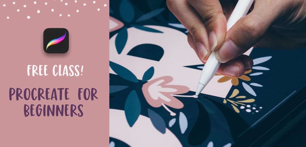
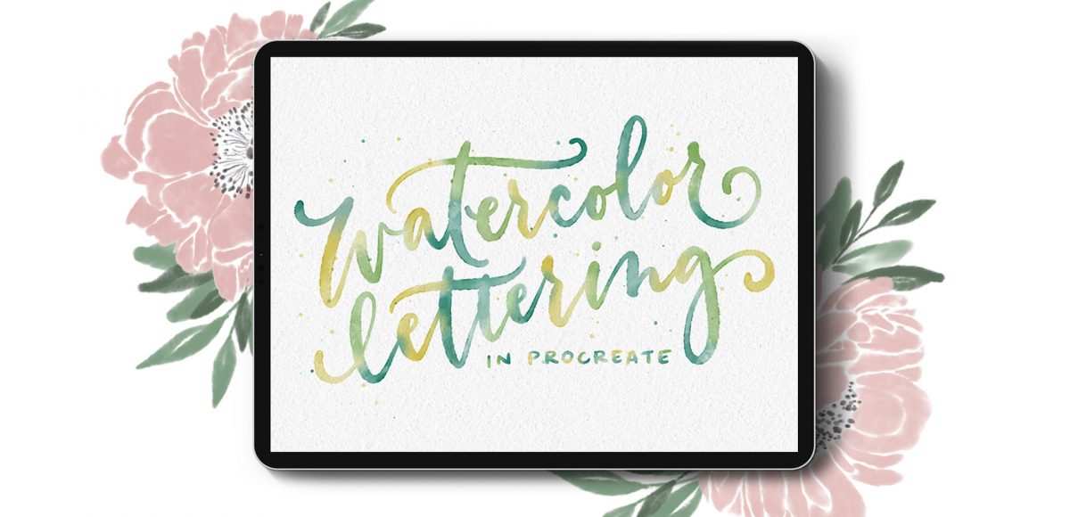
HomePosts Tagged "typography" (Page 2)

typography Tag

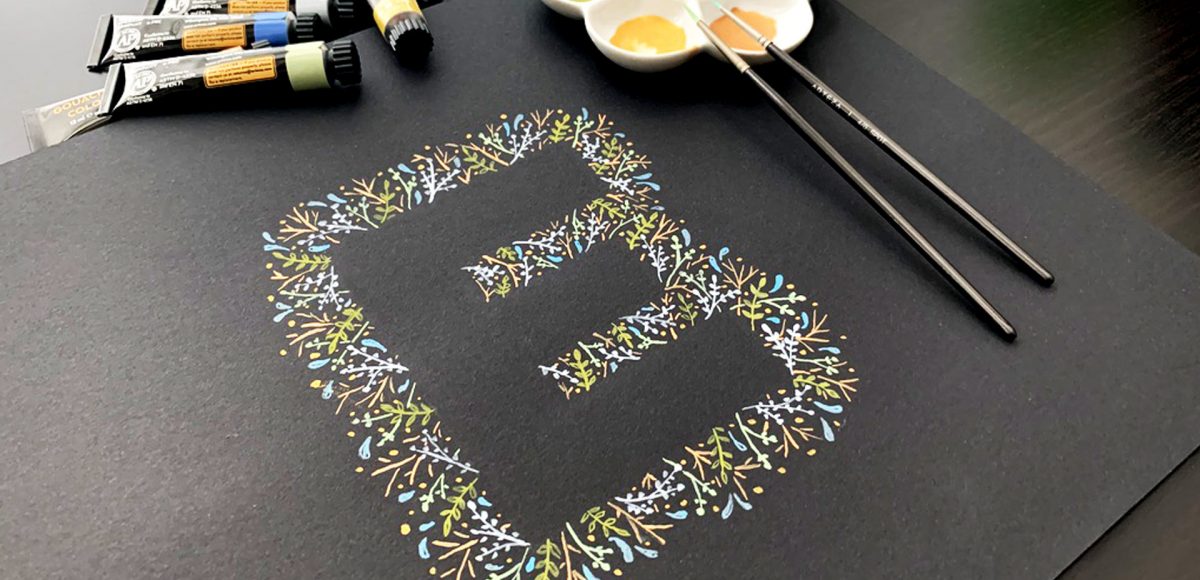
I am SO excited to announce my newest course today: Watercolor Lettering in Procreate! I’ve spent the last two months refining my process and making all of the projects, then creating bonuses, a brand new brush set, recording + editing and today is finally the day! In this 8 project course, you’ll learn how to create beautiful + realistic watercolor lettering in Procreate! I’ve also included a bonus on floral + foliage foundations since we have a few floral typography projects, too. And to set you up best for success, I’ve included ALL of my watercolor lettering brushes and paper textures, so you can follow along exactly. Read on for all the details + course trailer!

It’s the last Thursday in September, which means it’s time for your free October 2019 desktop wallpapers! This month’s wallpaper was entirely created in Procreate, with just the dates added in using Photoshop and my font, Miss Magnolia. I wanted to try something new this month with a depth effect/playing with brush transparency. The lettering and doodles were both made using my free custom brush pen (available in the Resource Library). For the dates, ‘R’ is for Thursday, to distinguish it from a same-sized Tuesday ‘T’ at a glance. 

The download includes the October 2019 desktop wallpapers in two common resolutions: 1280x1024px and 1920x1080px, with and without dates. I’ve left the year off of the ‘no-dates’ versions, so you can use it for any October in the future, too!

I’m realllly excited about this week’s Procreate tutorial! Little polaroids are some of my favorite things to make – you’ll definitely notice that if you’ve spent any time on my site. Now that Procreate has the quick shape tool, they’re super simple to make! In this week’s tutorial, I’m sharing how to create peeling polaroids in Procreate by applying 3 different shadow types. I’m even sharing my method for applying a trendy shadow on the top, too! Read on to see it all!

This is one of my new favorite lettering effects in Procreate! A couple years ago, I showed how to do something similar in Photoshop, so I thought, “Why not try it in Procreate?” Turns out, it’s even easier in Procreate! I love how it looks with multiple letters, too. This week, we’re creating a paper cut out effect in Procreate. Read on to see how and pick up the colors + brush used in the tut for free!

It’s the last Thursday in August, which means it’s time for your free September 2019 desktop wallpapers! This month’s wallpaper was entirely created in Procreate, with just the dates added in using Photoshop and my font, Miss Magnolia. For more on Procreate floral doodles, check out my free course, Procreate for Beginners! This month’s lettering was created by using my Signature Marker brush in my Font Lovers Procreate brush set. The doodles are a mix of the signature marker + my free monoweight brush (available in the Resource Library). For the dates, ‘R’ is for Thursday, to distinguish it from a same-sized Tuesday ‘T’ at a glance. 

The download includes the September 2019 desktop wallpapers in two common resolutions: 1280x1024px and 1920x1080px, with and without dates. I’ve left the year off of the ‘no-dates’ versions, so you can use it for any September in the future, too!

A while back, I created this tutorial where I shared 10 lettering enhancements anyone can do. The responses to the video have been amazing, so this week I wanted to take things a step further with a lettering shadows version! Adding shadows to lettering can really takes things to the next pop-off-the-page level. The best part is they are super simple to implement! Today I’m sharing 10 lettering shadows anyone can do – I even included a free download with them all listed out below 😉 Read on to see the full video!

A few weeks ago, I asked on my Instagram if anyone wanted to learn how to make animated gifs in Procreate. After reading through the responses, I knew I couldn’t stop with just one! So I created 2 tutorials 😉 The first one is meant for beginners: getting the basics down + understanding how the file needs to be built. The second tutorial is a bit more advanced, since we utilize masking to make ‘drawn in’ lettering. Now that Procreate offers an export option for animated mp4s, it’s even easier to post your animations straight to instagram. Read on to see both tutorials!

Chalk marker and traditional chalk lettering have been popular for a while now and they don’t seem to be letting up any time soon! While I love both, there’s soooo much less mess with chalk markers, so it makes them a little quicker and easier to experiment with. I had a thought the other week about using a wet paintbrush with my chalk markers to simulate depth. That idea ran into creating a paint streak effect, which led me to experimenting with fine line highlights and shadows. As I came out of that rabbit hole, I was so excited all of my experiments actually came out the way I had hoped, or better! This week, I’m sharing exactly what I did (including other effects), so read on for 10 chalk marker effects anyone can do!

I have a big freebie for you this week: I’ve put together 10 different lettering guides, including italics! You can grab them as traditional, printable guides (use tracing paper or a lightbox with them), as well as a Procreate version. Since there are so many different ones in one Procreate file, I thought a video would help show exactly how to use them. Read on to grab your free Procreate lettering guides (and printable ones), as well as some simple tips with how to use them!

In my course, Learn Font Making, I take you through all the steps to prepare your lettering for font making, convert it into a working, professional font and I share my best tips for selling your font, too. I’m often asked by students is if I think the market is too saturated for new font makers. Although converting your lettering into a sellable font *is* a process, the fact the font making market is booming right now should not hold you back from starting; it should actually do the opposite. In this week’s video, I share my perspective about the saturation of the font market. I also share tips to stand apart from the crowd to get your fonts noticed by those buyers. Read on for it all!

I remember sitting in my Color Theory 2 class at SCAD (12 years ago!) and we were given an assignment we had to use gouache for. ‘Gouache?’ I thought, “Can’t be that different from acrylics, can it?”

It was the first time I had ever heard of it, let alone had any knowledge of how to use it. Since sitting in that classroom that day, I learned that 1. yes, it is definitely different than acrylics and 2. it’s actually pretty amazing.

In this week’s tutorial, I’m taking you through gouache basics – how to mix colors, water ratios + what makes it so amazing to work with. Together, we’ll paint leafy gouache letters (or shapes!) that can be used for wall art, stationery or gifts! Read on to see it all!

I’m really excited to announce today that my newest course, Procreate for Beginners, is available! And yep, it’s free! You can check out all the course details (over 2 hours worth!) and sign up right here. If you’re new to Procreate or are just looking to pick up some workflow, tools or technique tips, this course was made for you. I take a slower pace, still describing every step as I go (as with all my courses), so you’ll know exactly what does what and why it does it, too. A few more details about the course as well as the course trailer are below!

GDPR Icon

Your Privacy Matters

We use cookies to customize and create content that’s most important to you. We’ll never share the info we collect.

View Privacy Policy