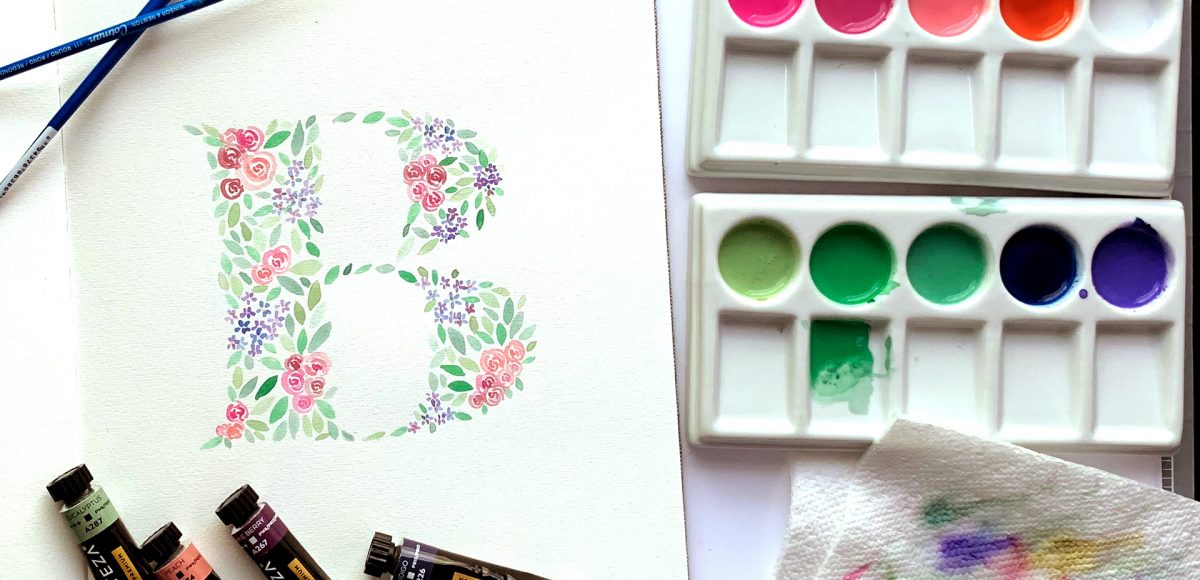
HomePosts Tagged "typography" (Page 3)

typography Tag

In the US, Mother’s Day falls on May 12th this year. After giving birth to our daughter on December 28th, this will be my first Mother’s Day as a mom! I wanted to celebrate by creating artwork that can be used as a greeting card as well as wall art! In this week’s tutorial, I share my process on how to paint a watercolor floral initial. All you need is your favorite font, watercolors and some watercolor paper. No prior watercolor floral skills necessary! Read on to see how!

Within the past week, Procreate released their latest version, which allows you to add text! It’s been really fun playing around with the new feature and seeing how I’ll integrate text into future Procreate artwork. This week, I thought I’d share an easy way to create artwork with text, as well as sharing some masking tips, too. Read on for how to use text in Procreate!

Happy Tuesday! This week I wanted to share a tutorial from my most recent online course, 3D Lettering in Procreate. The course takes you through 5 beginner basics projects and gets you comfortable with a bunch of 3D techniques. After that, there are 6 advanced projects that combine those basic techniques while adding on new ones for some extra stunning, pop-off-the-screen outcomes. This week I’m sharing one of the beginner basics techniques: the peeling sticker effect in Procreate. Read on to see it all!

Today I’m excited to announce my newest online course, 3D Lettering in Procreate! This course will walk you through all of the tools, workflow and effects needed to create believable + stunning, pop-off-the-screen dimensional iPad lettering! The course was created with beginners in mind and includes an entire ‘beginner basics’ section to get you comfortable with 3D essentials so you can feel confident heading into the advanced projects later on in the course. No lettering experience is necessary – I share my trick for using existing typefaces if that’s something you’d prefer ๐Ÿ˜‰ The course also comes with ALL of the original Procreate files from the videos, so you’ll have them as reference if you ever need them. Today I’m sharing the course trailer plus additional details, below!

One major change that came with Procreate’s last update was masking. It might not have seemed major if you aren’t familiar with masking, but it was actually a bigger deal than it probably got credit for. Masking essentially allows for a non-destructive workflow. What that means, is instead of erasing something you don’t need, then having to draw it back in if you change your mind, masking ‘hides’ the part you don’t want and you can bring back the original easily at any time. Pretty nice. You can check out how awesome masking is in Photoshop here and it actually works pretty similarly in Procreate. In this week’s tutorial, I’ll take you through the two most common lettering scenarios where I use masking in Procreate. Once you begin masking, you’ll see the immediate advantages and how much faster (and efficient) it makes creating and editing.

Happy almost-Halloween! With all the fun crafts that Halloween inspires, I couldn’t let it pass without adding a DIY to the mix! It’s been a little while since we had a craft tutorial and this is my biggest one yet. This week, we’ll create some mixed media 3D Halloween lettering you can use as decoration anywhere! We’ll plan it out + paint it with watercolor, add details with fineliner pens AND add some sparkle to finish it off. I’ll take you through my process of painting 3D, pop-off-the-page lettering, as well as how I plan out flourishing to frame the final piece. Read on to create your own mixed media 3D Halloween lettering!

Many of you likely know I teach a comprehensive course on creating and selling hand lettered fonts (check it out here!). The course reopens next week for the last time this year, so if you plan to get started, I thought some lettering supply recommendations were in order!

There are 2 ways you can create your initial lettering for converting into a font: digitally or analog. If you choose the digital route, I recommend using Procreate on an iPad with pressure sensitivity since there are amazing brush options for different looks. This post is all about the analog, though – as much as I love the iPad, there’s still something about lettering supplies on paper (not to mention the much lower price point!). Read on for my favorite lettering supplies for font making, analog-style ๐Ÿ˜‰

Last year, I bought myself a big pack of Coliro Colors FineTec metallic watercolors for my birthday. I had experimented with their gold collection earlier and couldn’t wait to have more colors to play with. The rest of the year, I obsessed with using them on new lettering pieces, custom greeting cards for friends and family – anything I could think of. The way they glimmer in the sunlight is so beautiful, I was constantly looking for ways to create other shiny outcomes ๐Ÿ™‚ I broke them out again the other day and realized I never shared my blending methods in a tutorial, so it was time for that to change! These watercolors get thick + dry pretty fast, so blending can be a little more complicated than traditional watercolors. In this week’s tutorial, I walk you through 3 blending effects using metallic watercolors with all of my favorite, long-tested tricks ๐Ÿ˜‰ Read below for them all!

If you’re just getting started with Procreate – especially after all the recent updates – it’s totally normal to feel a bit overwhelmed! This week, I wanted to do a super simple Procreate tutorial for beginners that will also give you some great insight into the capabilities Procreate now has. In this tutorial, we’ll create 2 easy ribbons in Procreate and you’ll pick up some tips you can use for your future digital artwork, as well. Read on to get started!

If you love lettering – whether it’s on paper or an iPad, you’re probably familiar with how powerful your lettering becomes when it’s vectorized. Vectorization allows your lettering to be infinitely rescaled without losing quality. This means it can be put on anything, at any size and look as great as the day it was drawn. Since it’s a digital copy, it can exist for forever without fear of it being buried in past stacks of lettering experiments, too. It’s also a crucial step in creating open type fonts!

In this week’s video, I’m sharing my favorite, most reliable Illustrator trace settings when it comes to vectorizing lettering. These are the settings I use every time I vectorize to keep as much original quality as possible. Read on for it all!

One of my favorite discoveries of the past year is a product called BRUSHO. It’s essentially concentrated, powdered watercolor, and it’s awesome. It took me some time to find the best process for using it with my DIY artwork, so in this week’s tutorial, I’m sharing everything I’ve learned! Skip all the troubleshooting/wasted material I went through and let’s create a Father’s Day card using BRUSHO together!

GDPR Icon

Your Privacy Matters

We use cookies to customize and create content thatโ€™s most important to you. Weโ€™ll never share the info we collect.

View Privacy Policy