
It’s been awhile since I made a lettering tutorial, so a new one was in order! I’ve had a few requests on my tips for improving brush lettering, and I have 3 simple ones anyone can use to see instant results! Read on for the full video and those 3 simple tips to improve your brush lettering all written out 😉
Pin it for later!
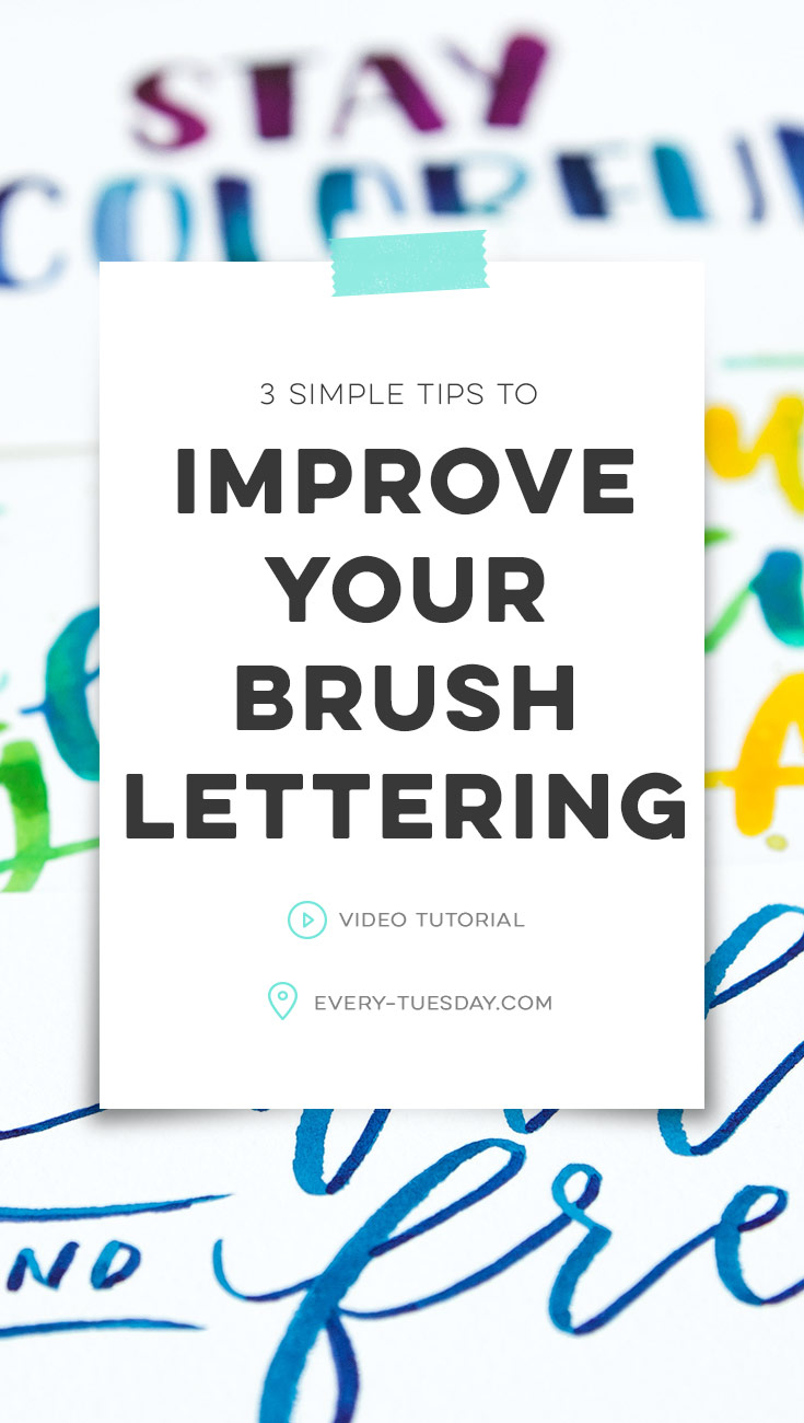
3 Simple Tips to Improve Your Brush Lettering
Mentioned in this video:
I also mentioned some free lettering guides you can download and use – here they are!
Free Lettering Guides
Standard, Italic + Dot Grid
- File type: pdf
- Size: 86kb
- Minimum software version: n/a

Here are the 3 simple tips to improve your brush lettering all written out!
- Lettering anatomy + structure practice
- As with any creative discipline, it’s important to know the rules before you break them 😉 Creating lettering is no different. Use the provided lettering guides to understand the structure of your letters, where your baseline, x-height, ascender, descender and cap height go for each of your letters and how they correspond to other letters. Don’t get too fancy from the beginning – get your consistency down first before you add bounce or flourishing later on.
- Understanding where thicks and thins go
- One of the biggest mistakes new letterers make is placing their thicks and thins in the wrong places. To help with getting them right, begin drawing out each letter individually. If it helps, make arrows on each letter of the direction of the stroke. Every downstroke has more pressure/a thicker stroke and each upstroke is lighter pressure/thinner stroke. Do a few letters at a time until you’re happy, then continue to add more. Trying to do the entire alphabet at once can cause confusion and reduce the muscle memory, so slow and steady is the trick here!
- Consistent weights
- Now that you understand the general structure of your lettering’s anatomy and you know where to place your thicks and thins, it’s time to practice consistency! Once of the most obvious signs of an experienced letterer compared to a novice is line weight consistency. The goal here is to have all of your thicker strokes (downstrokes) the same thickness and all of your thinner strokes (upstrokes) the same thinness. With your brush marker or paintbrush, create practice strokes, memorizing the amount of pressure used for your downstrokes and upstrokes. Do this repeatedly until you’ve built up the muscle memory for your lettering and then begin lettering. Eventually, your hand will just know what to do without those practice weight strokes ahead of time 😉
Receive special offers on courses + products, a new design file every month plus instant access to the Resource Library!

Pick up over 50 design + lettering files as our gift to you when you join the Tuesday Tribe for free!
error
Congrats!
Please check your email to confirm.
You May Also Enjoy
 My Favorite Lettering Supplies for Font Making Posted in Tutorials, Roundups, Typography, Hand Lettering, Beginner
 Create Colorful Rainbow Brush Lettering Posted in Tutorials, Hand Lettering, Color
 10 Chalk Marker Effects Anyone Can Do Posted in Tutorials, Typography, Hand Lettering, Illustration, Crafts, Beginner
 Holiday Hand Lettering Projects: Week 3 Posted in Tutorials, Typography, Hand Lettering, Holiday, Crafts
Eva Lobaton | June 20, 2018
|
Thank you Teela! I really apreciate your videos.
And thank you for the Lettering Lines. Greetings from México.
Eva Lobaton