A while back, I created this tutorial where I shared 10 lettering enhancements anyone can do. The responses to the video have been amazing, so this week I wanted to take things a step further with a lettering shadows version! Adding shadows to lettering can really takes things to the next pop-off-the-page level. The best part is they are super simple to implement! Today I’m sharing 10 lettering shadows anyone can do – I even included a free download with them all listed out below 😉 Read on to see the full video!
Pin it for later!
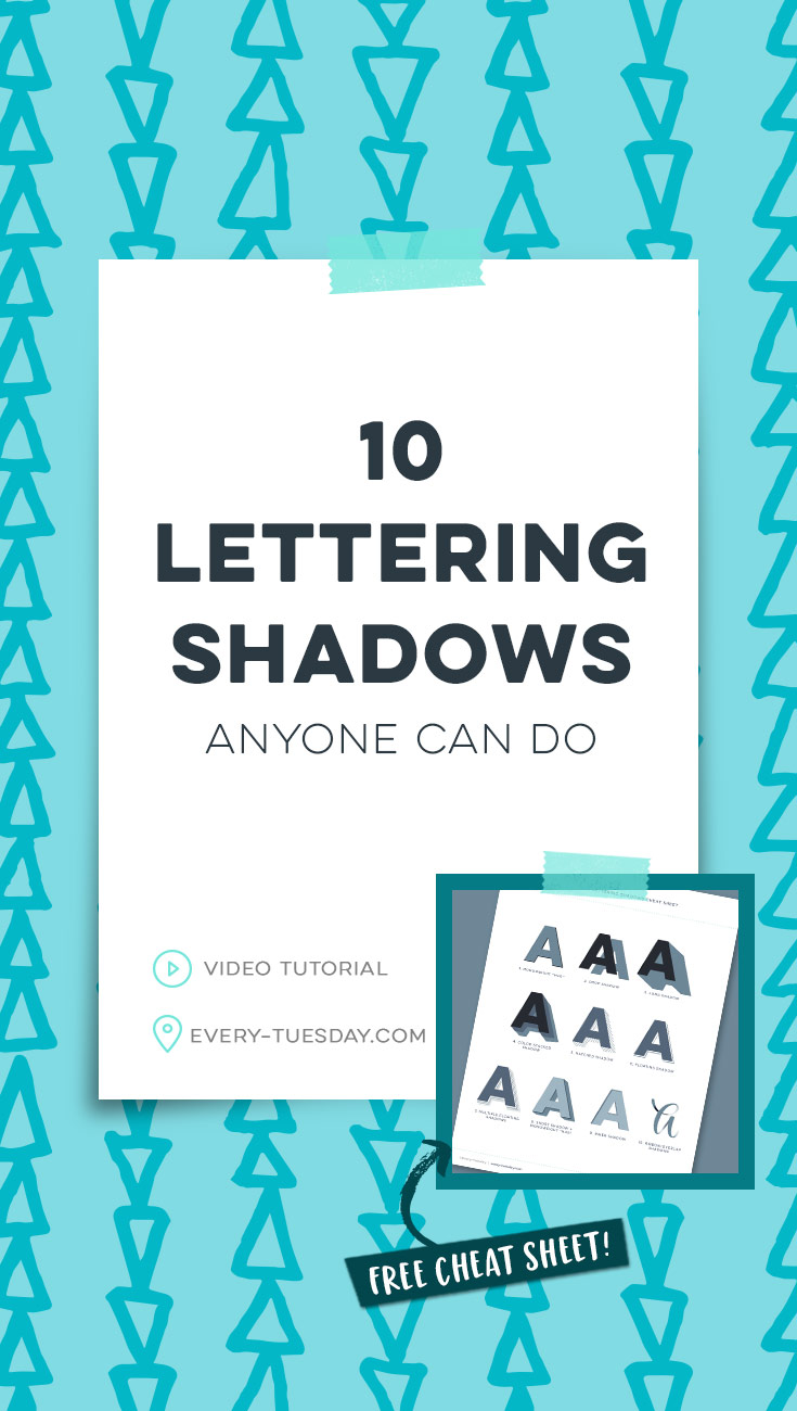
10 Lettering Shadows Anyone Can Do
Mentioned in this video:
My friends at Arteza have generously offered all Every Tuesday readers 10% off their purchase through September 1, 2019 when you use the code TeelaCunningham4 at checkout! You can see more of their supplies in action over on their YouTube channel.
I also mentioned a free cheat sheet with all the shadows listed out! Download that right here:

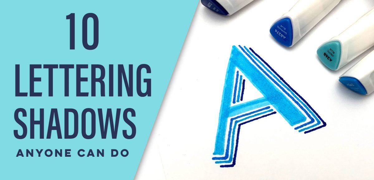
Here’s a quick recap of 10 lettering shadows anyone can do!
- Monoweight ‘hug”: Attach a single weight line to the edges of your base letter.
- Drop Shadow: Create a duplicate base letter offset and behind your original.
- Long Shadow: Recreate a drop shadow, connecting extremities and filling in any white space.
- Color Stacked Shadow: Recreate the long shadow, adding an additional layer of a different color.
- Hatched Shadow: Place repeating lines that are evenly spaced, similarly angled and the same length around your letter. Place these where your shadow should fall.
- Floating Shadow: Recreate the monoweight hug, but this time leave a space between the base letter and the single line shadow. Make sure to leave that space consistent all the way around your letter.
- Multiple Floating Shadows: Repeat the floating shadow, making each additional shadow line slightly offset from the previous one.
- Short Shadow + Monoweight Hug: Create a short shadow by making a block letter and filling it in. Apply a monoweight hug to the edges of your base letter.
- Inner Shadow: Place a fine line shadow along the edges of your letter. Use the base letter’s color to blend the darker color until a smooth transition occurs. Repeat as needed for darker shadows.
- Ribbon/Overlap Shadows: Use a script style letter as your base. Place a small amount of darker ink where overlaps will occur. Use the lighter color to blend the darker color until a smooth color transition is achieved.
This post contains affiliate links. This means I may make a commission at no additional cost to you if you choose to purchase the products listed. I only promote products I’ve personally used, trust and believe in. Thank you in advance for supporting the free content on Every Tuesday!
Receive special offers on courses + products, a new design file every month plus instant access to the Resource Library!

Pick up over 50 design + lettering files as our gift to you when you join the Tuesday Tribe for free!
error
Congrats!
Please check your email to confirm.



No comments