Home2014 (Page 5)

March 2014

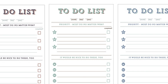
It has been a crazy last month for me. I’ve been working some late nights finishing up a new website for a client. With those late nights came plenty of ‘to-do’ lists for the next day/morning/end of day. I’ve got a sketchbook I keep next to my keyboard at work and I think the last 5 pages all have multiple lists on them! So I thought – as long as these lists exist, they might as well look good 🙂 So! This week’s freebie is one very good looking to do list to make all the items on it a little easier to bear. Pdf includes the to do list in 4 different colors: orange, plumb, seafoam and cape cod blue. Each one measures 3.5″x7″ and can be printed with your home printer.

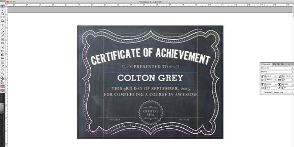
I remember being in college, creating corporate identity guidelines and having no idea how to put page numbers on at the end! I tried figuring it out myself before googling and applying them in a way I was sure wasn’t the ‘right’ way. Fast forward to 3 years after college and I was creating a catalog I had to apply page numbers to the right way. Once I knew what I was doing, I promised myself I wouldn’t be googling it again. So to make this easy on anyone who might be finding themselves in a similar situation – googling with no sense of certainty – I decided to make a quick tip tutorial on applying page numbers in InDesign.

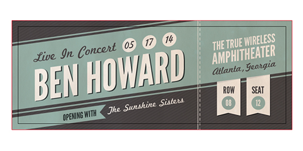
Last week’s tutorial was how to make a custom concert ticket in Adobe Illustrator. In today’s video tutorial, I’ll show you how to take that same Illustrator file and make it a Photoshop file. If you’re more comfortable working in Illustrator, or ever have a client asking for a psd when you only have an ai, this a great method to use, and you don’t have to remake a single thing!

This week’s tutorial is my first ever video tutorial! It’s a two parter that shows you how to create a retro concert ticket from scratch in Illustrator, with the final file being 100% print ready. I show you how to set up your document, layer your file properly, apply bleed, use the blend tool, what expanding an object means, and finally, placing a rasterized texture for the final retro feel.

I’m preparing to update/redo my entire portfolio site, so I’ve been on the hunt for the perfect theme for quite awhile now. The problem is, so many themes I come across are full of flashy parallax driven gimmicks. Don’t get me wrong; an unexpected smooth moving parallax effect still gives me the ooo’s and ahh’s, but it’s been tough finding ‘the one’ that doesn’t completely overdo it for me. I don’t think it’s that I’m too picky, I actually think it’s because with all of the options to get funky, it’s harder to get simple.

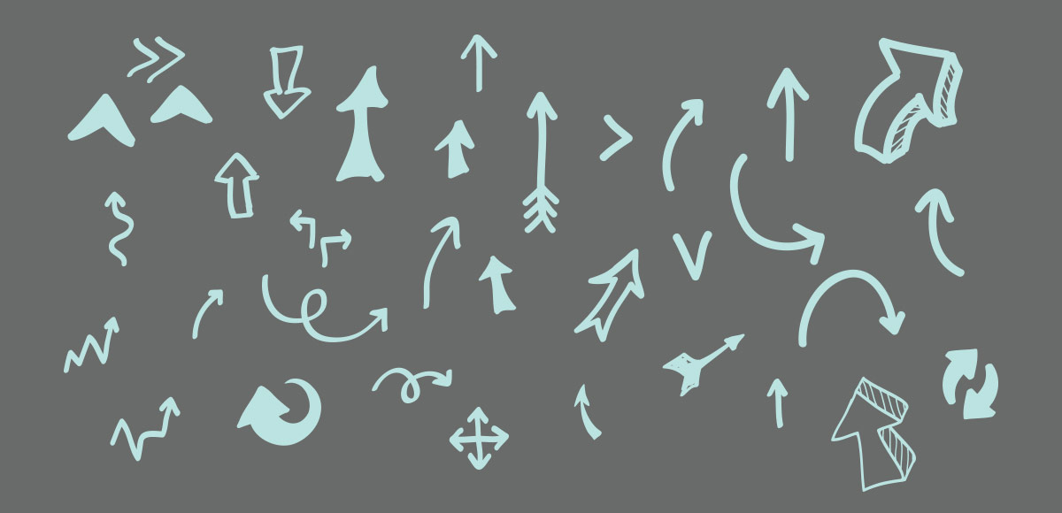
Happy Tuesday! I’ve always loved incorporating hand drawn vector arrows into my artwork. Arrows work especially well for step by steps images, or for before and afters. If there’s a specific place you’d like your reader to look, an arrow is perfect for drawing attention to it. Instead of using the default Photoshop arrows, hand drawn has always been my method of choice. 🙂 This week, I’m sharing some arrows from my own collection that you can begin using for your own work. This download contains 35 free hand drawn vector arrows as both an ai + eps file for Illustrator, CS3 or newer. Download link and preview image below!

GDPR Icon

Your Privacy Matters

We use cookies to customize and create content that’s most important to you. We’ll never share the info we collect.

View Privacy Policy